
Discover the ideal way to learn about and choose an electric vehicle
This work was for a multinational automobile manufacturer. They were coming out with a new electric vehicle (EV) and wanted to validate and challenge users' current online journey to learn about and decide on a vehicle.
The team
Project Manager
Principal UX Consultant
UX Consultant (me)
My role
Created the recruitment screener
Created and ran sessions
Conducted analysis
Reported on findings
The methodology
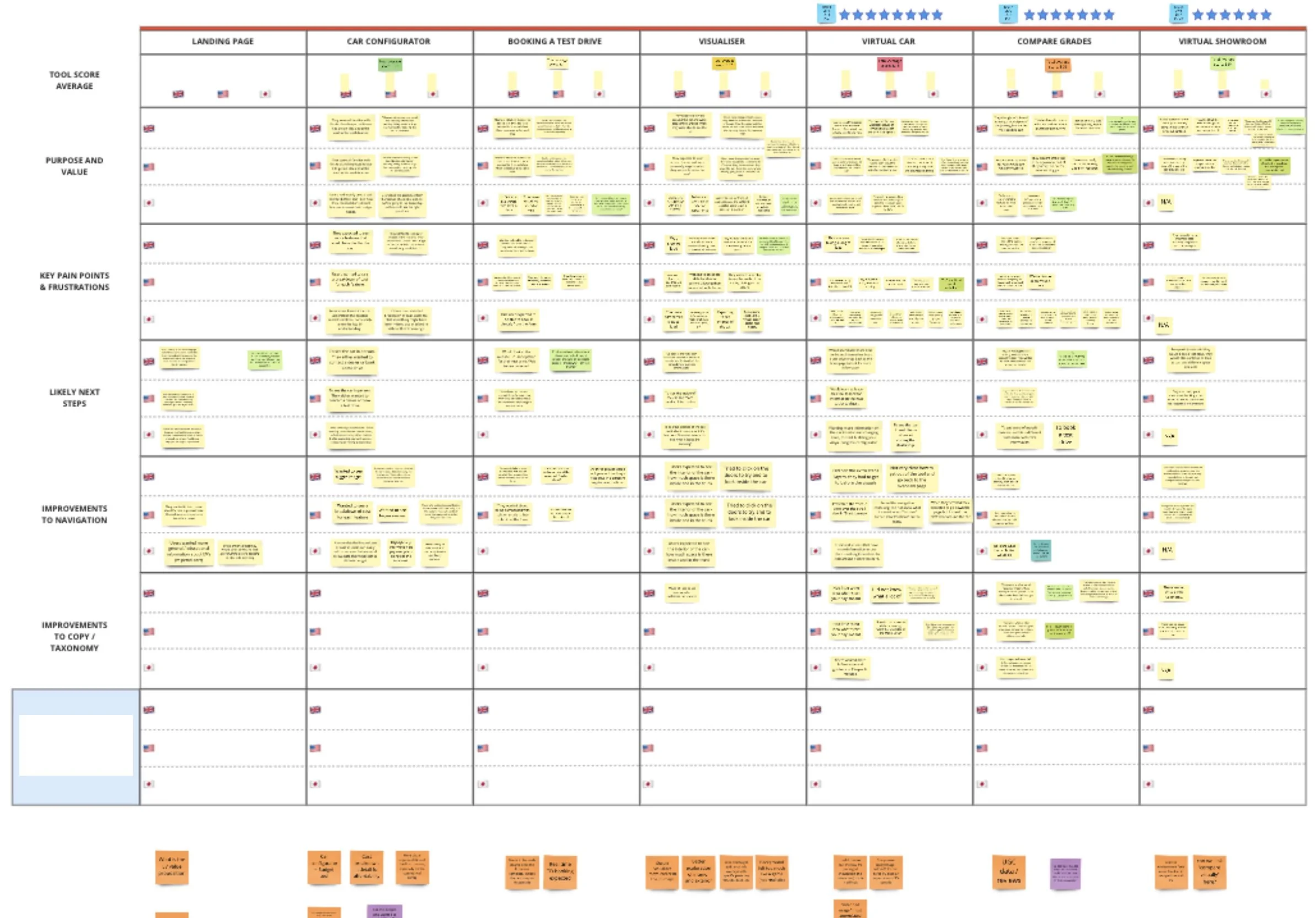
The research was conducted for three markets with six participants in each
Japan
The United Kingdom
The United States
All users were recruited to match specific criteria. This included having a neutral or positive opinion of the manufacturer and electric vehicles. I facilitated sessions with UK and US users; however, I used a third party to run sessions with Japanese participants, and those interviews were then translated.
What was tested?
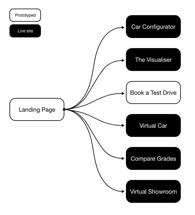
There was no website for this particular EV yet. So I showed participants a prototype made up of both static designs and live web tools from across different markets. The prototype was the landing page, and there were links to the static and live tools throughout it. These tools were
Car Configurator - From their Australian website
The Visualiser - From their Italian website
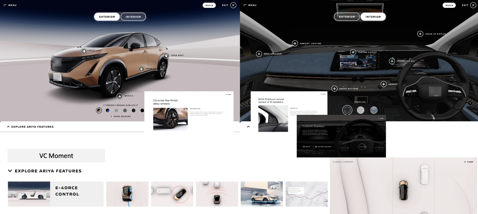
Virtual Car - From their UK website
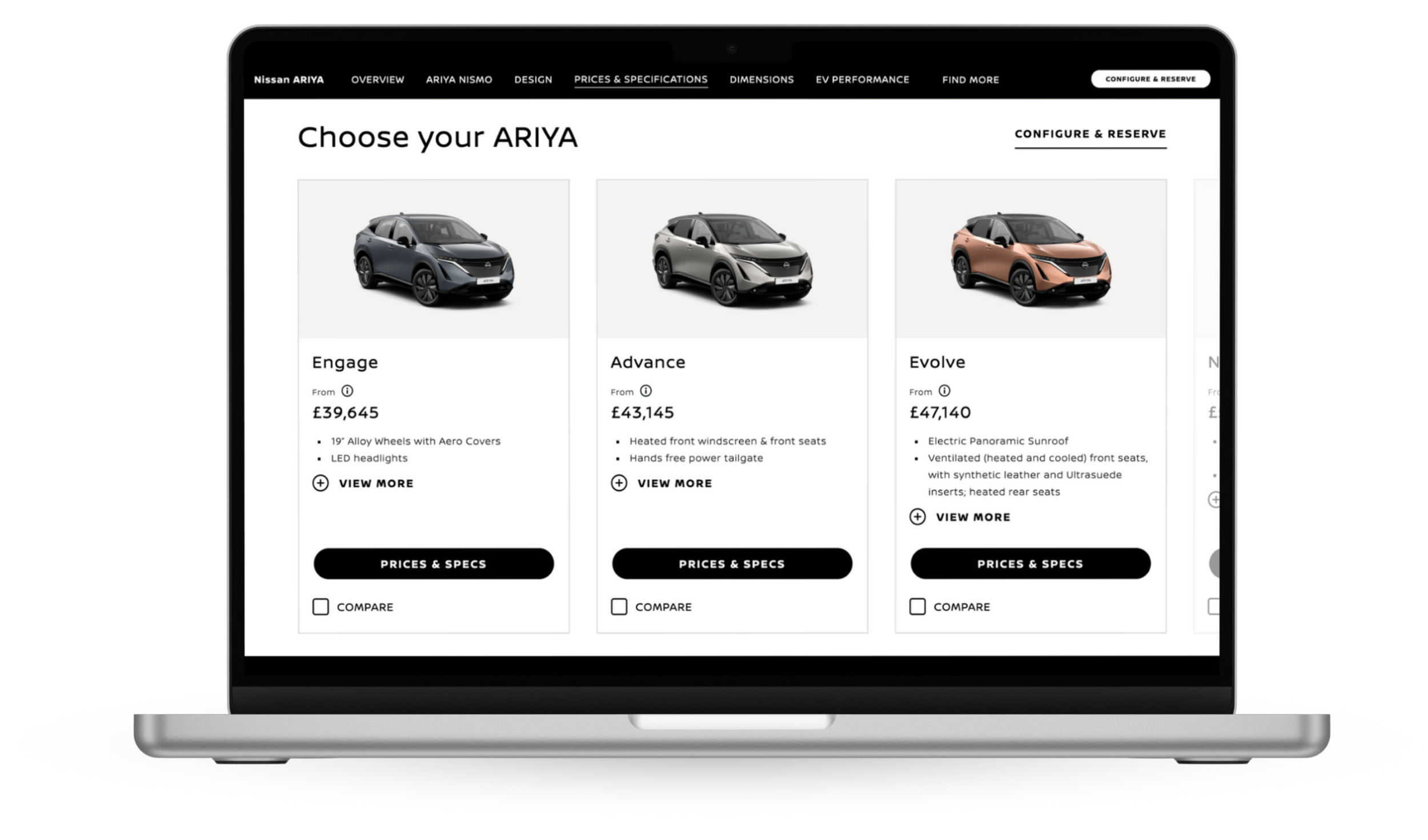
Compare Grades - From their UK website
Virtual Showroom - From their Philippines website
How the sessions ran
I started each session with questions about the participants' car purchasing behaviours and interest in electric vehicles. I then asked participants to imagine coming to the manufacturer's website because they are interested in purchasing the new EV and want to research before making further decisions.
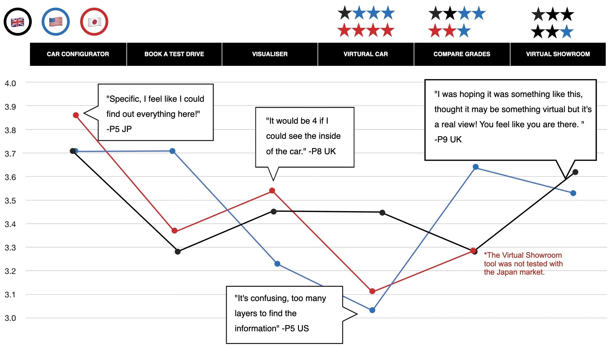
They then got to experience and compare each tool. To analyse this numerically, I asked participants to rate each tool from one to four.
They were asked what tools they would need to use to make an informed decision, which were not helpful, and which ones they found repetitive.
They were asked in what order they would have wanted to experience each tool.
Analysing the data
Before testing, I prepared a Miro board to reflect the order in which the sessions would run, making it easy for those observing (the client and Principal UX Consultant) to add notes. After each session, I was able to add my notes to the board. This made it easy to jump right into analysis. I spent three days analysing the data collected. During this time, I looked for any difference between markets, collected the one to four ratings, and identified the tools that were similar, preferred, and in the order they wanted to experience them.
What was found
There were a lot of detailed findings that came out and were reported. Here are some high-level ones.
Similarities
There were commonalities found between the tools that users found repetitive. The main ones were The Visualiser and Virtual Car. They both had digital images that allowed users to see a 360° view of the vehicle.
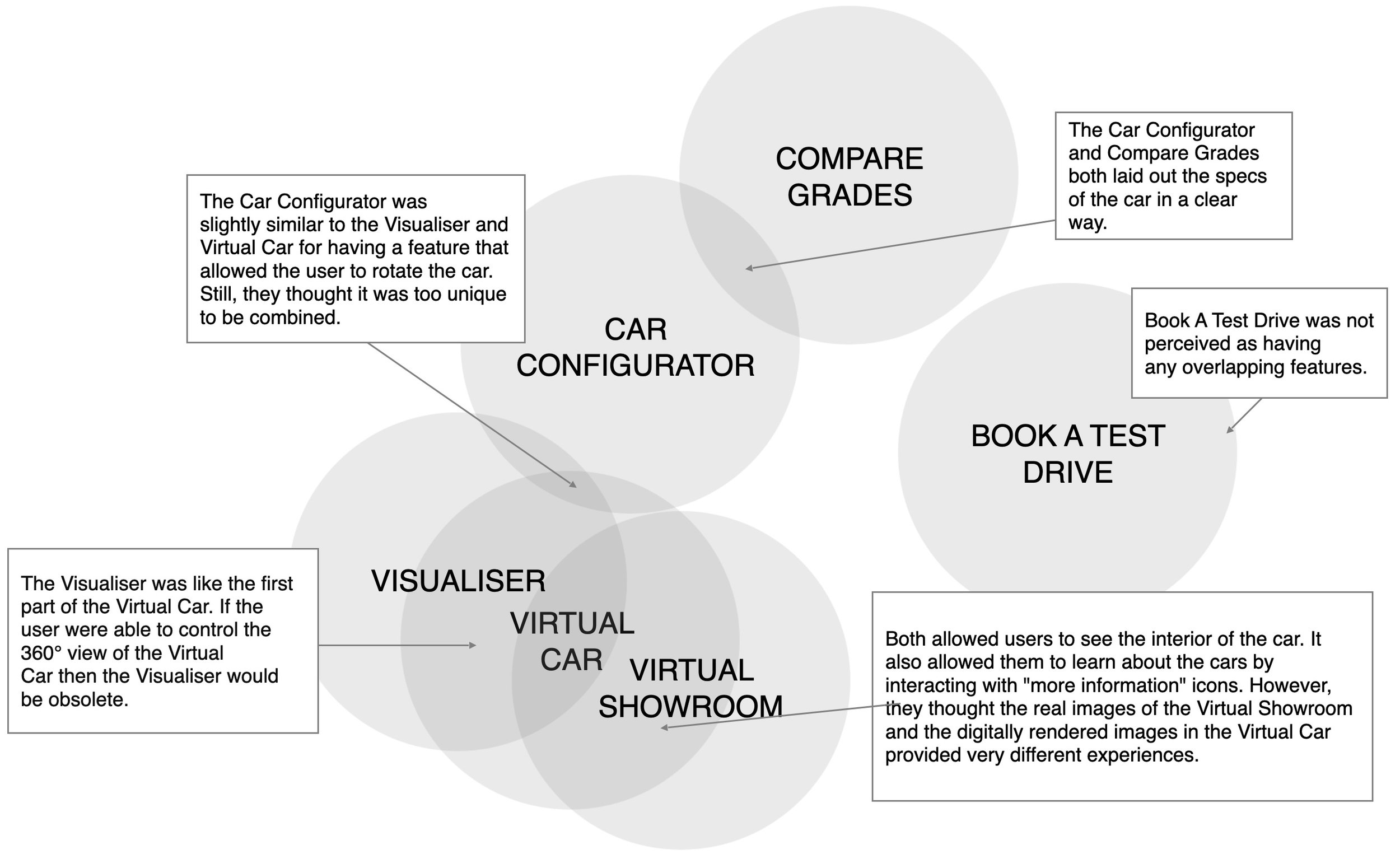
Paint points
Experiencing the Virtual Car caused the most frustration. This was primarily due to the confusing information architecture and overall navigation of the tool. However, it was still seen as a critical part of the journey as it provided internal views of the vehicle with information about the features and benefits.
Differences in markets
There was some insecurity and a need for assurance surrounding EVs. It is something that is still new to users. General information about EVs was needed to help them understand the practicalities of owning one. This was mainly the case with the US market. Japanese market seemed to have a understanding of EVs.
Ideal Journey
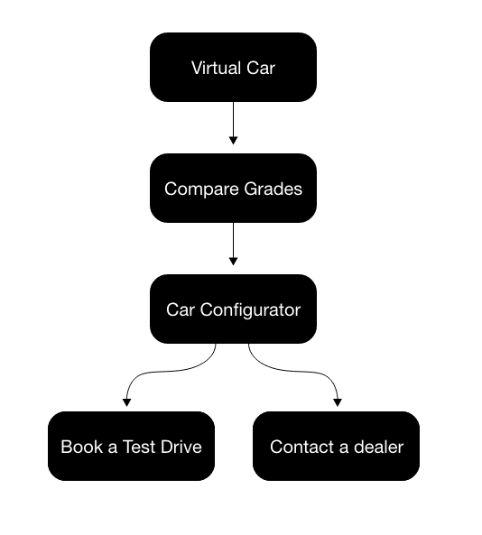
With these findings, I was able to determine that users wanted to:
Experience the Virtual Car
Use the Compare Grades tool
Use the Car Configurator
After experiencing these three tools, they would be informed enough to take the following steps to book a test drive or contact a dealership.
Going forward
After sharing findings with the client, there was a collaborative workshop to define a new journey that included the essential tools in the order the users wanted to see them.
The new journey was used to revise the prototype for round two testing and later used to help determine the order of tools within the page.