
Improving a multinational retailer’s post-purchase email communication
The aim of the project was to understand the expectations of users in the post-purchase journeys so that the client can improve the end experience for their customers and bring research-based change.
The team
Project Manager
UX Consultant (me)
UX Content designer
UI Designer
My role
Created the recruitment screener
Created and ran stakeholder interviews
Created and ran user Interviews
Wireframing
Created and ran unmoderated testing
Analysing
Reported on findings
Methodology
I started this project with ten stakeholder interviews to understand the post-purchase process and their current emails.
Next, I interviewed fifteen participants who had experience with post-purchase emails. All of these sessions were conducted remotely over Teams and Zoom. These interviews influenced the wireframes for unmoderated testing.
For forty unmoderated tests, each participant looked at two emails, one that the clients were currently sending out to customers and one the UI designer and I created using Figma and Adobe XD. These tests were done using UserZoom.
Analysis was done using Miro.
After analyses, I made tweaks to the proposed emails, broke them up into 73 components, and delivered them to the client using Zepplin.
1. Stakeholder interviews
What was done
I talked to those responsible for and involved in
email communication and design
purchase and post-purchase communication in all departments
customer service call centres
What was found
There was no one process or team responsible for these emails. It resulted in inconsistencies and delays in changes. There needed to be a unified process that could be governed across departments.
After speaking with the client, they selected one person who would serve as a gatekeeper for the post-purchase emails. We decided that the deliverables would include a tool kit (or components library) and rules that all departments must abide by.
2. User interviews
The focus of these discussions
Their online post-purchase experience, specifically through email
How they responded and wished to be communicated with when things go wrong
Their behaviour when it came to receiving post-purchase confirmation and tracking emails.
What was found
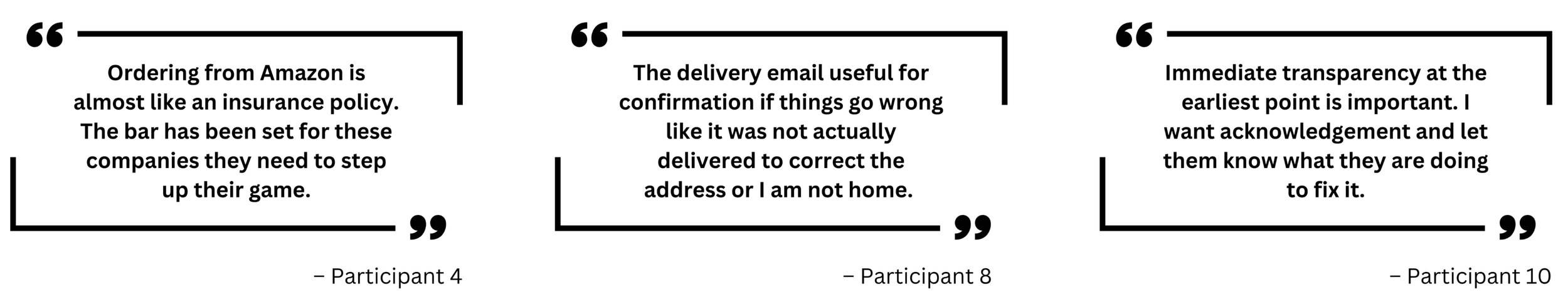
Customers skim confirmation emails, focusing on details only when issues arise.
Excessive detail can be overwhelming; emails should be concise and easy to navigate.
The pandemic has raised customer expectations for seamless post-purchase experiences, and brands are expected to meet this standard.
Return Information:
The confirmation email is the first place customers look for return instructions.
A tedious or unclear return process discourages returns and causes frustration.
Customers want to monitor returns due to anxiety about lost packages.
Participants emphasised "minimalism" in post-purchase emails, preferring clear and essential information over lengthy content.
When issues occur, customers expect:
Immediate notifications.
Clear explanations of the issue and its cause.
Apologies and details on the resolution.
Despite other options like app notifications and SMS, email remains the preferred communication method.
3. Wireframing
After gathering insight from interviews and looking at the emails the users mentioned providing a good or bad experience, I then wireframed new emails. I also got help from a UX content designer who focused on the TOV and a UI Designer.
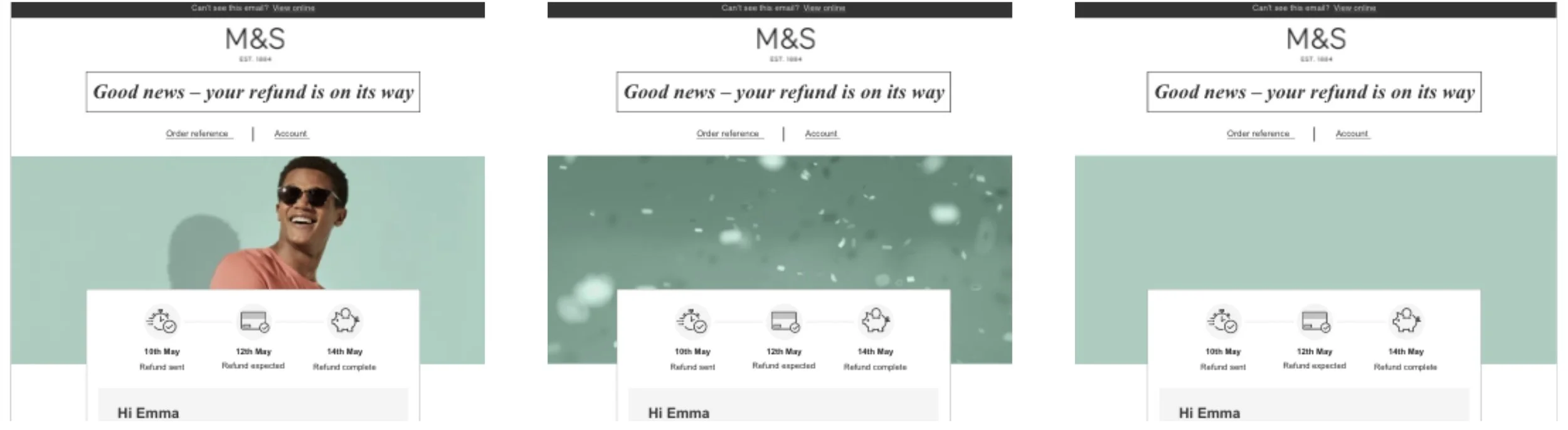
We came up with six high-fidelity emails with varying designs that I then took into unmoderated testing.
Purchase confirmation
Refund expectation
Cancellation of order
Delays
Split deliveries
Payment detail updates
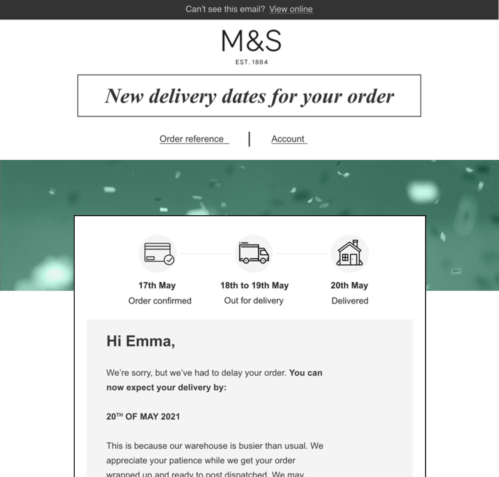
4. Unmoderated testing
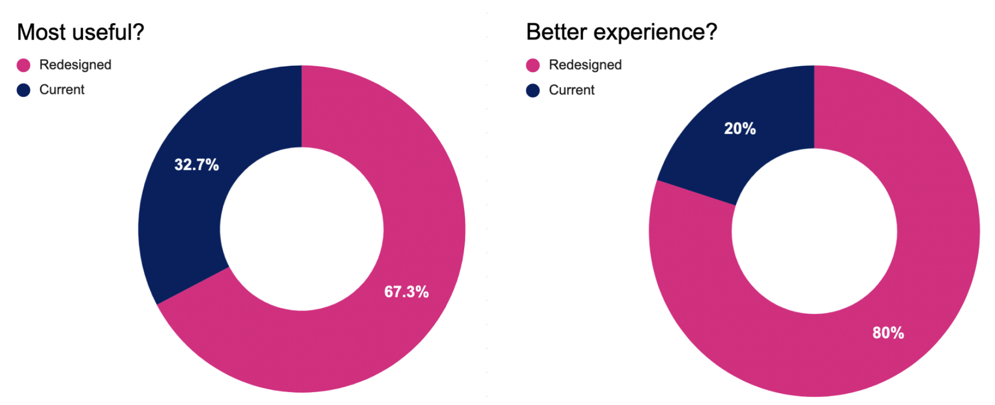
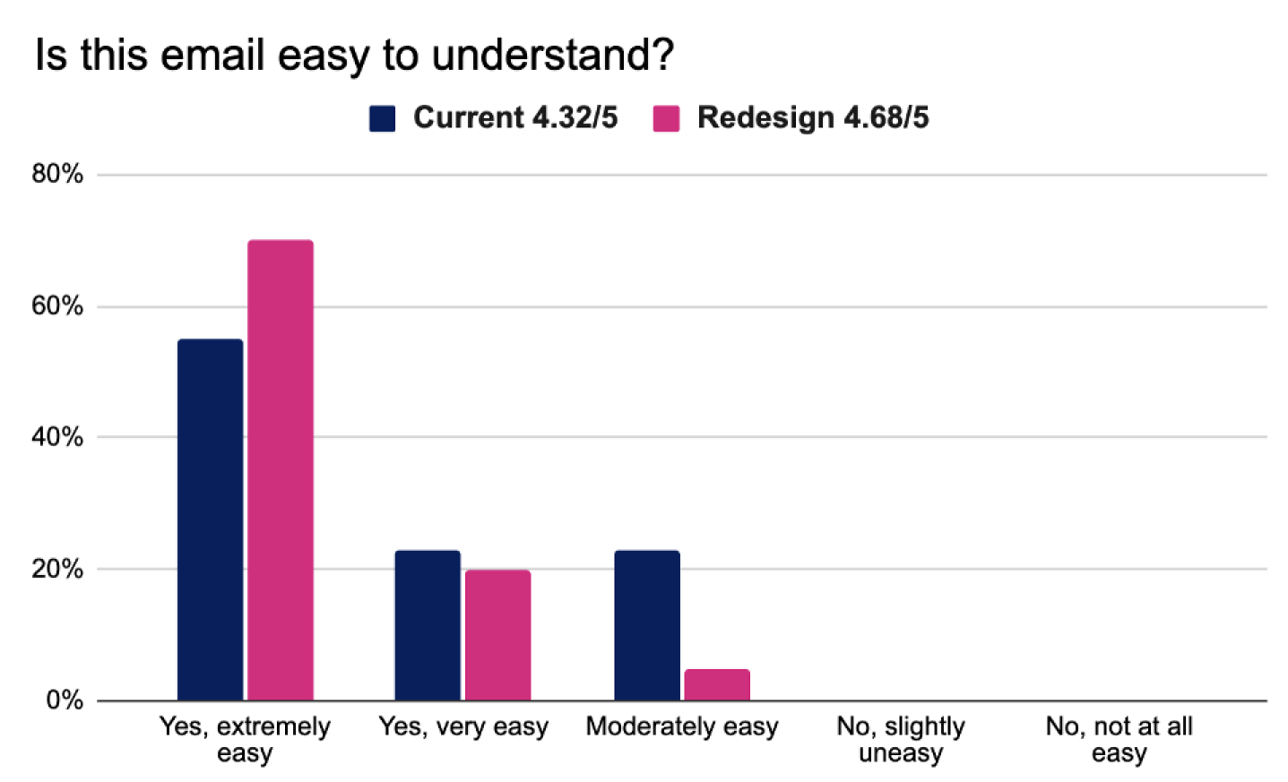
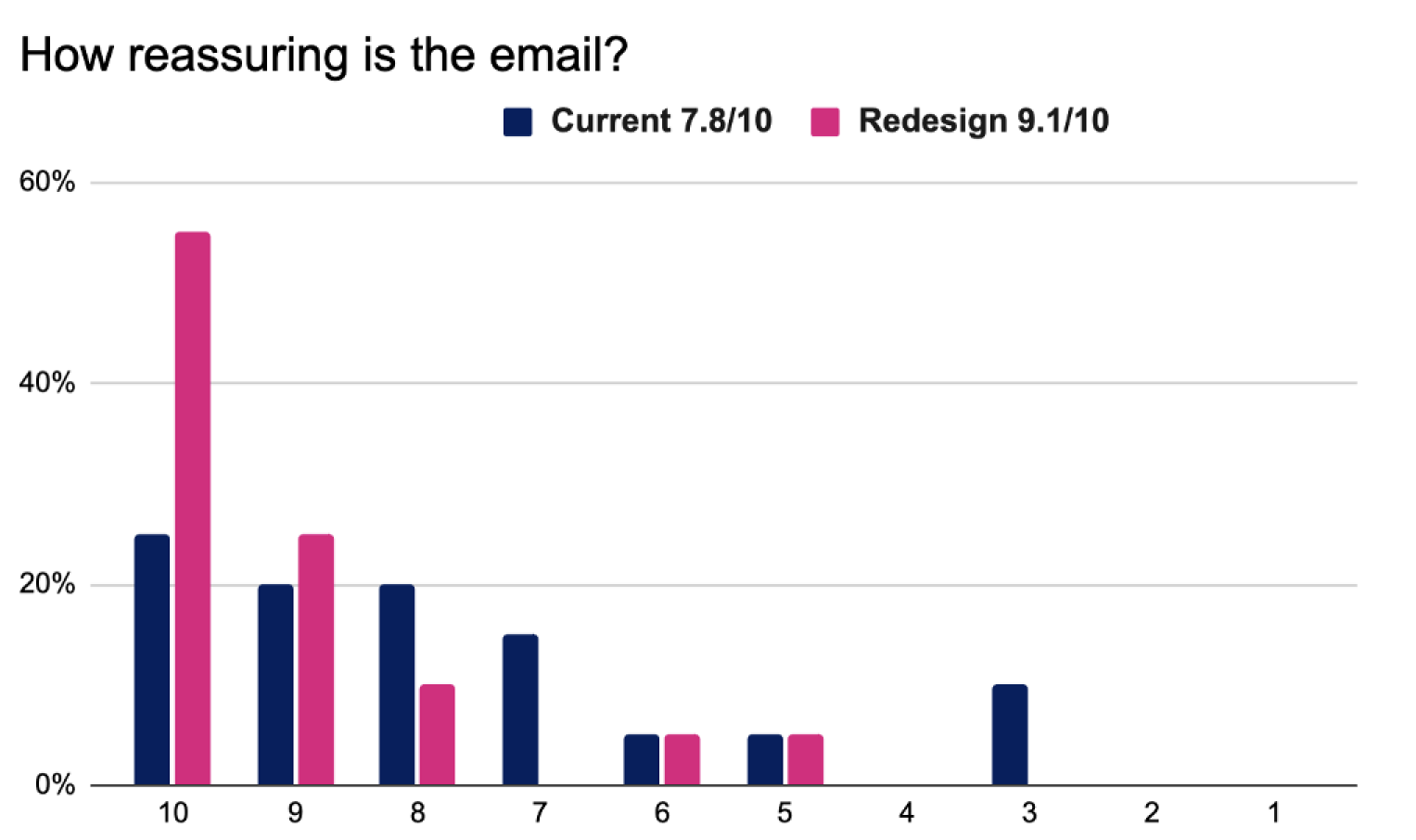
For unmoderated testing, I used UzerZoom to test emails with 40 participants. They were asked to vocalise what they saw and then took a short survey asking them about their preference and preferred tone of voice. They were asked how reassured they would feel after receiving the email, how much they understood and if anything was missing.
I analysed and compared the data gathered from unmoderated testing using Miro. The findings confirmed some of our initial thoughts but allowed us to refine what was needed for the toolkit.

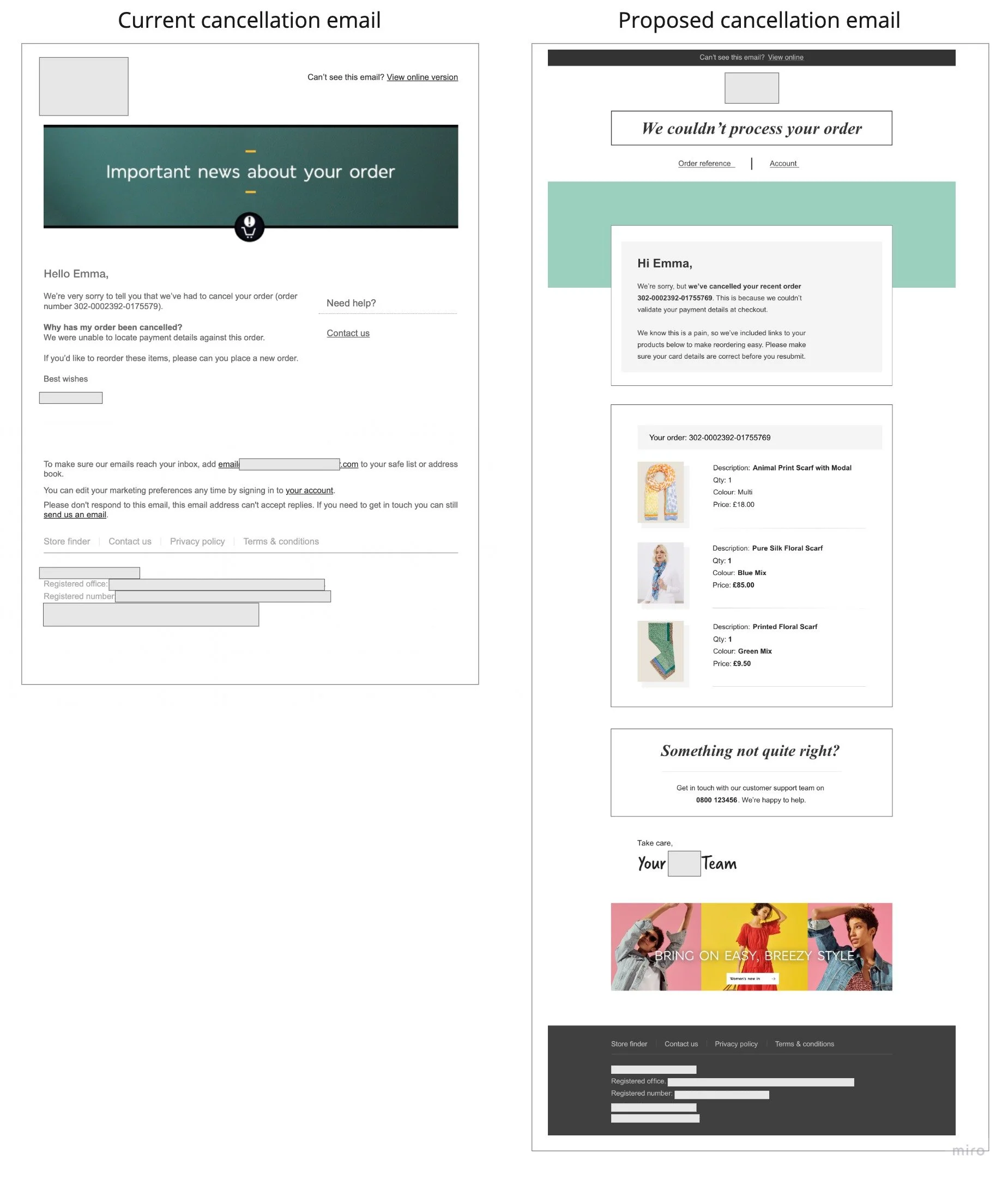
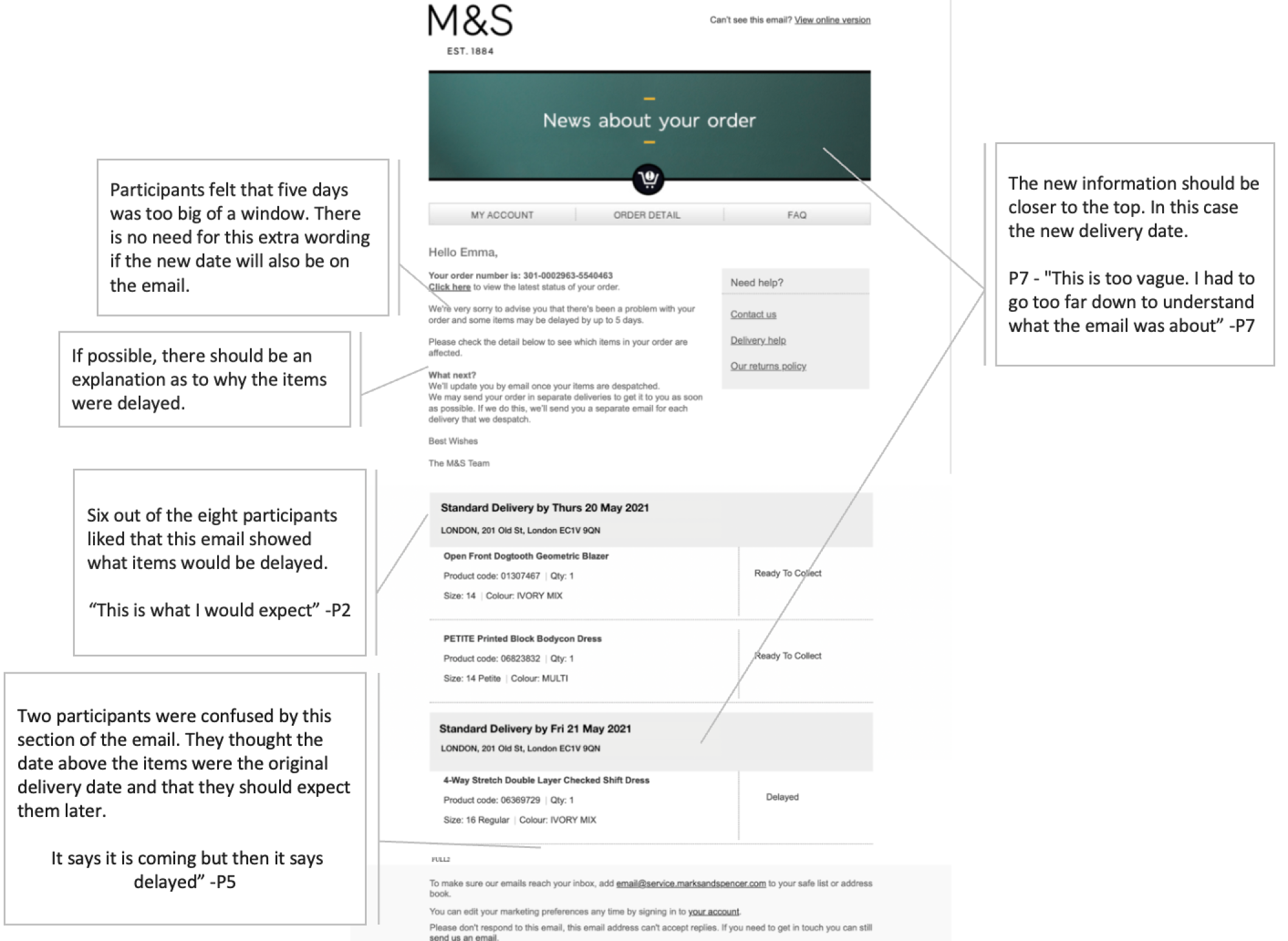
Example of the findings we brought back to our client
Current Email:
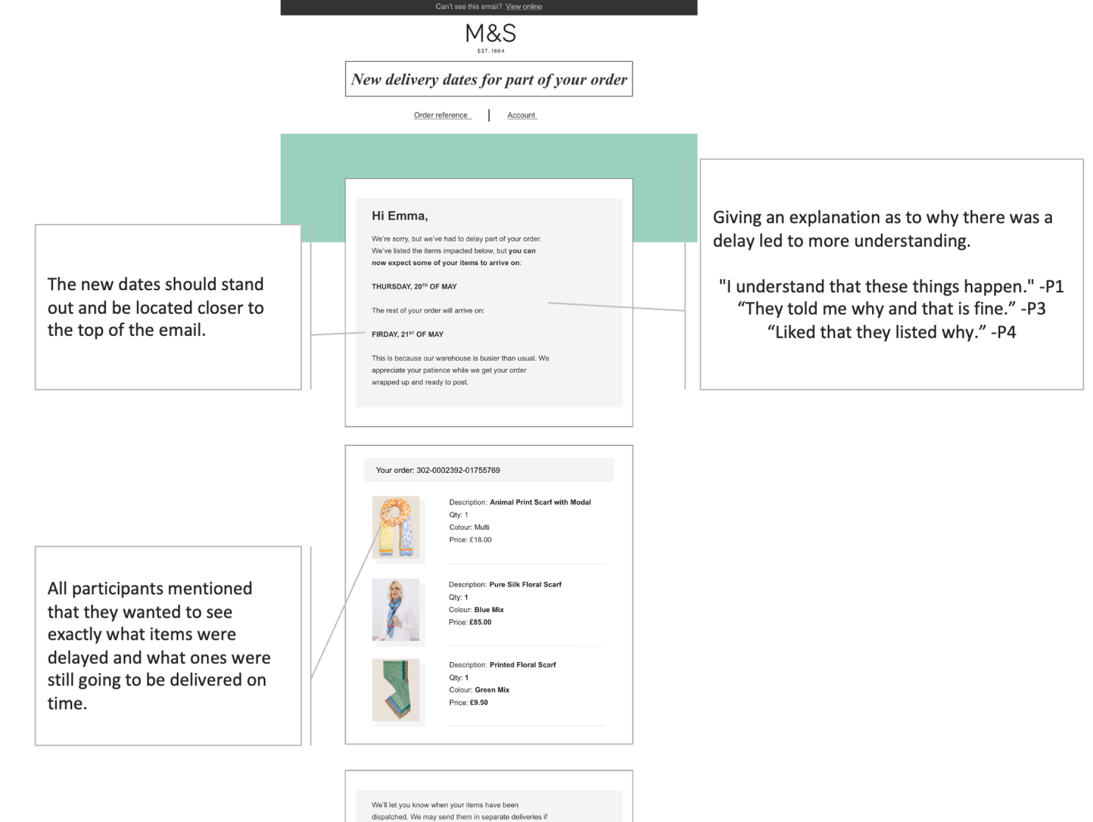
Redesigned Email:
Survey Results:
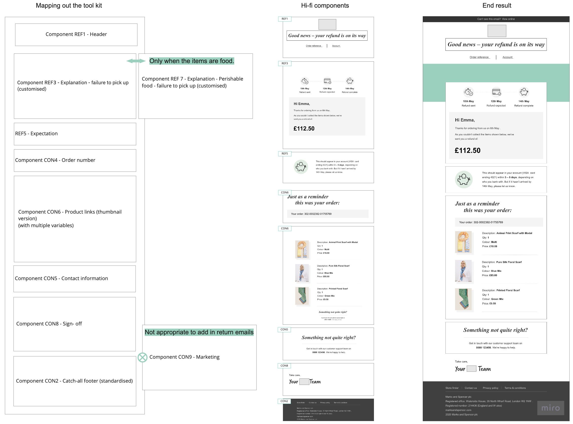
5. Creating the tool kit
I broke down the proposed emails into 74 components. These components would be a set of blocks that can be pulled together and rearranged. I also included rules to help the client govern the post-purchase experience.
Each type of email came with a list of components. Some components belong to specific emails, while others could be used for multiple emails, like the sign-off or footer components.
Outcomes
As we found out during stakeholder interviews, there is red tape when it comes to implementing changes. My team did not hear back from the client about this particular project right away. They let us know six months later that they had started rolling out the new post-purchase emails and that we could start seeing our work the next time we order something from them. 😊