
Digital Transformation
Designing a manual service into a scalable SaaS
Product: B2B SaaS | Role: UX Strategy, Service Design
Overview
Verity, formerly Client Relationship Consultancy (CRC), had delivered client relationship insights for years via a hands-on consultancy model. However, the manual processes, inconsistent delivery, and reliance on spreadsheets were limiting growth. I was part of a small team leading the transformation of this bespoke service into a scalable SaaS platform. My focus was on rethinking the end-to-end user experience: from internal operations and user roles to platform navigation and client-facing content.
This is a high-level snapshot of the work I led to help kickstart Verity’s digital transformation. Each project below came with its own set of challenges, insights, and learnings. If you're curious to dive deeper into any of them, I'd be glad to talk through the details.

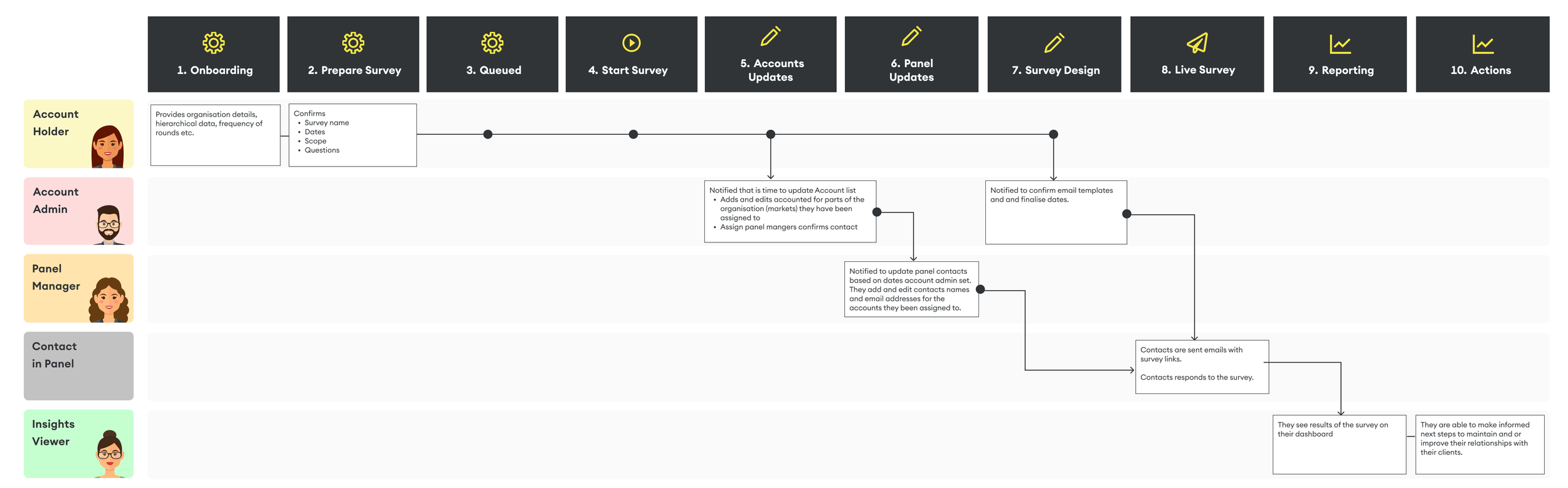
The Service Blueprint
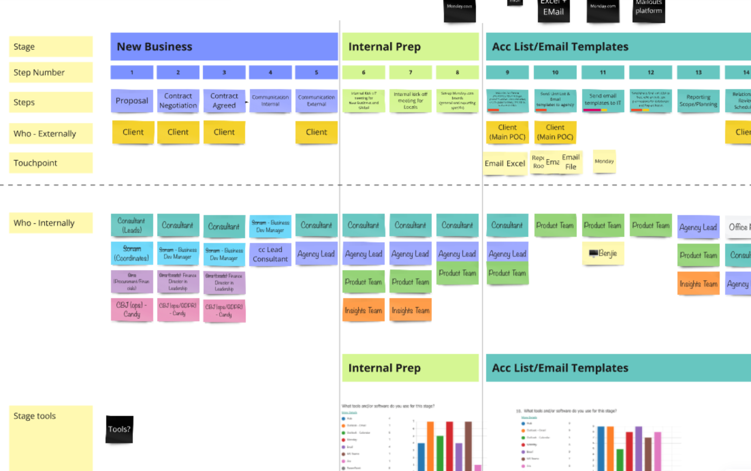
Early in the project, I ran workshops and internal surveys to document how we delivered surveys, reports, and consultancy. The resulting service blueprint revealed operational inefficiencies, data gaps, and moments of friction. This foundational map later guided how we restructured the platform, workflows, and user touchpoints.
With this foundation, I could reimagine the new high-level customer journey with confidence, which became the foundation for more detailed journeys that followed.
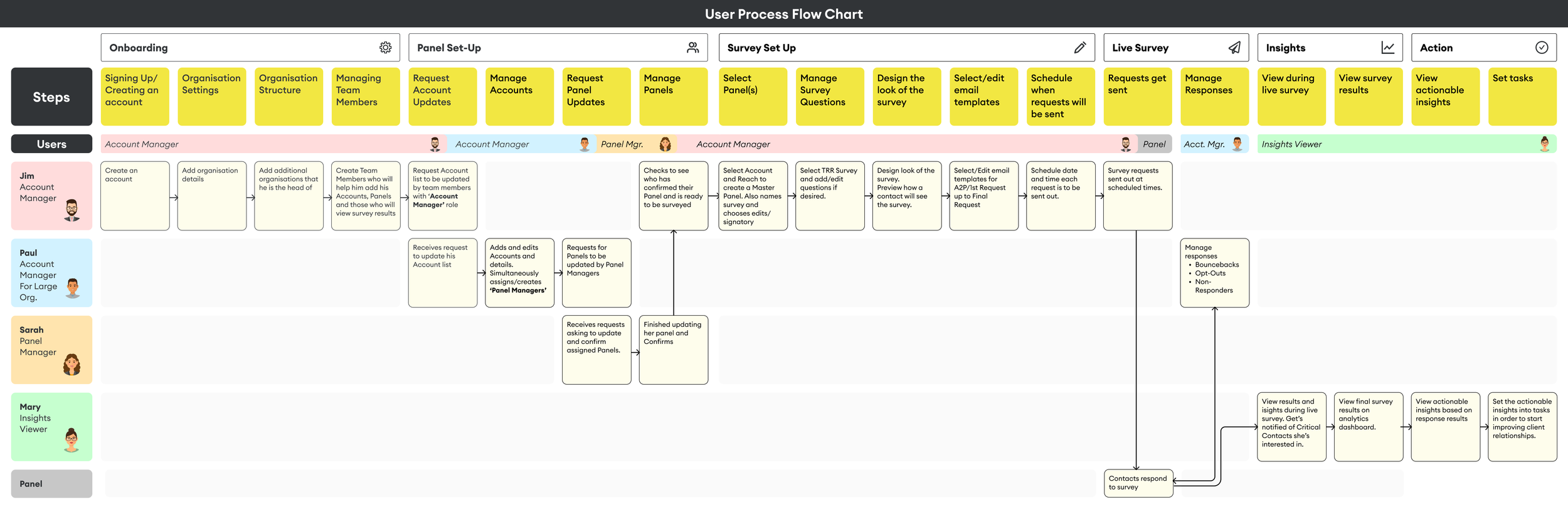
Reimagining User Roles & Access
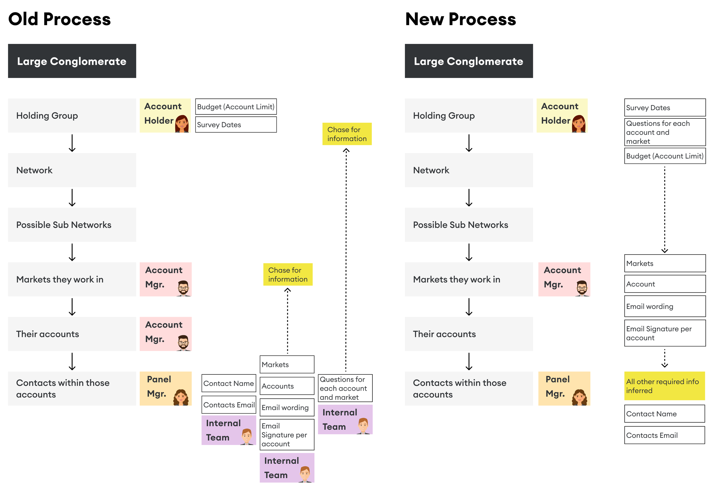
Our clients’ complex organisational structures required a more flexible, secure approach to user access. I collaborated with internal teams to design a hierarchical model of roles and permissions, ensuring users saw only relevant data. The existing manual process to set up surveys, collecting contact lists from large companies, was time-consuming and inefficient. To support organisations of all sizes, the new system needed to adapt to varied structures while maintaining strict control over access to sensitive survey results.
Roles and personas:
By mapping out the service blueprint and holding internal interviews, I gained a clear understanding of who we needed to contact, when, and for what purpose. This insight helped identify the roles necessary for the new platform.
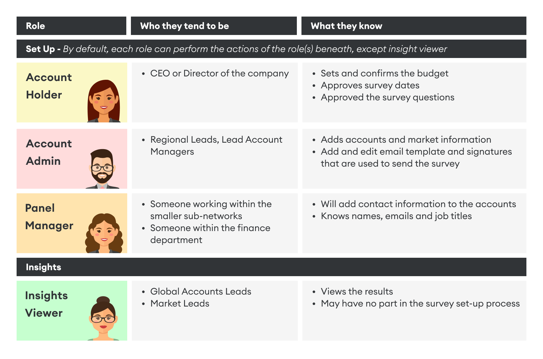
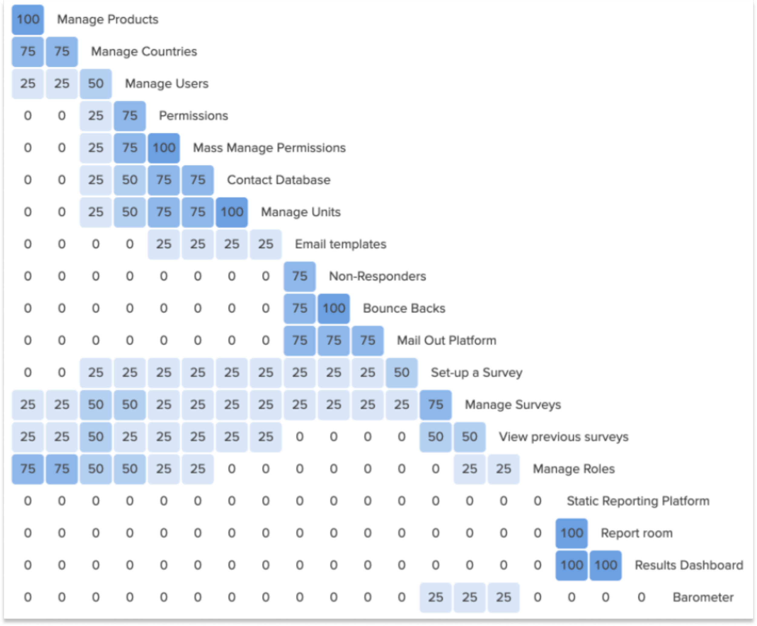
Permissions:
After understanding the complexities of these roles, I collaborated with our data analysis team, and we shifted from a flat data structure to a hierarchical one. This allowed us to position users within their correct level in the business hierarchy. As a result, they could access everything below their level but nothing above it.
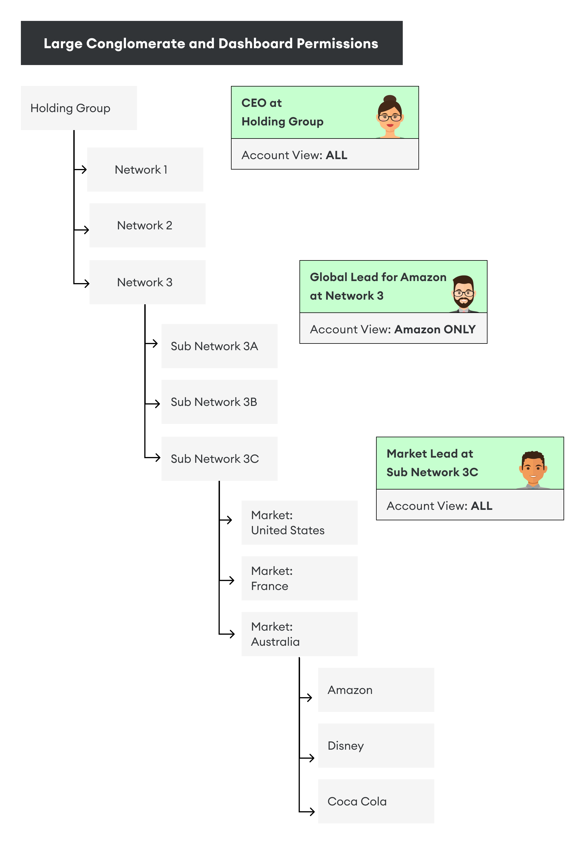
Flexible organisation structure
Moving to a hierarchical structure also helped me address the existing manual and inefficient process of collecting contact lists from large companies by taking a "top-down vs. bottom-up" approach for gathering the necessary data.
With that, the customer journey started to take shape.
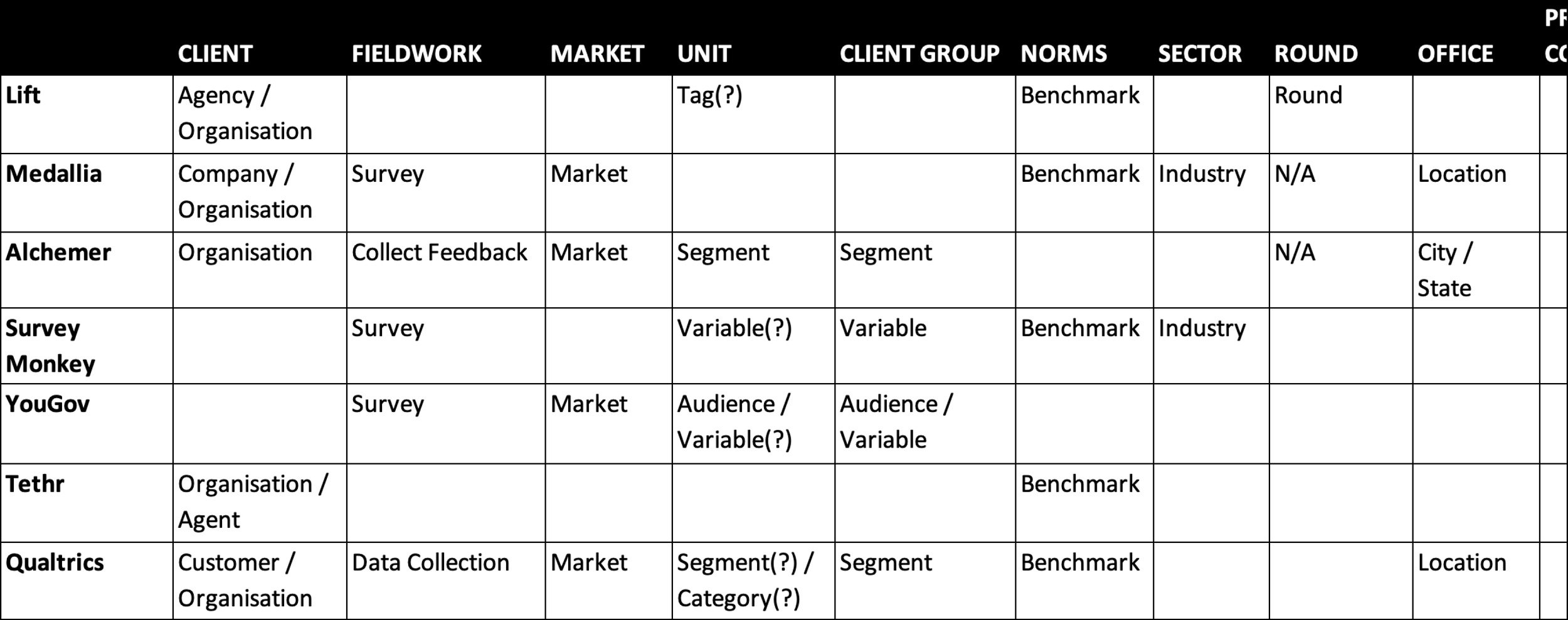
Terminology
Our legacy terminology varied across teams and lacked clarity. I led a company-wide initiative to standardise terms, running internal surveys and a competitor analysis. These new definitions not only improved platform usability but also supported our rebrand and improved cross-team alignment.
Example of survey results
By presenting these results, it became easier to convey the problem. If we couldn’t define these terms internally, how could we expect our users to?
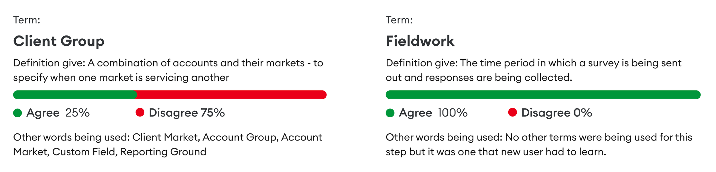
Competitor Analysis
Next, we examined how our competitors labelled similar concepts. We also looked at companies outside of our direct competition but who also distributed surveys.
Learnings and outcome
This process helped us solidify new terminology. Changing 20 years of habits takes consistency and repetition, but the payoff is clear. It simplified future work and supported marketing, sales, and onboarding efforts.
The old terminology in numbers
We were using over 130 terms to describe our process. Many of these were difficult for clients to understand and for staff to explain. As a result, we made changes to simplify the language we use.
The new terminology in numbers
We successfully reduced the number of terms to just over 90. We focused on using more self-descriptive terms, removing unnecessary ones, replacing confusing ones, and reducing overall complexity.
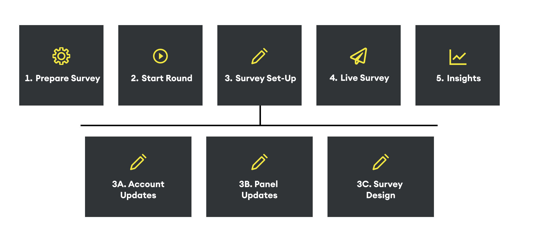
Information Architecture
As we embarked on developing a new client-facing platform, we identified the need to establish a solid information architecture that would serve as the foundation for user navigation.
User Journey and Information Architecture
To create a user-centric design, we analysed the tasks users would perform throughout their journey. This analysis informed my hypothesis about the platform’s information architecture that we could then test.
Card Sorting Exercise and Tree Testing
To validate this hypothesis, I conducted card-sorting exercises and tree tests with 17 users. This method helped us structure content and features in a way that made sense for a seamless navigation experience.
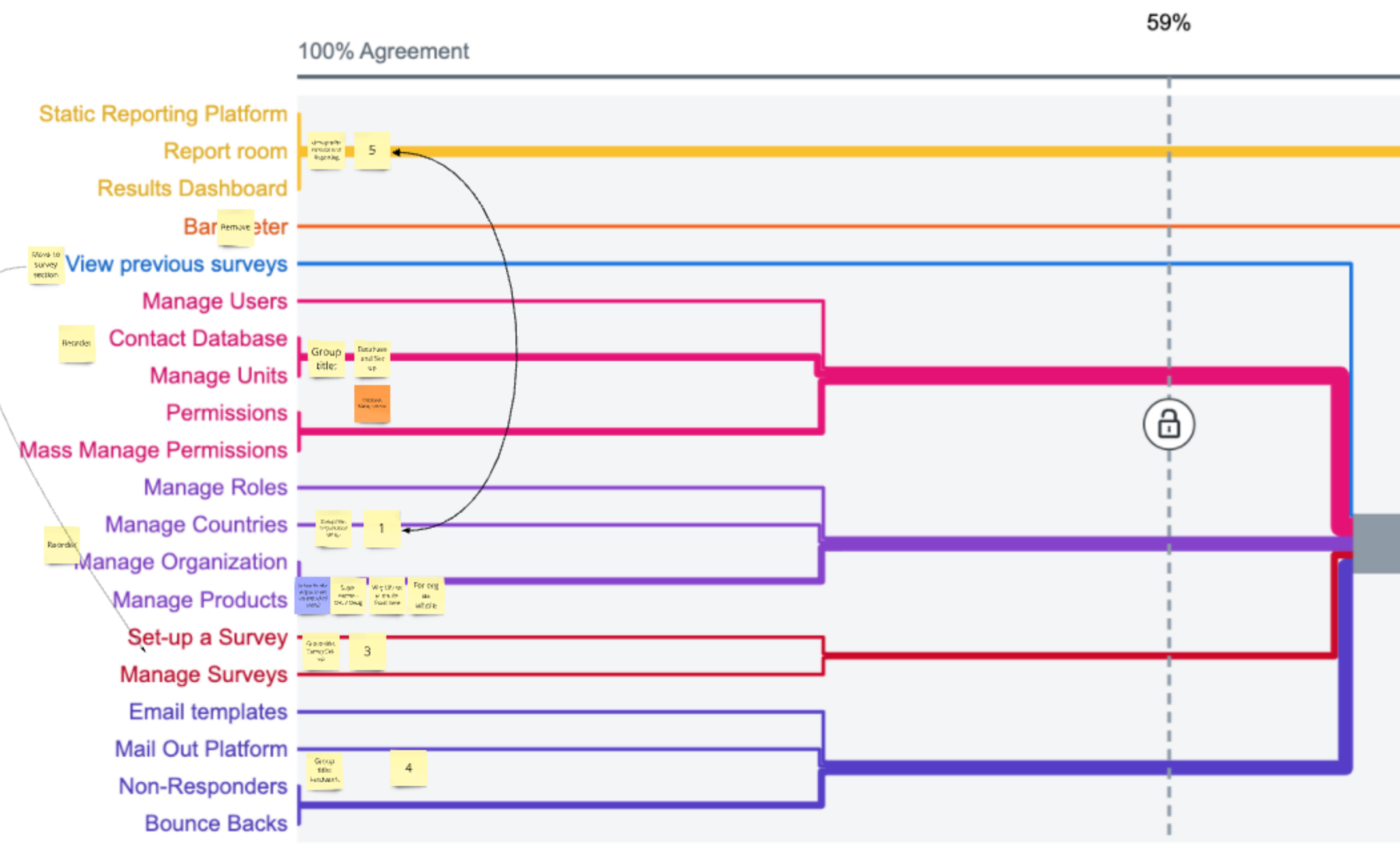
Confirming Information Architecture
This resulted in creating a shallow 3-level information architecture.
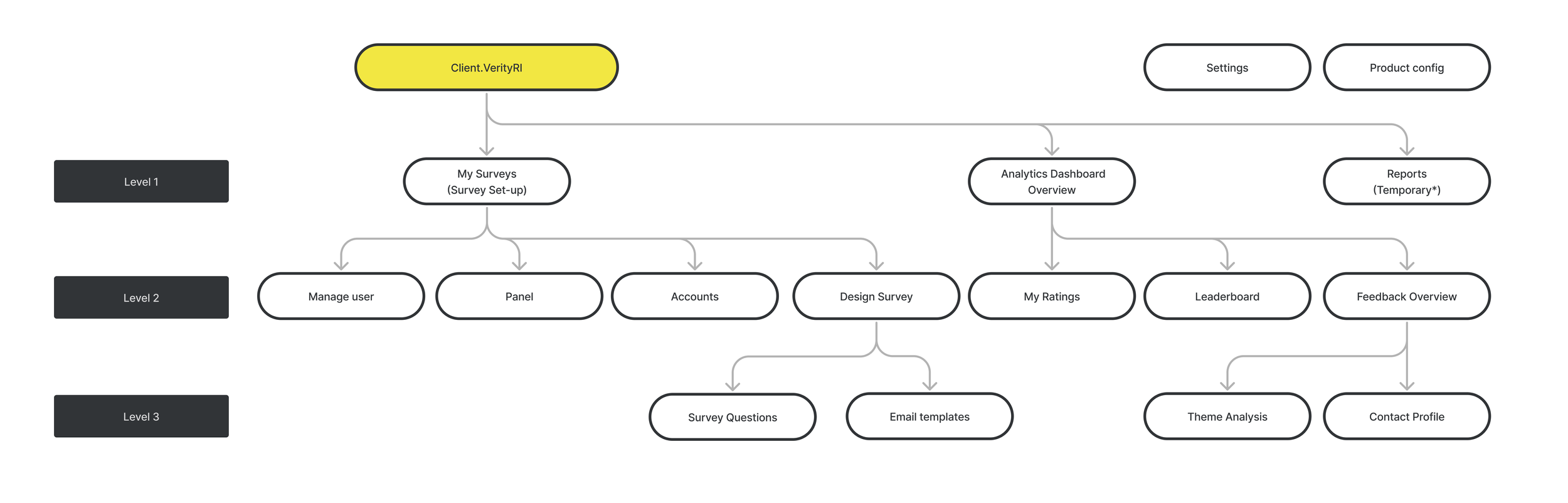
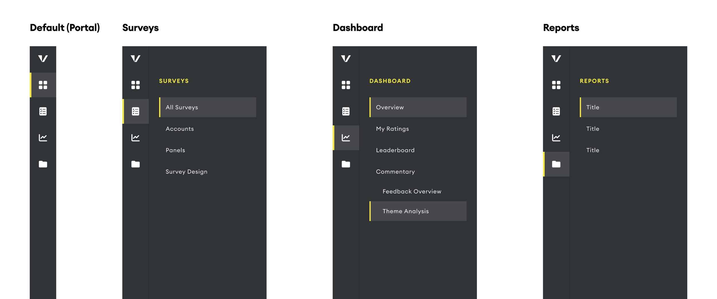
Designing the Navigation
By establishing a clear information architecture, we laid the groundwork for a platform and were able to confidently design the navigation of the platform.
Project Overview
The new platform would consist of three main areas:
Survey Setup: A section where users can easily update all necessary information to send out surveys.
Dashboards: Interactive views displaying survey results, along with tools to assist users in managing their relationships, such as action tracking features.
Reports: A folder with downloadable reports, which we still used as we transitioned to a dashboard-centred offering.
Learnings and outcomes
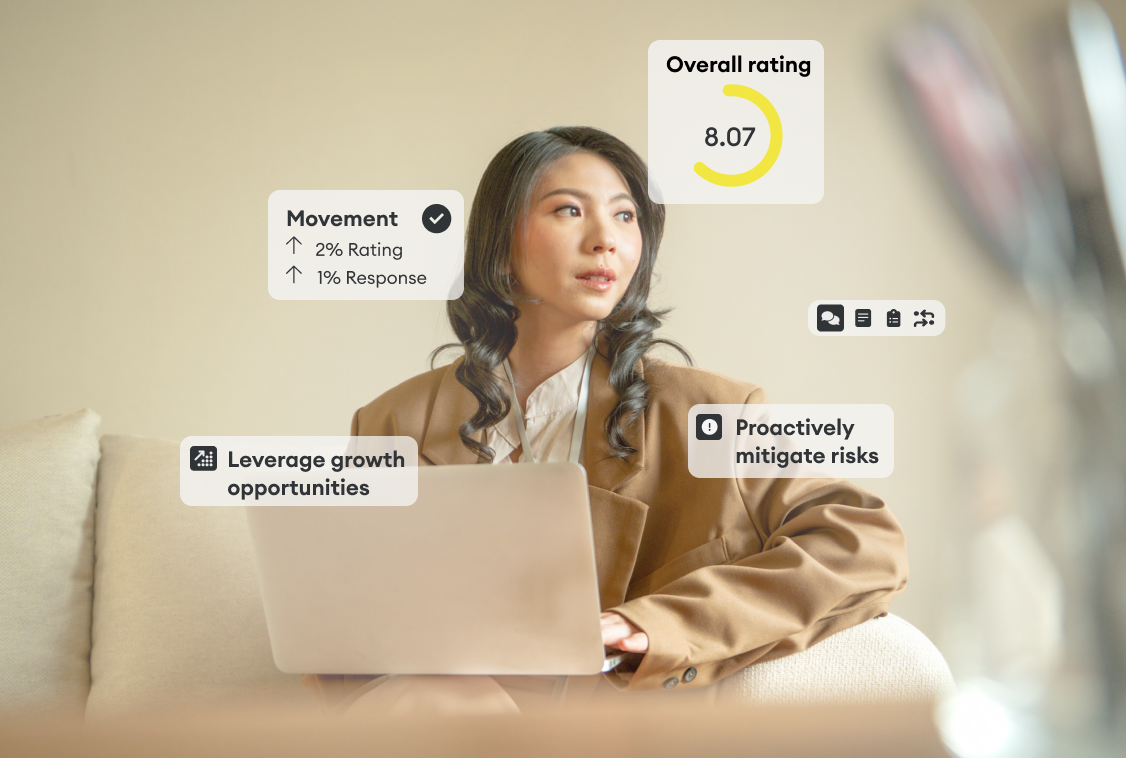
Our redesign enabled Verity to scale its operations without compromising the quality of client insights. We replaced manual workflows with automation, introduced self-service capabilities, and laid the groundwork for AI-powered features. Most importantly, we created a platform that could serve a broader client base while preserving the personalised value we were known for.
These foundational projects set the stage for designing and testing new user flows, beginning with guided prototypes that helped users confidently set up their own surveys.
This also drastically reduces the cost by reducing the hours it takes to run a survey by half.
Before (Old Process)
📝 34 steps (12 involved the client, all steps needing support by internal teams)
⏳ 17 weeks
⌛ 4,821 hours
After (New Process)
📝 26 steps (13 involved the client, 7 are automated, 6 done by the internal team)
⏳ 8 weeks
⌛ 2,264 hours