
Designing a Database Platform
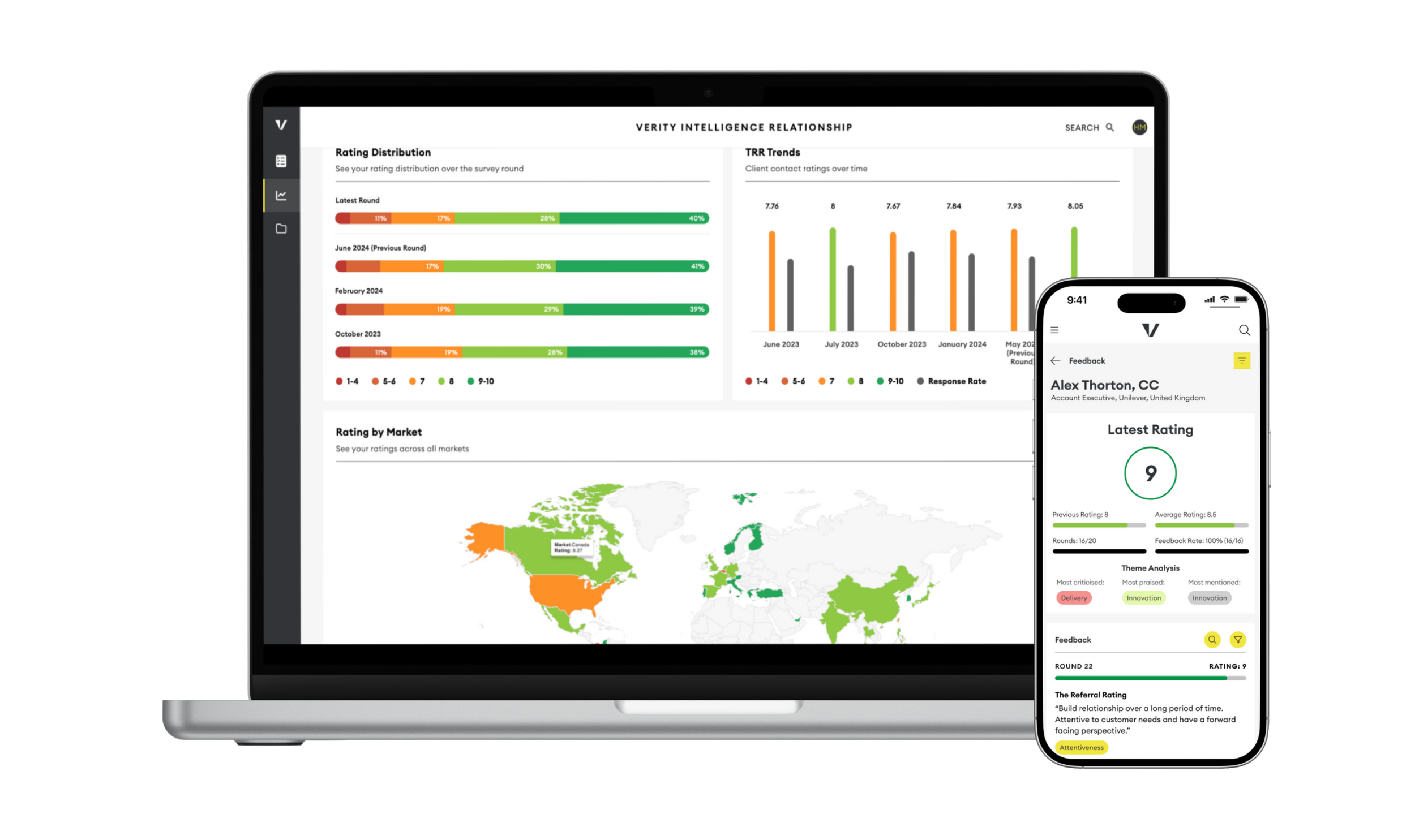
Designed a dashboard to surface client risks and opportunities at a glance.
Product: B2B SaaS | Role: End-to-end design process
Methods: User Research, Journey Mapping, Prototyping, User testing
Overview
Our previous dashboard was fragmented and difficult to navigate, with overlapping data spread across multiple tabs. Built using Tableau, it also lacked the flexibility for quick updates or improvements.
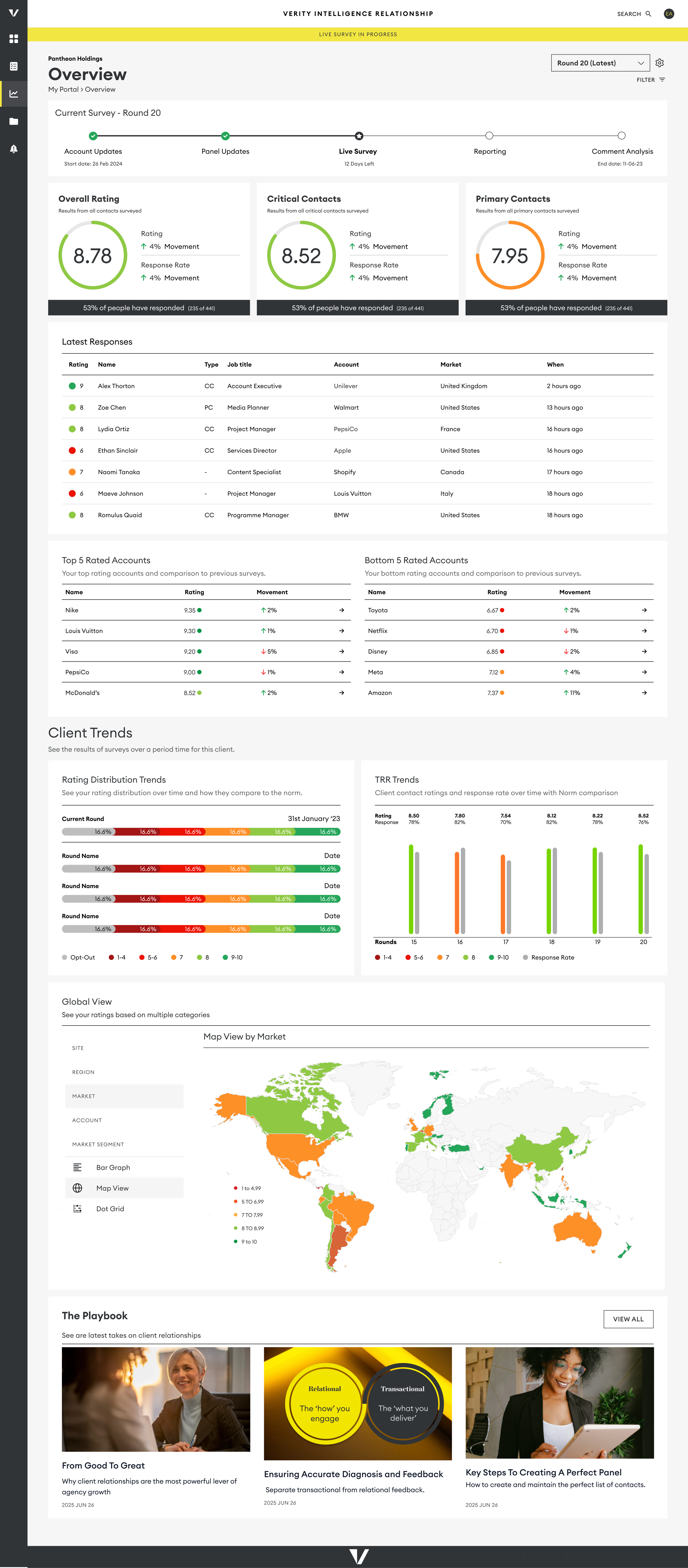
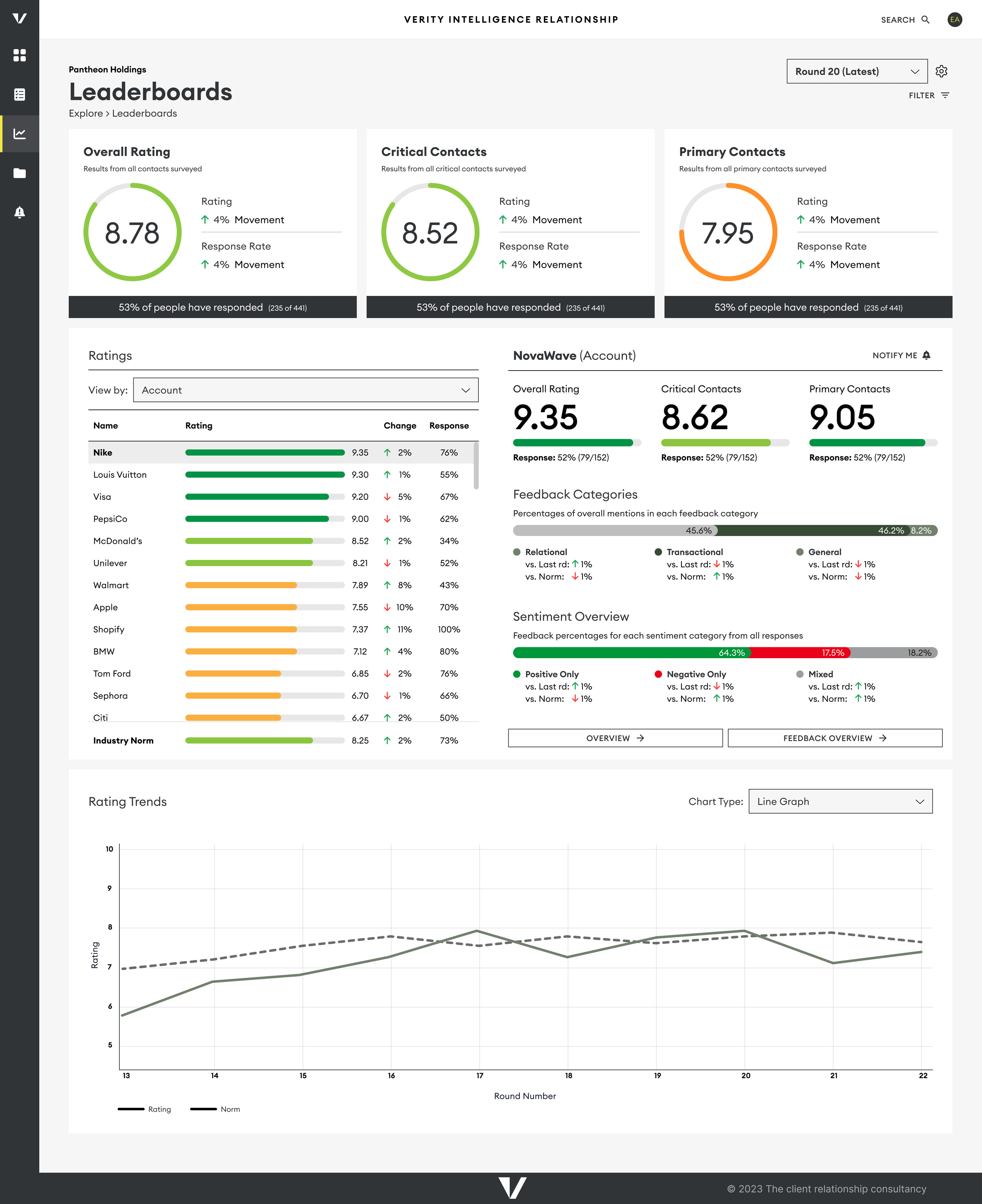
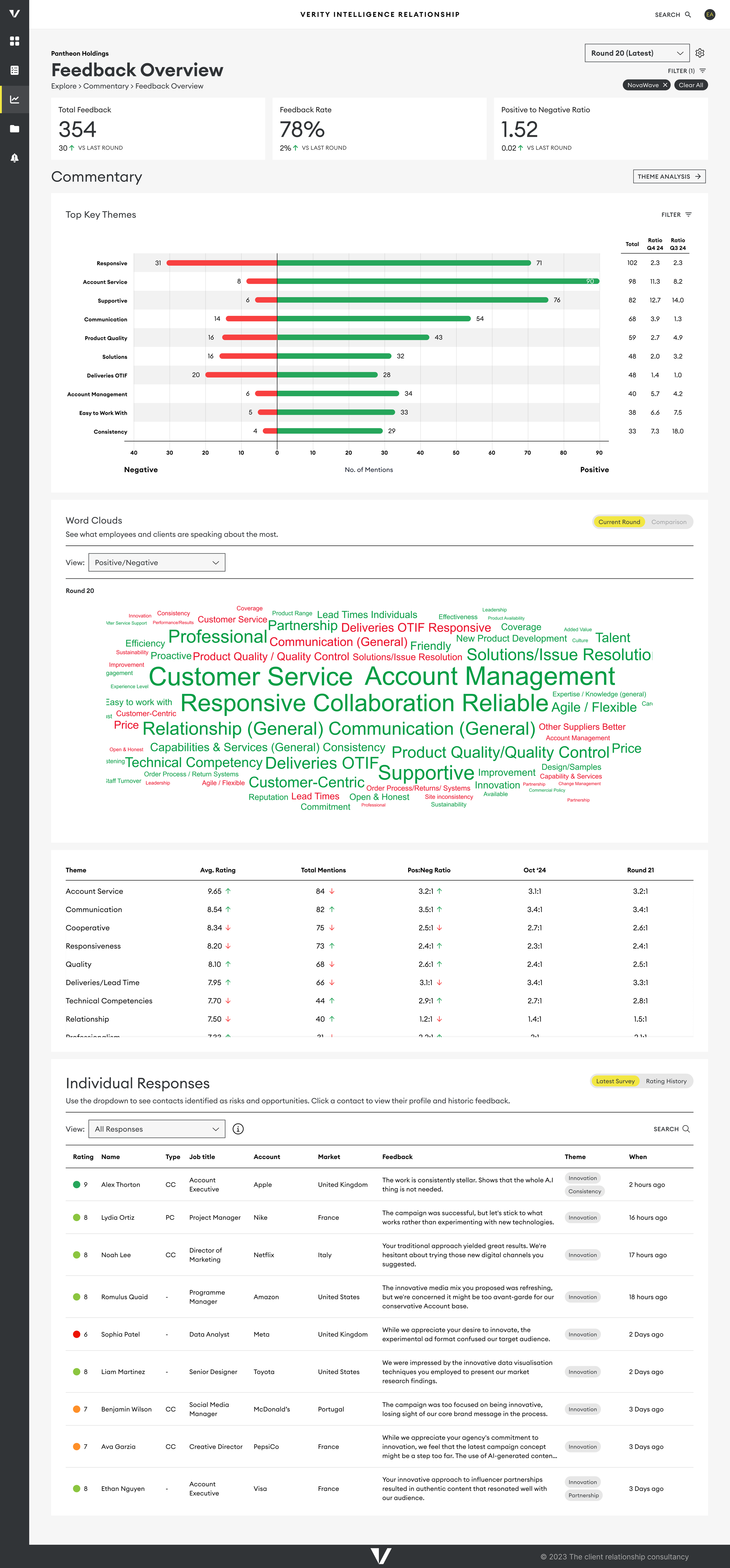
We set out to design a more intuitive, unified analytics dashboard that clearly guides users through their survey results. The new design supports multiple user personas, adapts to evolving data needs, and is fully responsive, making insights accessible on any device.
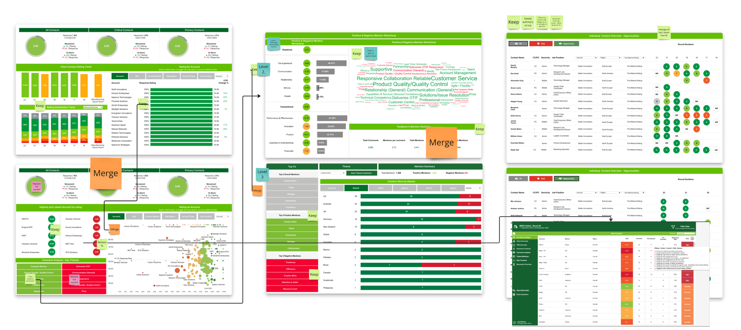
Audit of Current Materials
We began by reviewing the current dashboard and how users engaged with it. Analytics revealed that many users logged in but quickly stopped using the dashboard, often relying instead on PDF reports that provided a clearer narrative but lacked real-time data. These reports, while requiring significant time from our analytics team, included customizable elements that could be replicated in the dashboard. By auditing these materials, we identified similarities and organised them effectively.
Understanding User Needs Journeys
To gain insights into data consumption, we engaged with our primary personas—Market and Agency Leads in the advertising industry—and attended ten Relationship Review Sessions. These meetings revealed user priorities and the steps they took to access information, which was crucial for real-time feedback during client meetings.
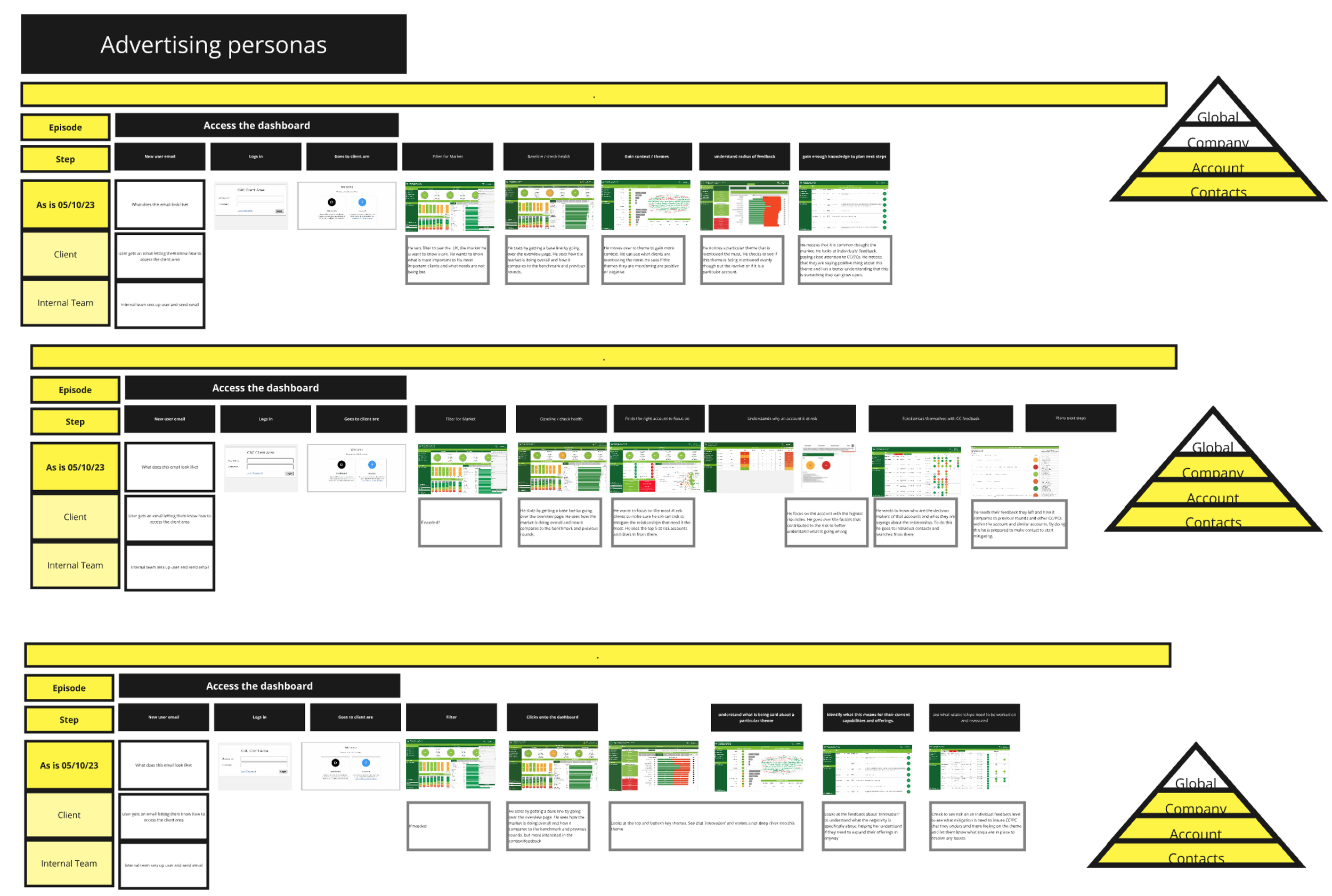
Mapping out Journeys
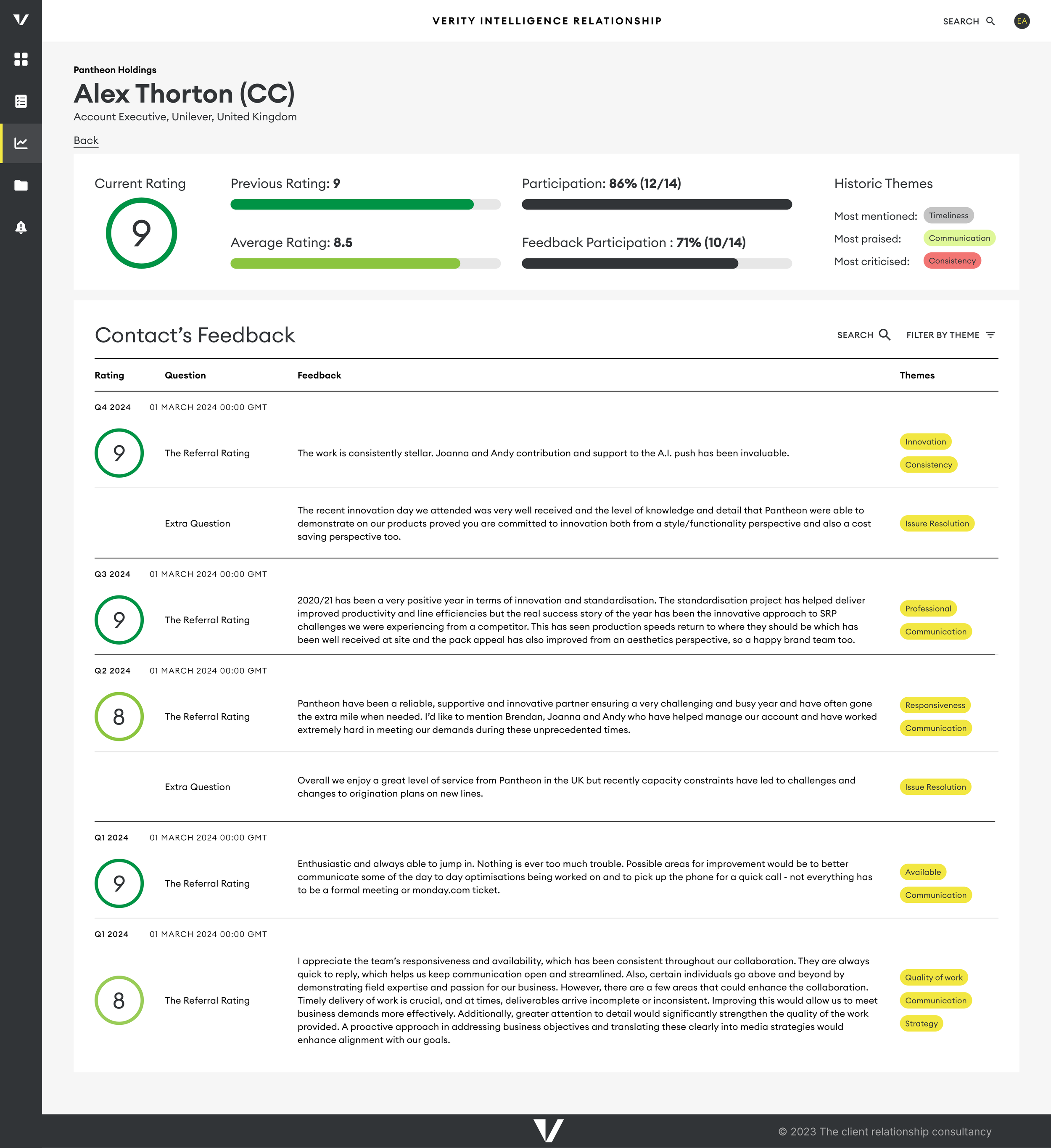
We mapped out user journeys, starting with a need for contact information and moving into detailed analyses. Users wanted to assess overall ratings, compare them to previous surveys and benchmarks, and drill down into specific ratings to identify themes and critical feedback from decision-makers. While users appreciated detailed insights, they also needed quick alerts for urgent issues, such as identifying at-risk accounts
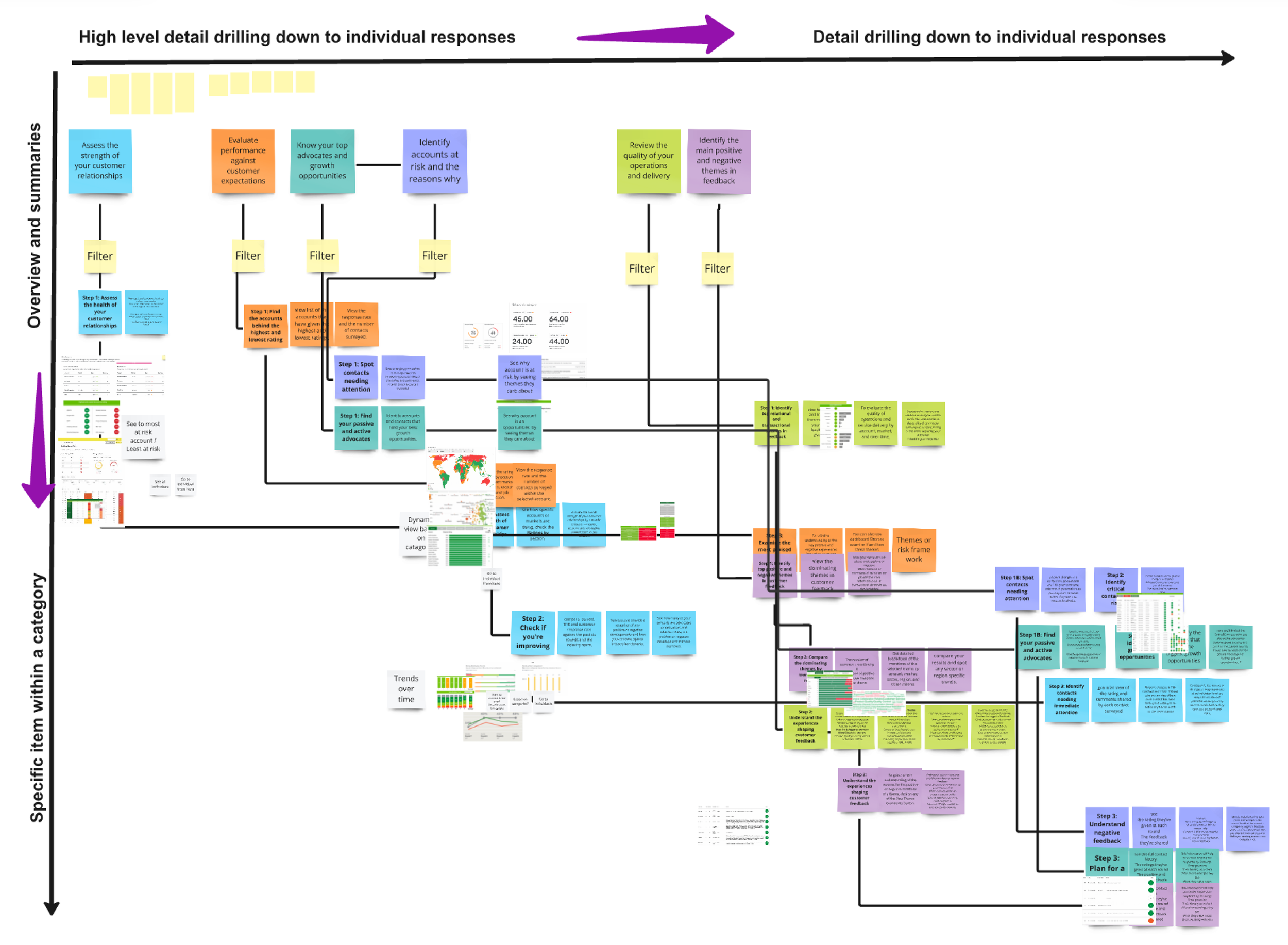
Information Architecture
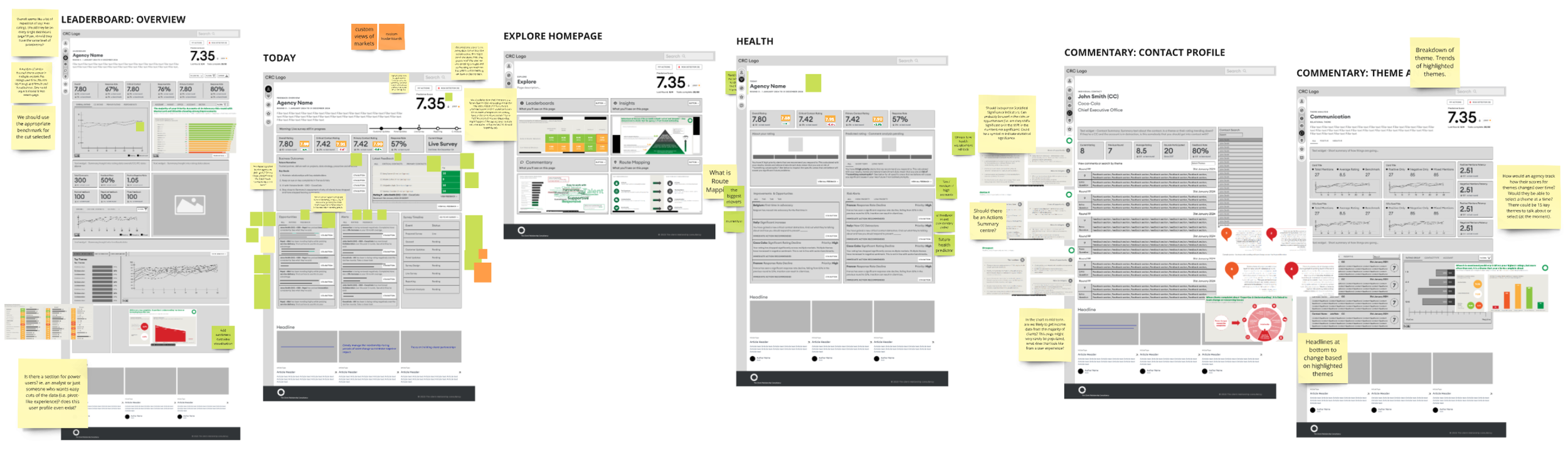
By analyzing these user journeys, we structured the new dashboard's architecture around key views, including:
Overview and ratings
Context and themes
Individual responses from key decision-makers
Testing and Collaboration
We rapidly prototyped low-fidelity dashboards based on our initial structure and tested them with consultants. Rather than formal user testing, we partnered with our leadership team, presenting prototypes as part of a collaborative development process to gather feedback.
Results
As a result, we observed an increase in dashboard usage during and after live surveys, leading to a reduction in manually created reports. While the old dashboard only tracked visit frequency, we saw a significant increase in engagement compared to the previous version, and we successfully onboarded more users thanks to the streamlined design.
Wireframes of some of the Dashboard Views
Next Steps
A key part of our service is the consulting that accompanies customer satisfaction survey results. To enhance this, we're collaborating with consultants to build a risk and opportunity framework and an action planning feature—helping clients turn insights into meaningful improvements.
With our transition to Salesforce and a fully digital process in place, we're now positioned to integrate AI into reporting and streamline survey setup through API connections. While our current focus is on Creative Agencies and Manufacturing, this new infrastructure opens the door to expanding into additional industries.