Case Study for Raft
Designing a manual service into a digital product.
The Company
Verity Relationship Intelligence helps B2B companies manage their client relationships by regularly sending out client feedback surveys. These surveys provide insights into how their business relationships are performing, allowing them to compare results to historical and benchmark data.
The Problem
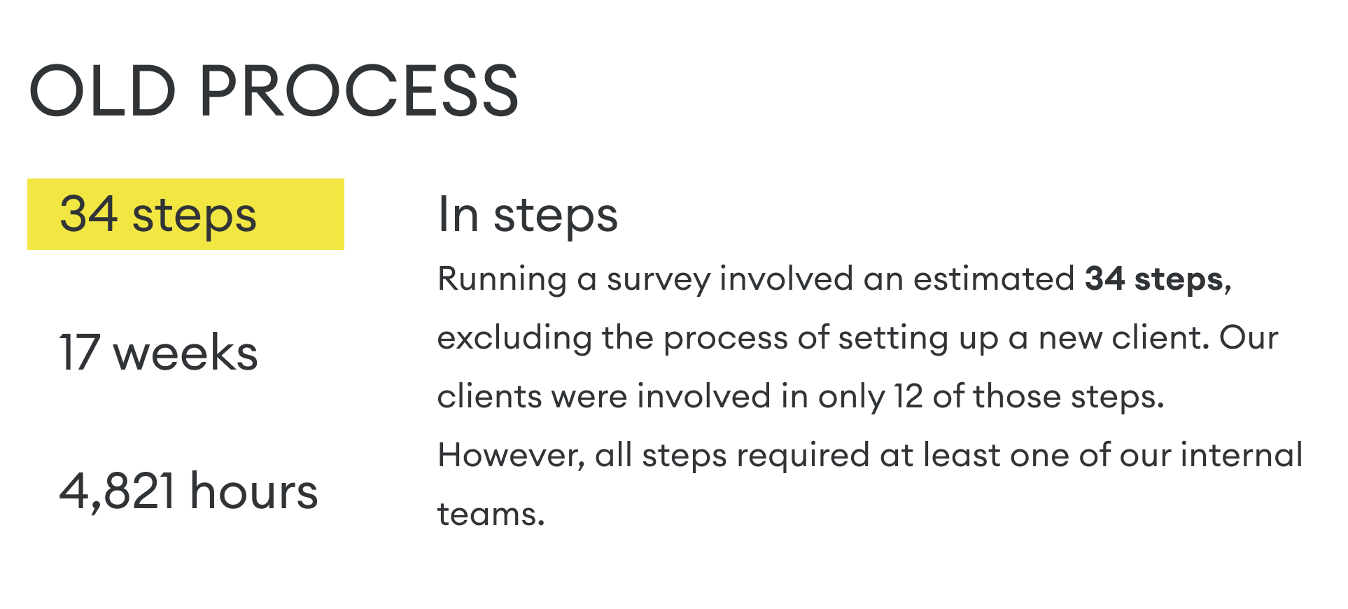
Although clients benefited from our service, producing it required significant time and manual effort. We began to struggle to meet deadlines and even had to temporarily halt new business.
The Solution
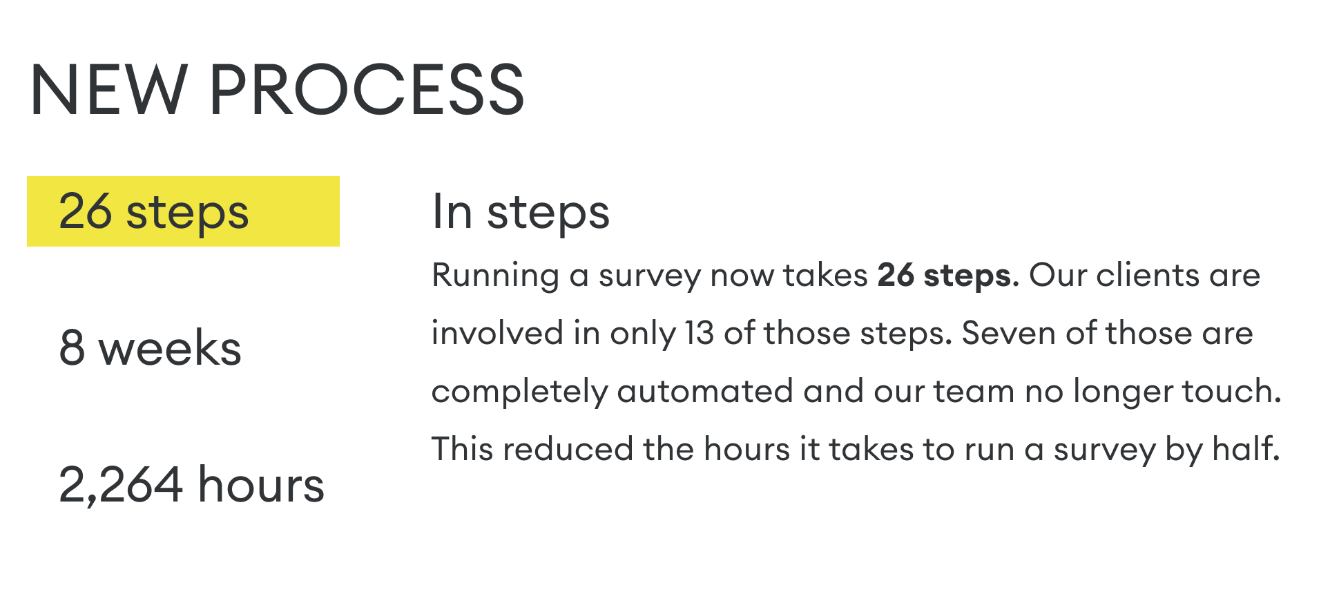
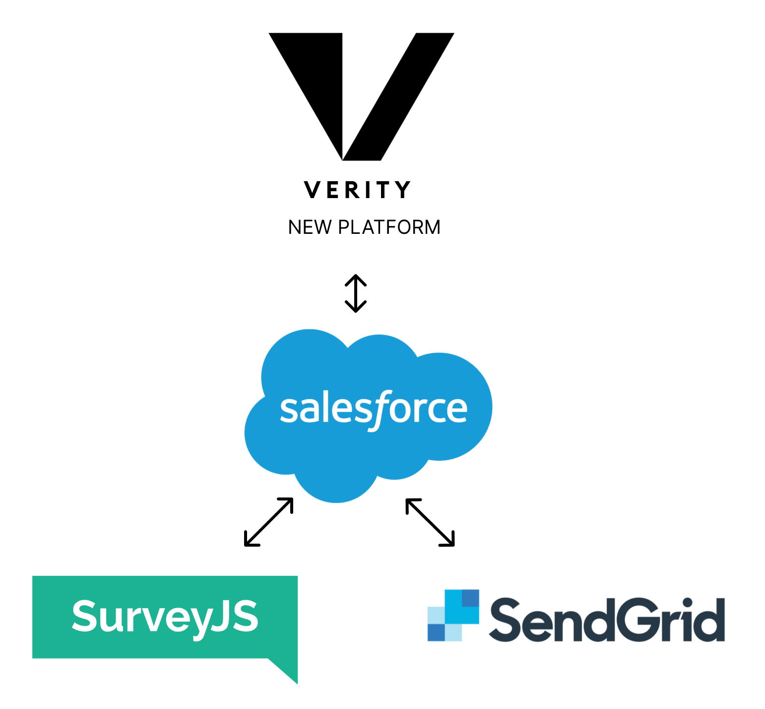
We urgently needed to automate and streamline our processes. This led to a major digital transformation, which was accompanied by a complete tech restructure and rebranding. This allowed me to rethink every aspect of the business, leading to the design of a new SaaS product, service, and customer experience. Though it was a significant undertaking, it allowed the company to modernise and scale effectively.

The Service Blueprint
Workshops / Miro / Survey / Internal stakeholders
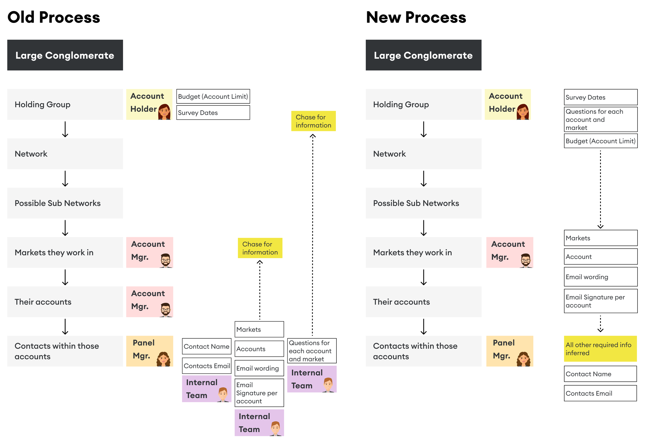
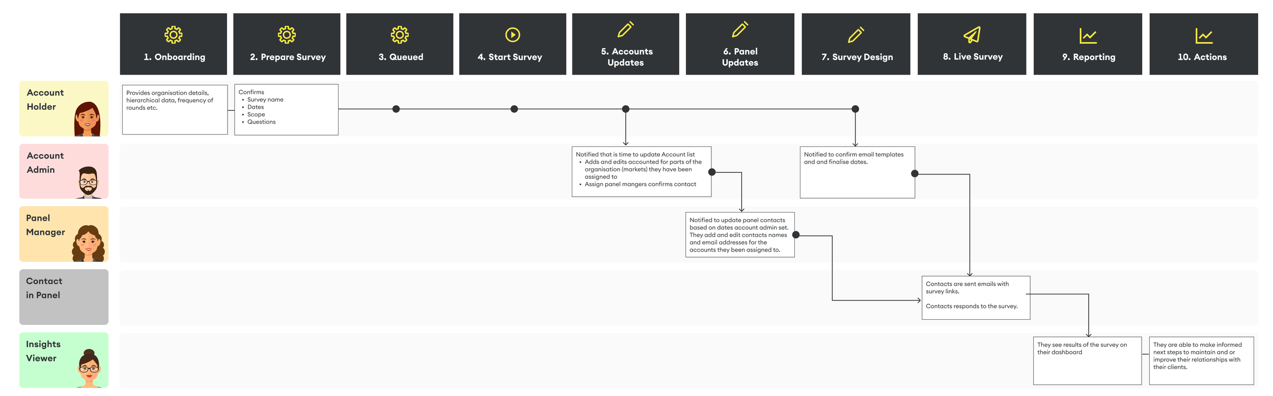
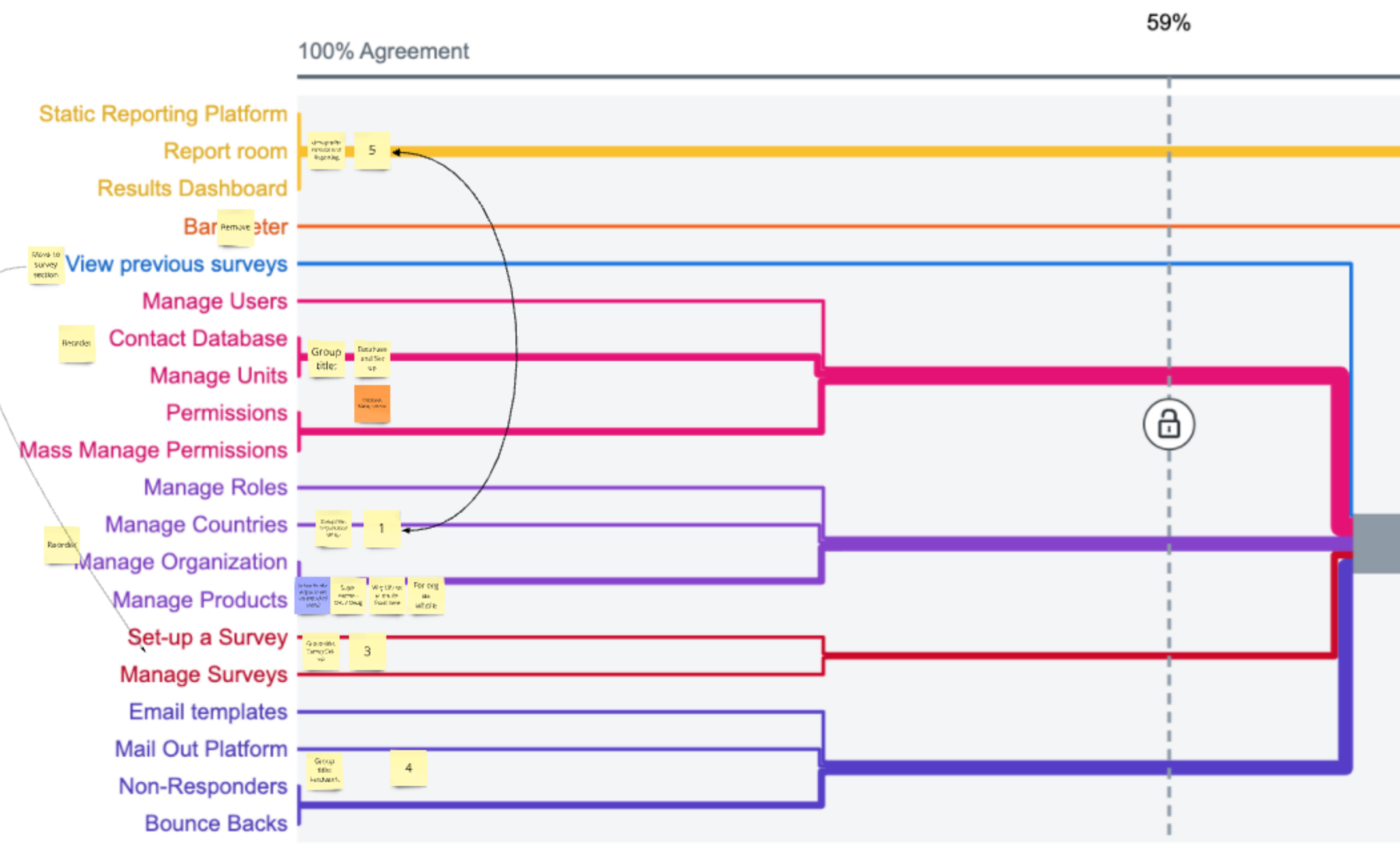
At the very beginning of my time at the company, I worked closely with our internal team to understand the entire process of running a survey from start to finish, at every level. This effort resulted in a detailed Service Blueprint.
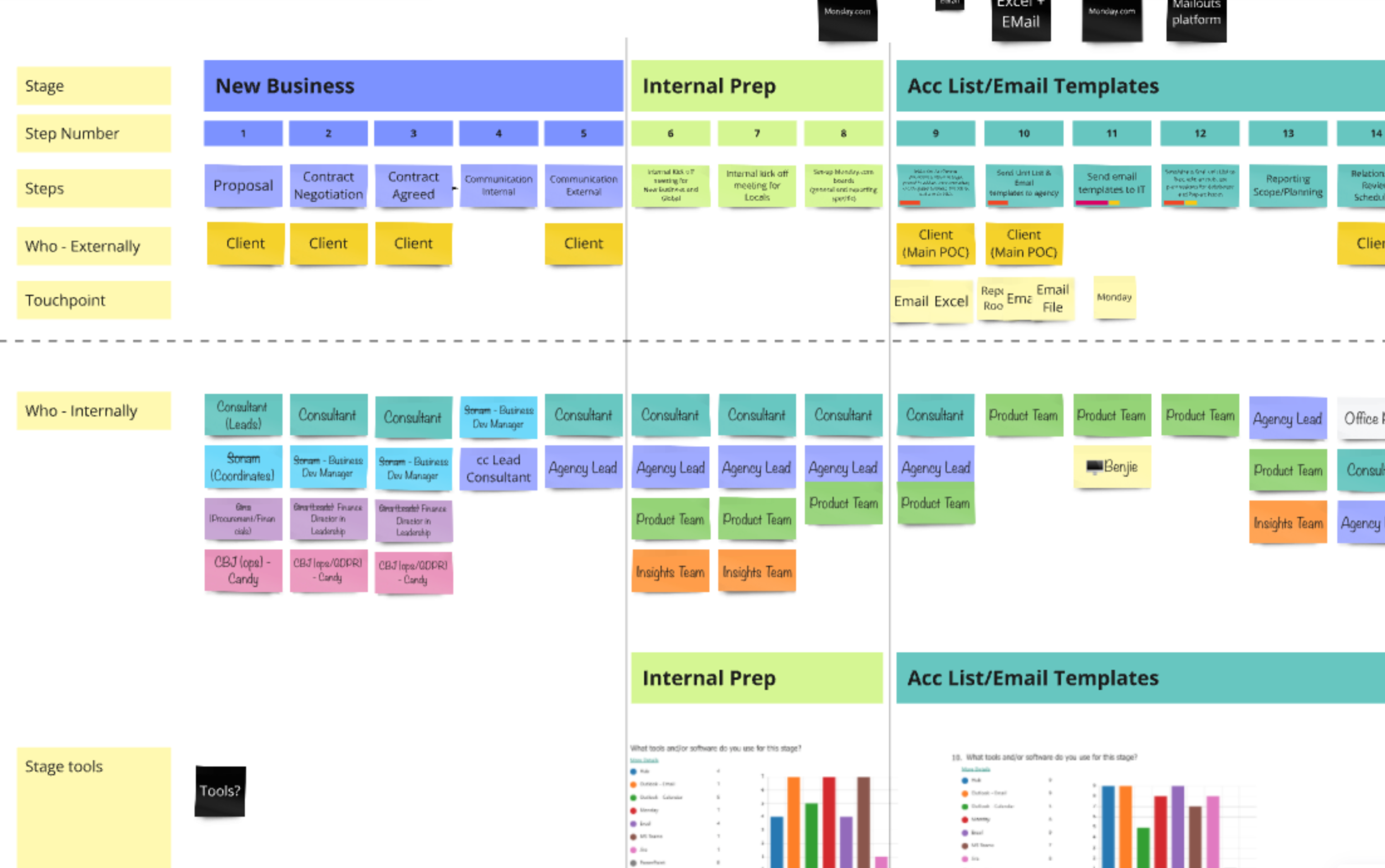
The process helped me deeply understand how the business operated, where the biggest opportunities for improvement were, what data needed to be collected and when, and who our key users were.
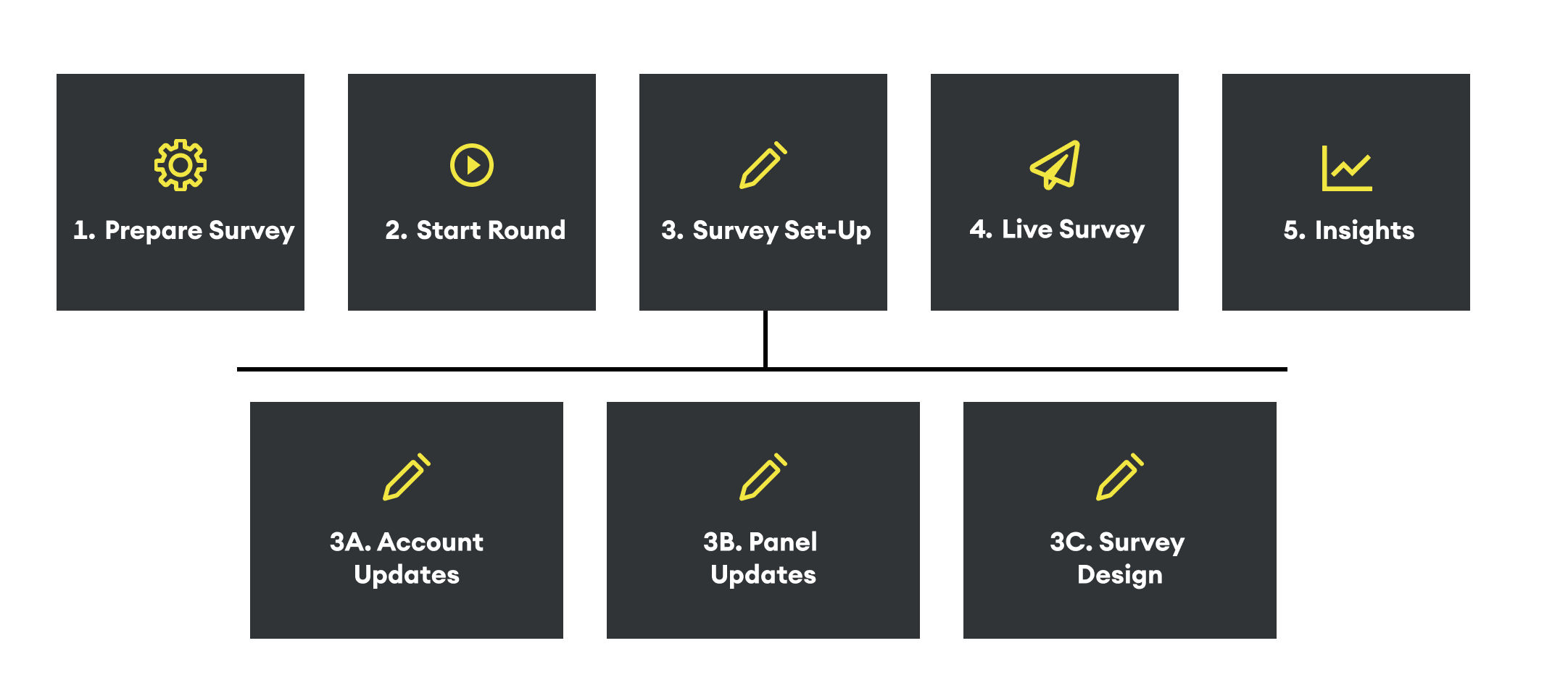
New high-level customer journey
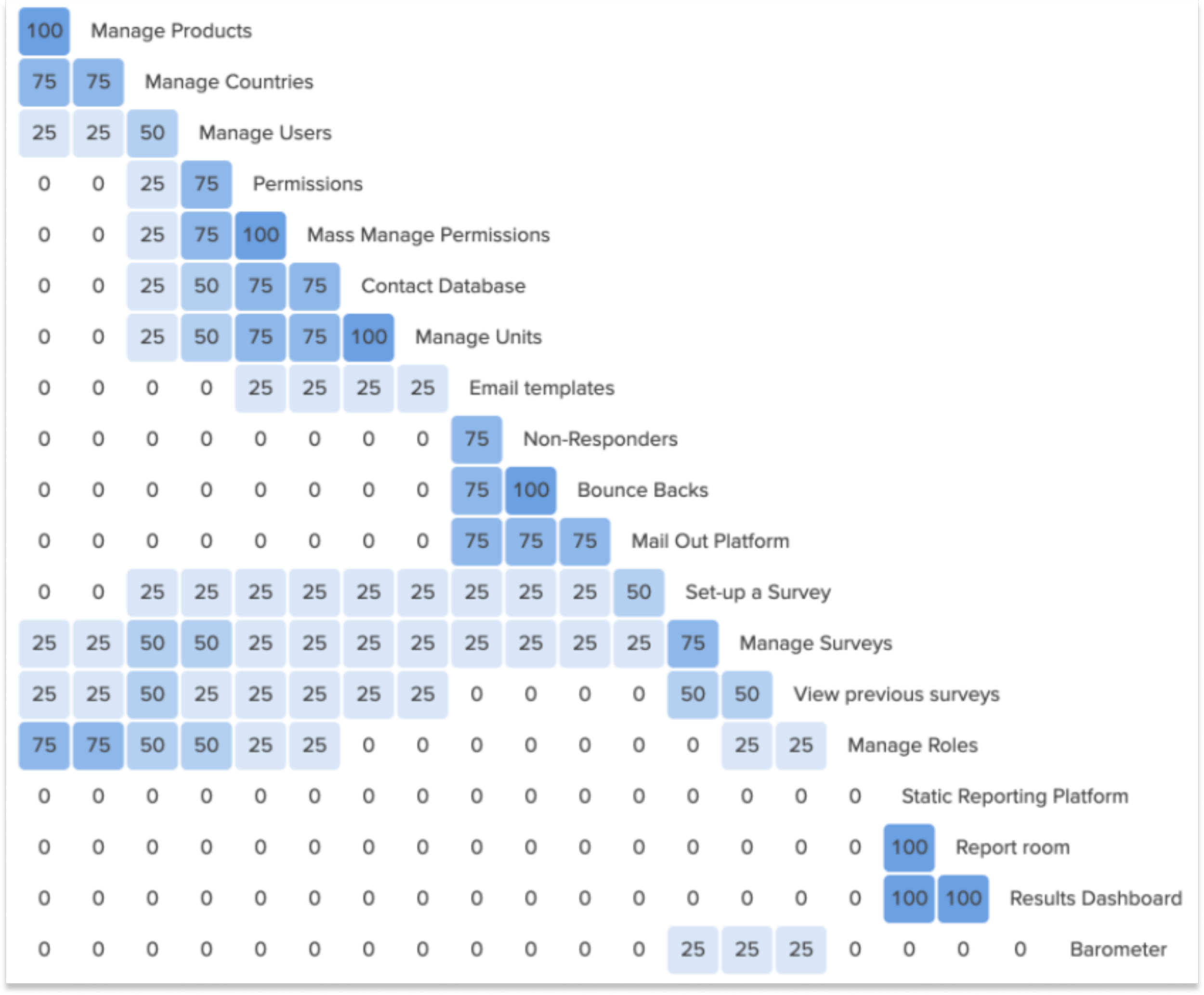
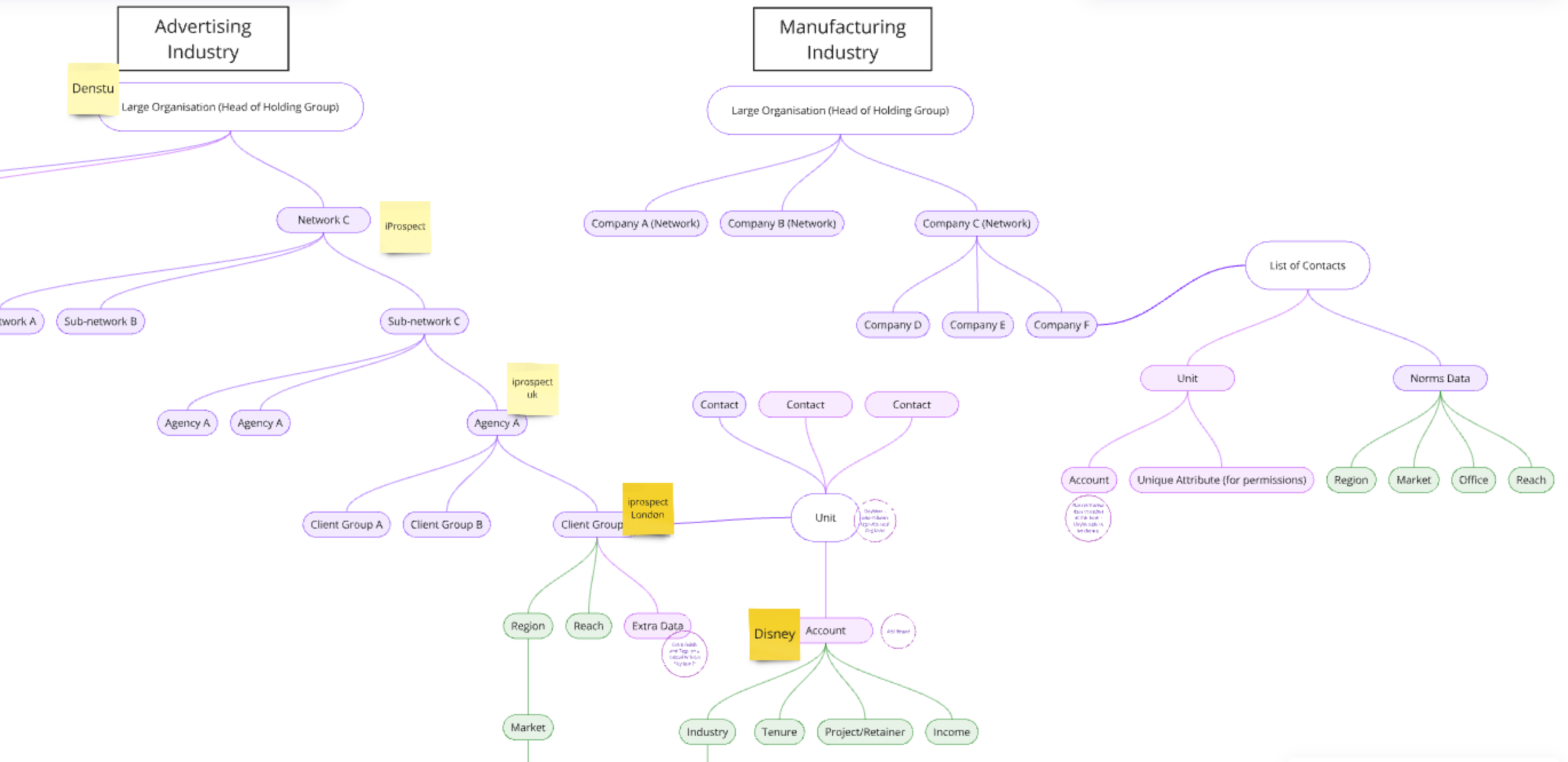
Complex Users
Identifying Our Users’ Roles and Permissions for any size organisation
Workshops / User interviews / Data analysis team
Rules:
By mapping out the service blueprint and holding internal interviews, I gained a clear understanding of who we needed to contact.
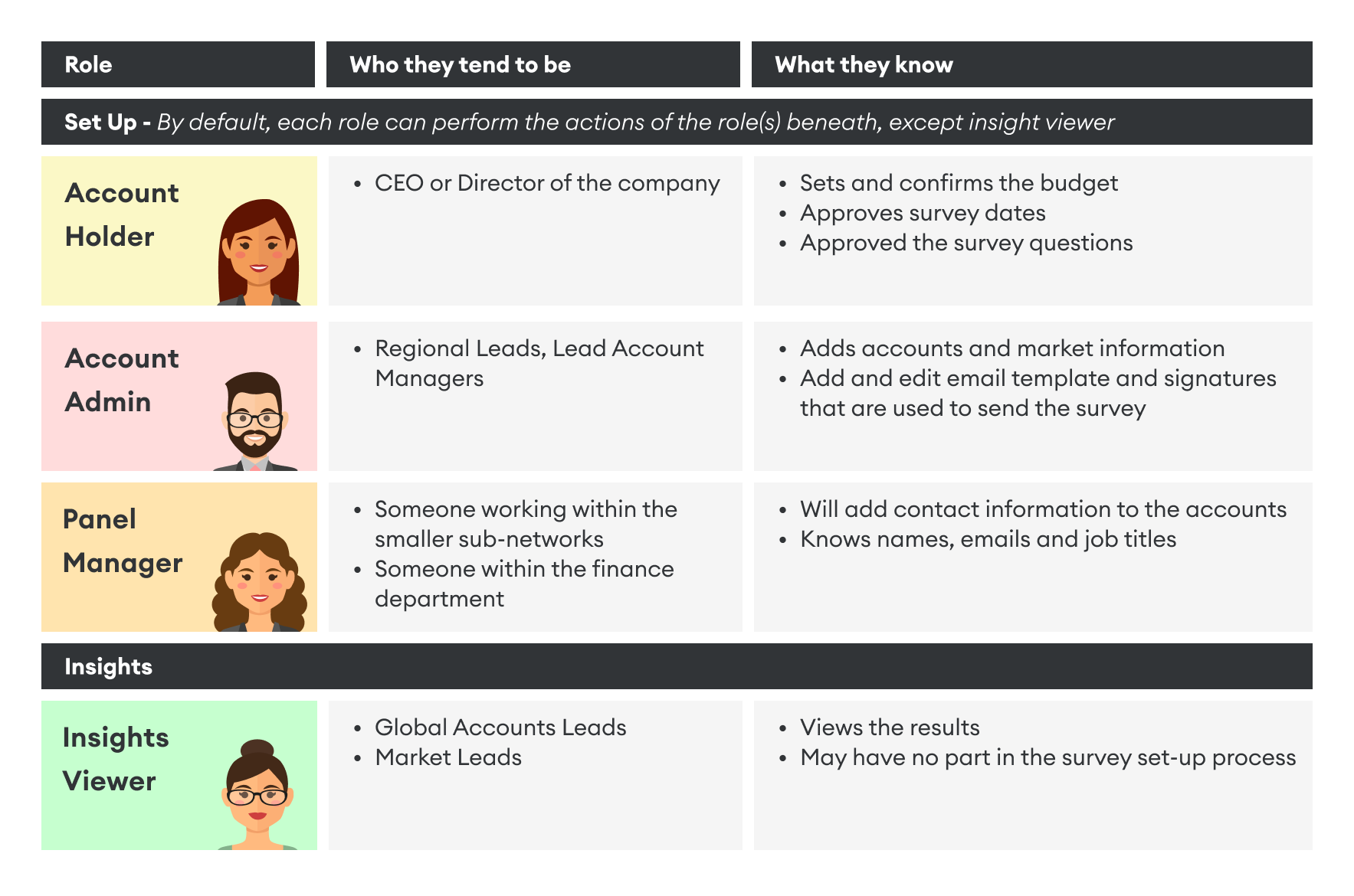
Permissions:
Challenge: Granting users access to the dashboard on the new platform needed to be precise, as the survey results were highly confidential.
Solution: By collaborating with our data analysis team, we shifted from a flat data structure to a hierarchical one.
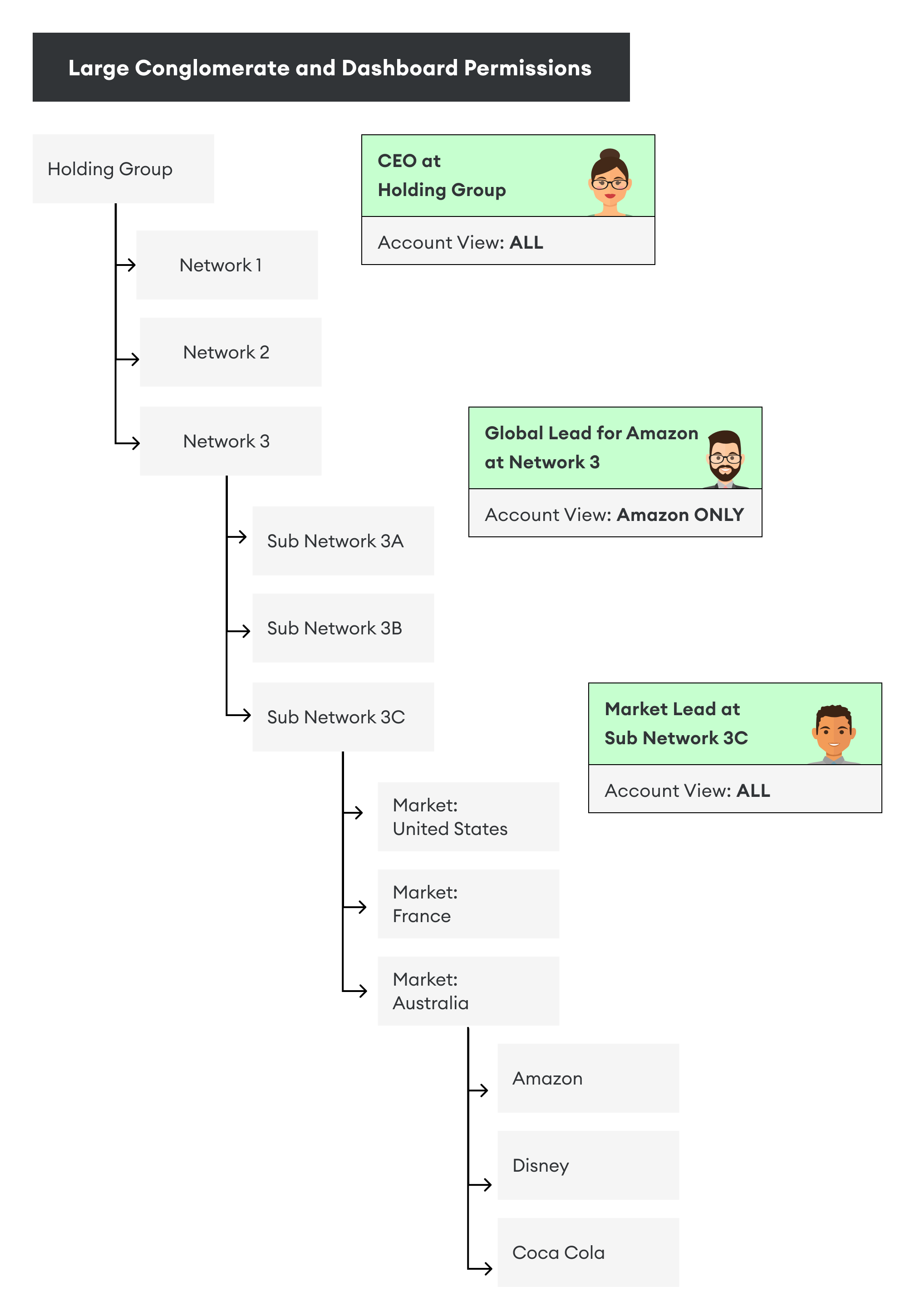
Flexible organisation structure
This led to the development of a "top-down vs. bottom-up" approach for gathering the necessary data.
With that, the customer journey started to take shape.
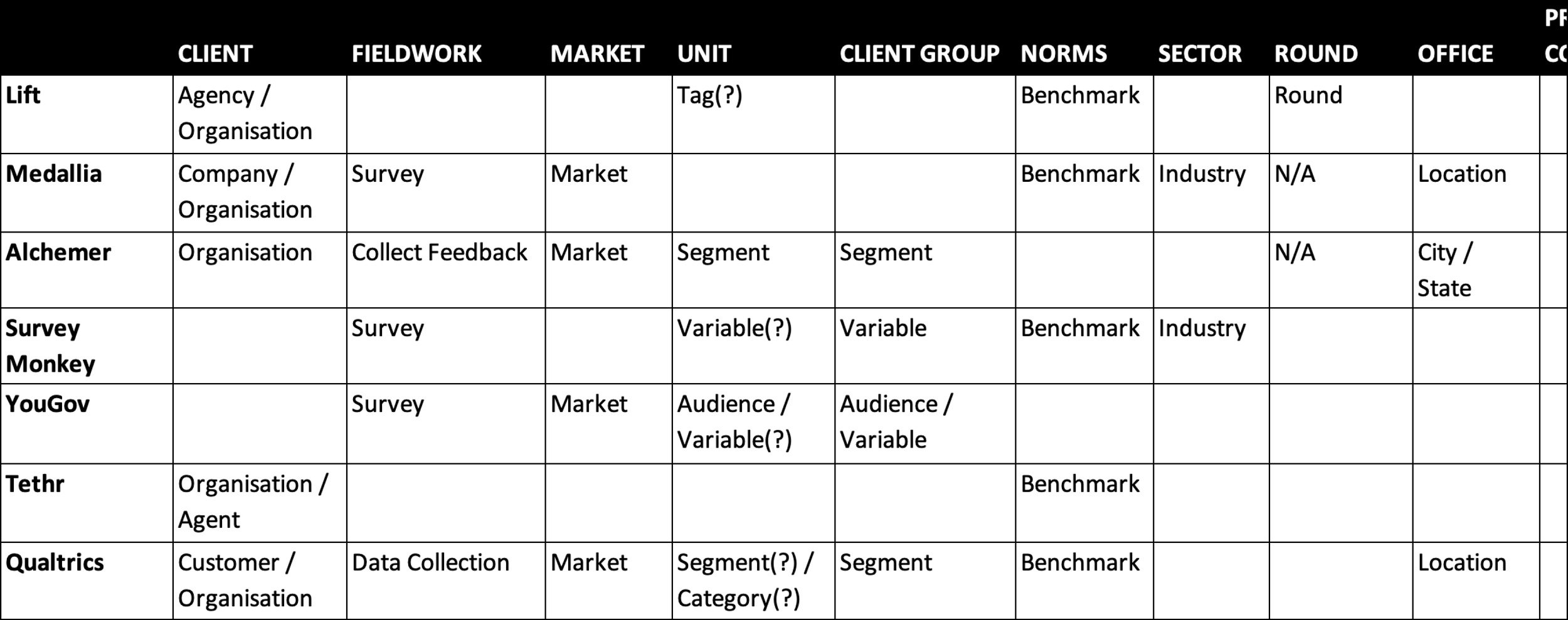
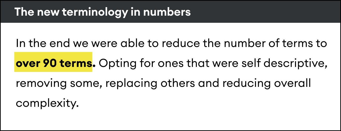
Terminology
A Quest for Stakeholder Buy-In
Survey / Competitor Analysis
Challenge: Since there was no single, standardised way of doing things, multiple terms existed for the same concept, and stakeholders were passionate about the ones they used.
Internal Survey : To address this, my team first had to help stakeholders understand the problem.
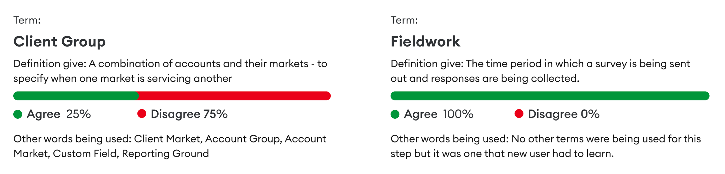
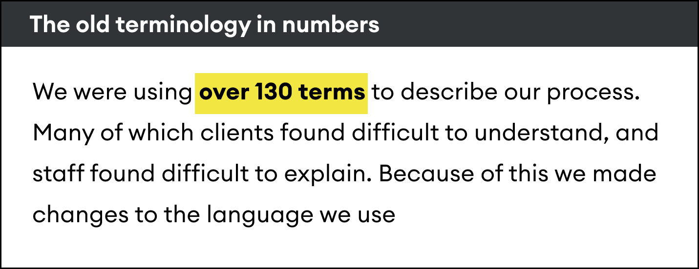
By presenting these results, it became easier to convey the problem. If we couldn’t define these terms internally, how could we expect our users to? Most of these terms were only being used internally, but as we transitioned to a client-facing platform, this needed to change.
Competitor Analysis
Next, we examined how our competitors labelled similar concepts. We also looked at companies outside of our direct competition but who also distributed surveys.
Policy Change
We then presented our findings and recommendations to the board for sign-off. This was important for gaining the rest of the company’s support.
Information Architecture
Laying the Foundation of the New Platform’s Navigation
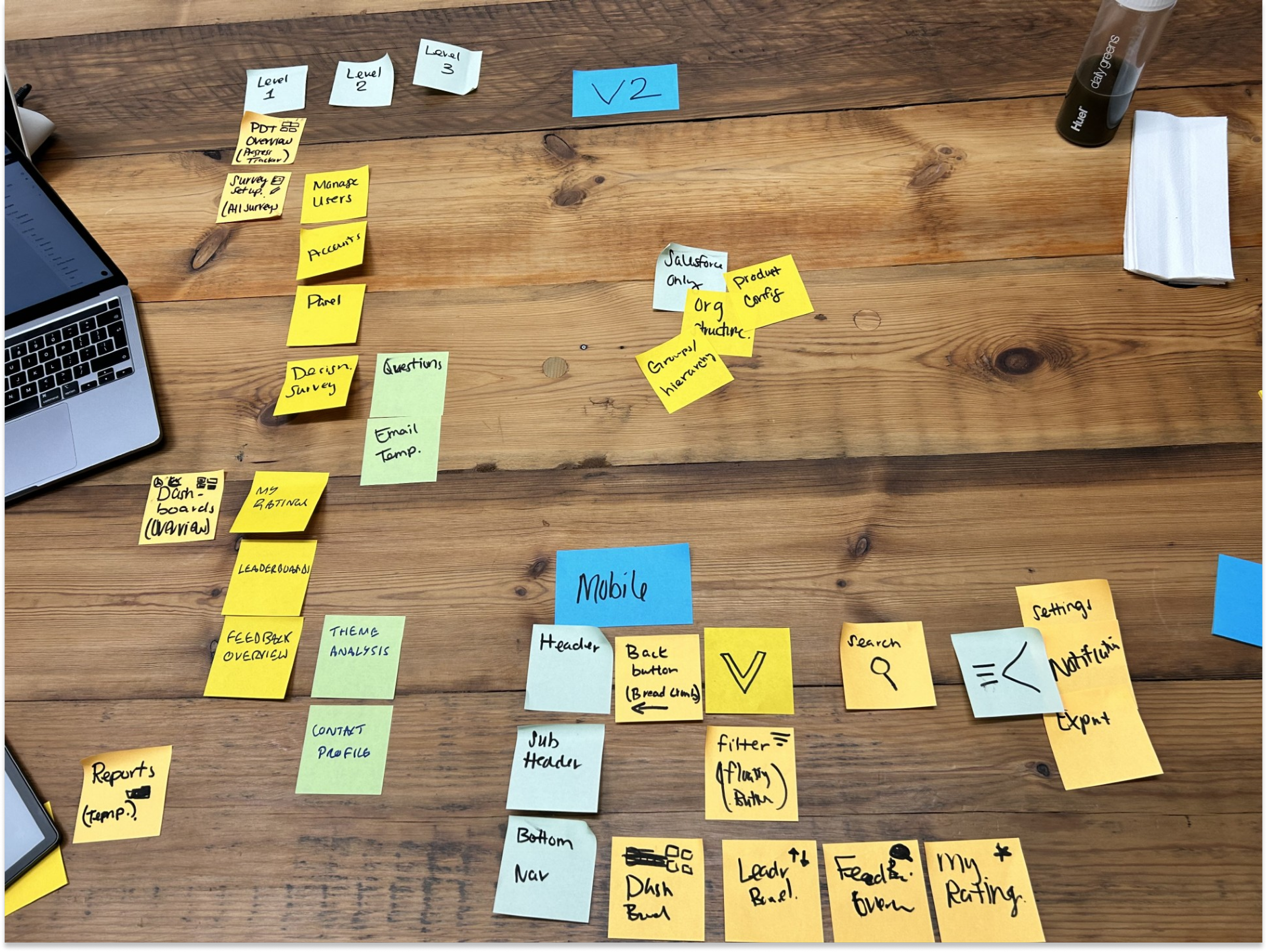
Card Sorting / Tree Testing / Optimal Workshop
The new platform would consist of two main components:
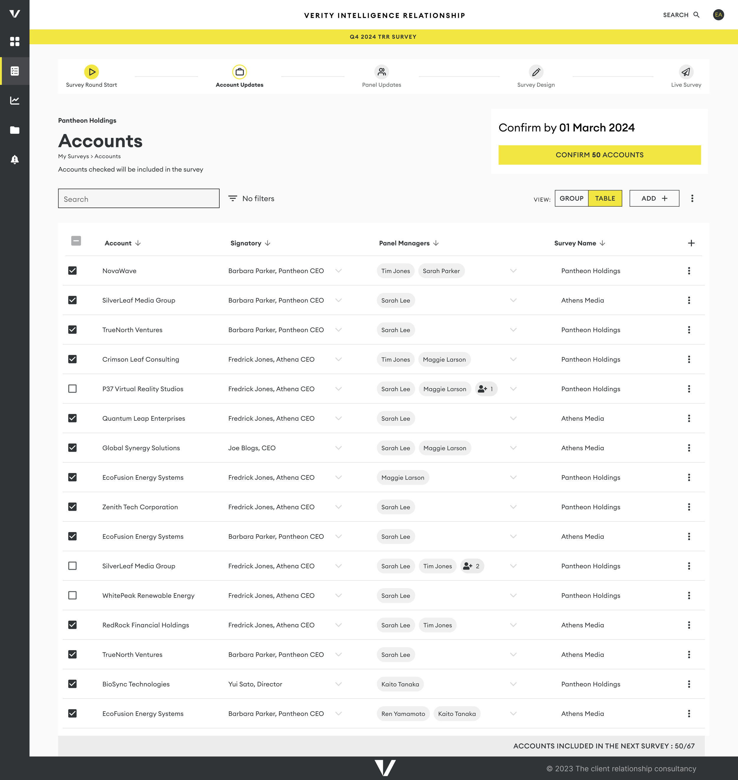
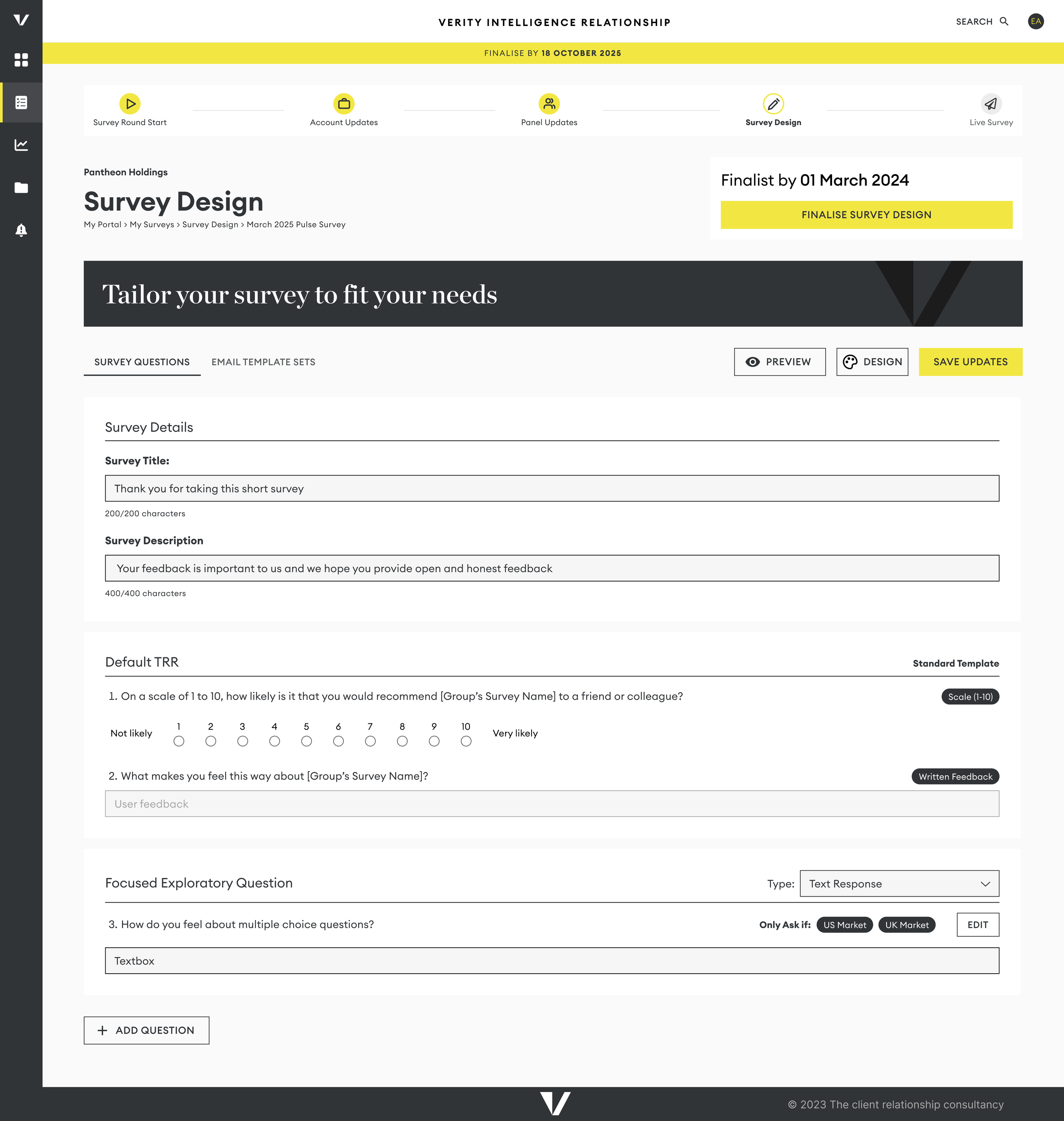
Survey Setup: A section where users can easily update all necessary information to send out surveys.
Dashboards: Interactive views displaying survey results, along with tools to assist users in managing their relationships.
Card Sorting Exercise and Tree Testing
To validate this hypothesis, I conducted card-sorting exercises and tree tests with 17 users. This method helped us structure content and features in a way that made sense for a seamless navigation experience.
Confirming Informaiton Atchetiure
This resulted in creating a shallow 3 level information architecture.
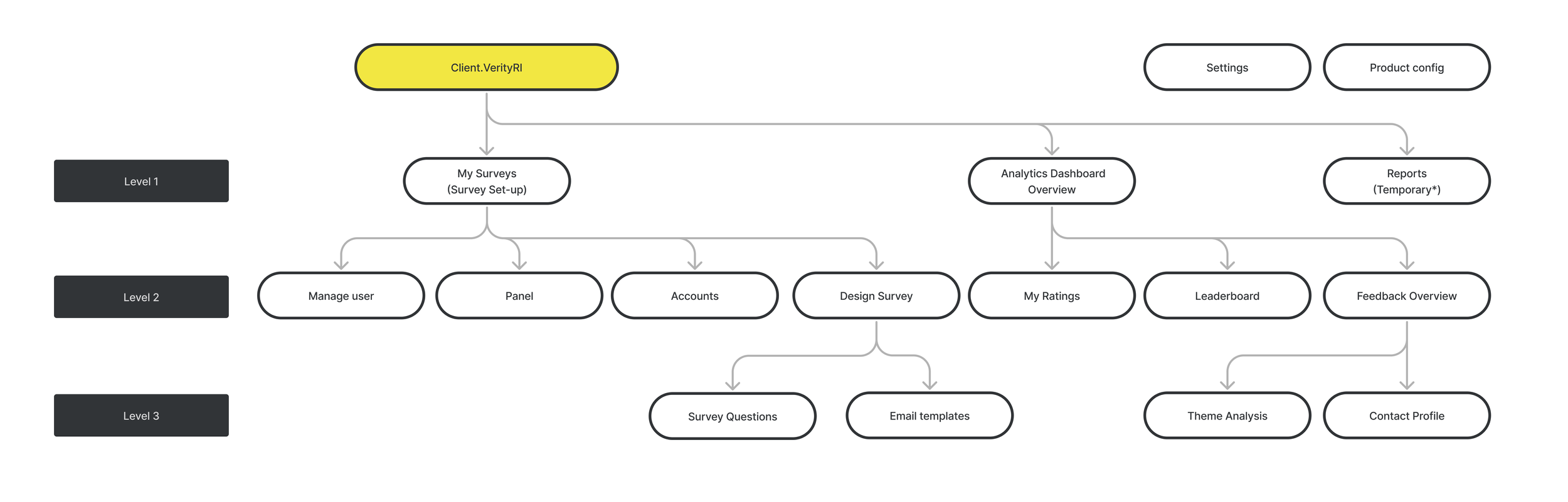
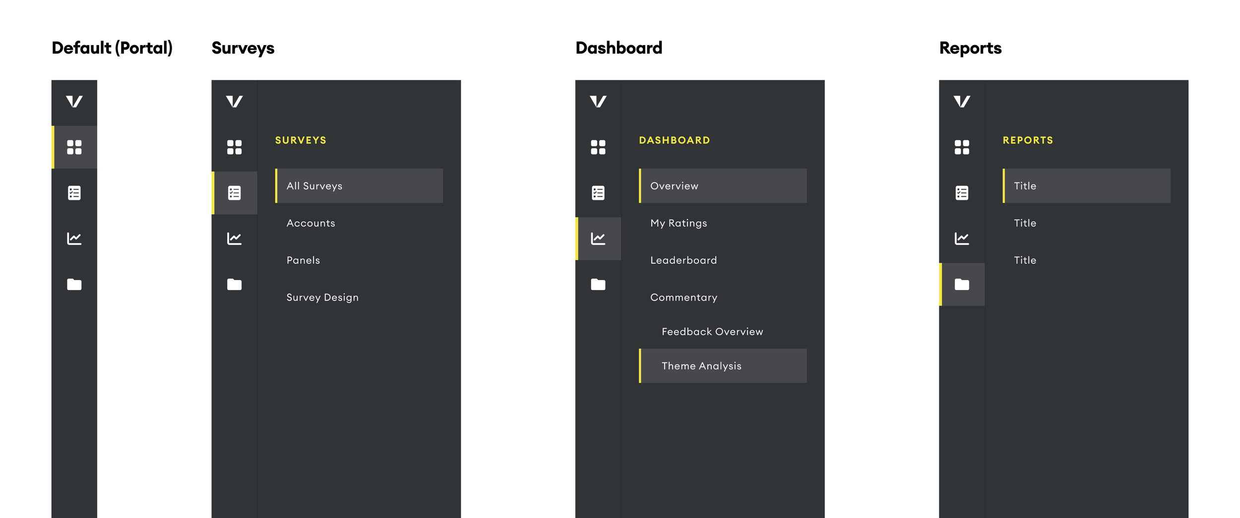
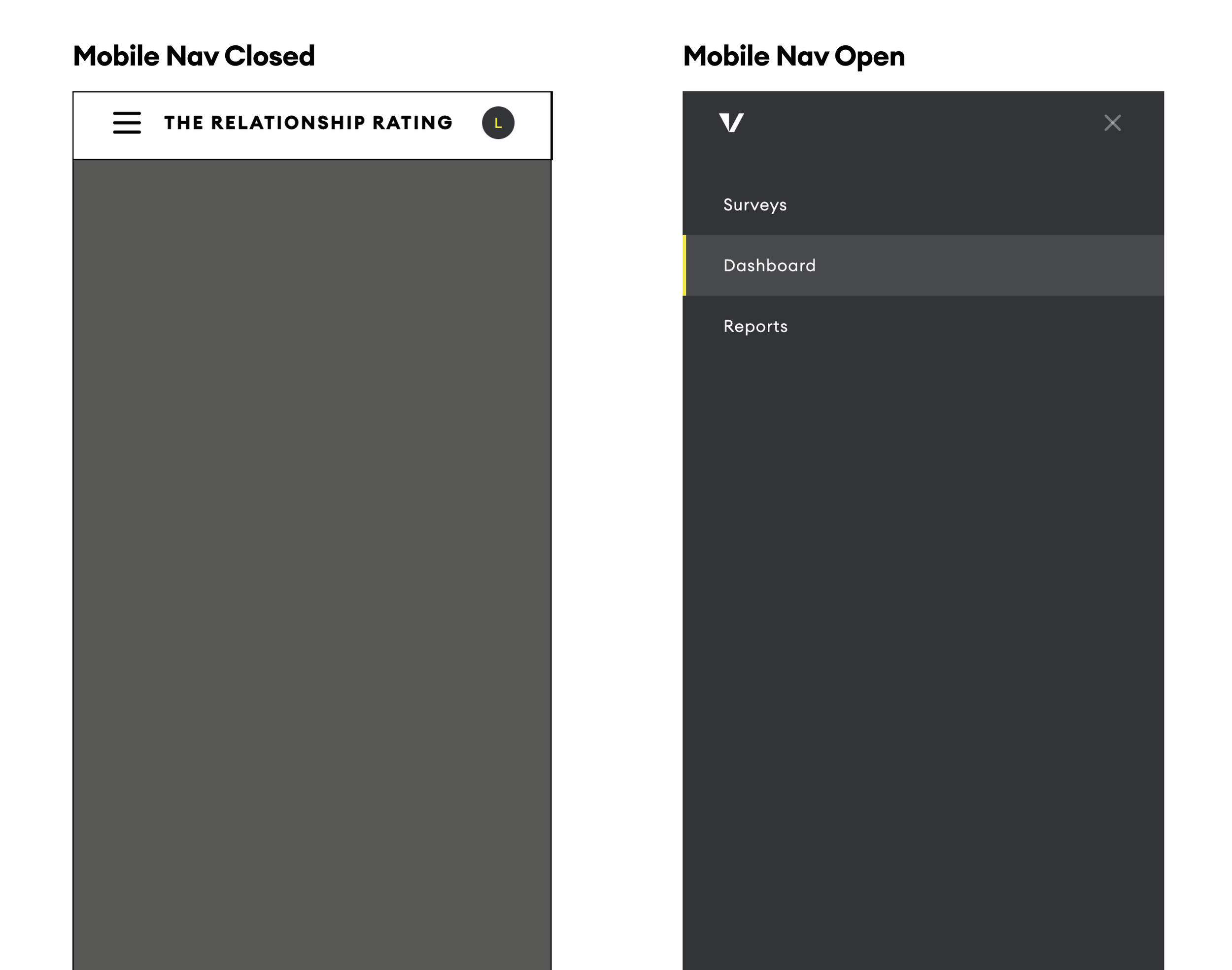
Designing the Navigation
By establishing a clear information architecture we laid the groundwork for a platform and were able to confidently design the navigation of the platform.
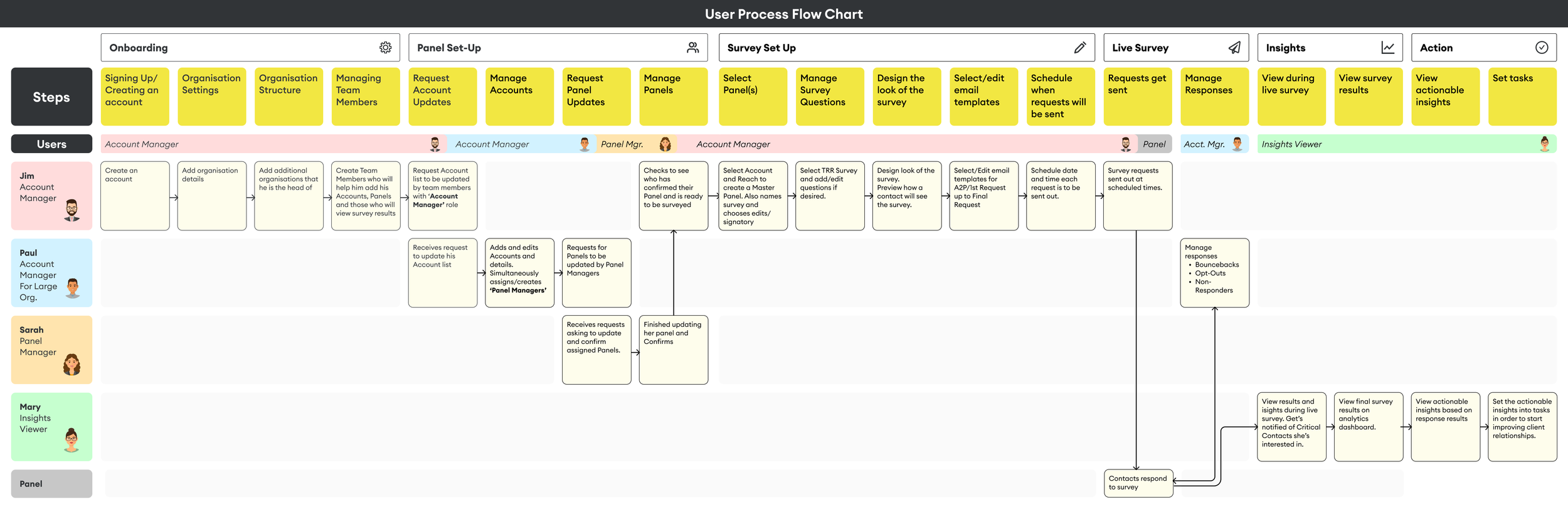
Designing The Platform
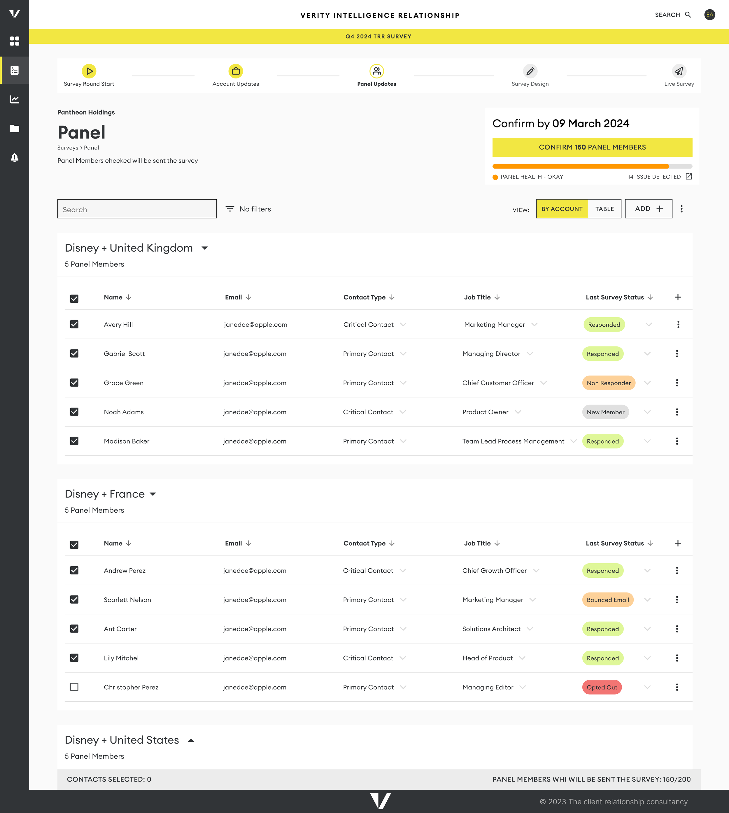
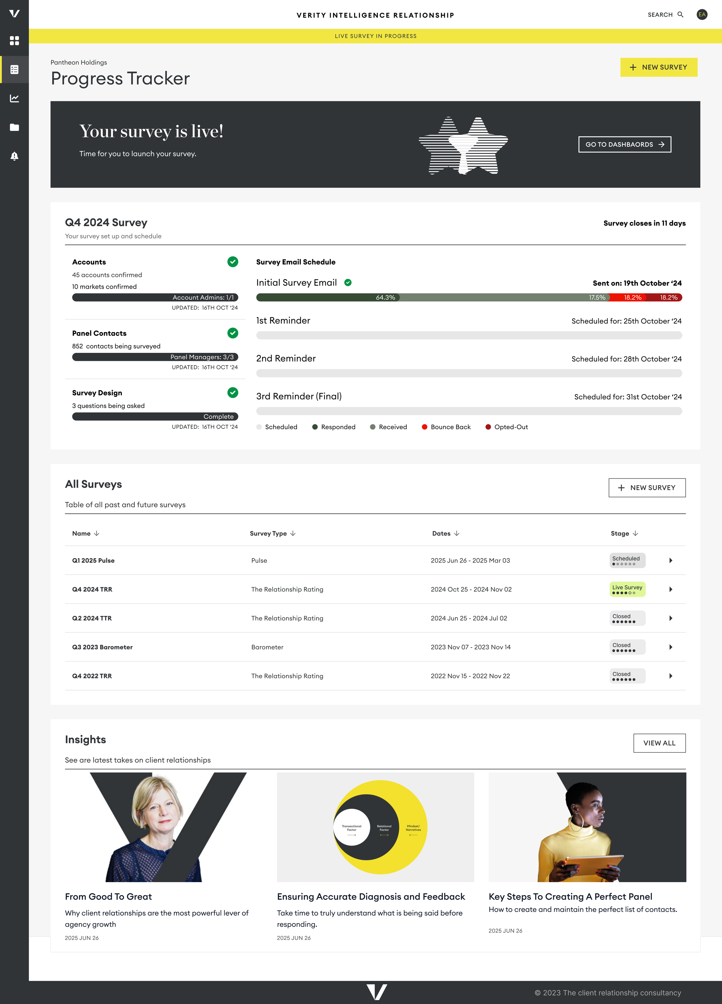
Designing the survey setup experience in the new platform
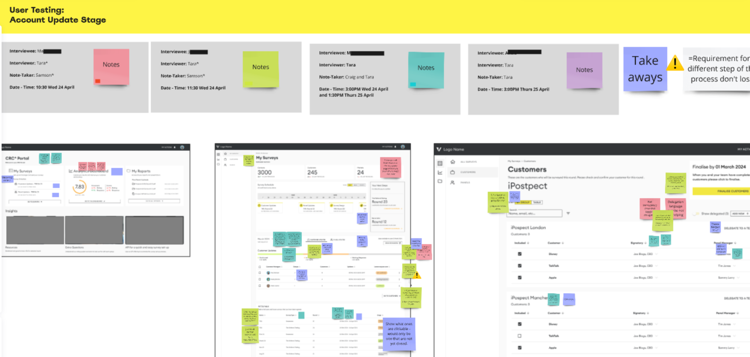
User Testing / Survey / Prototyping / Figma
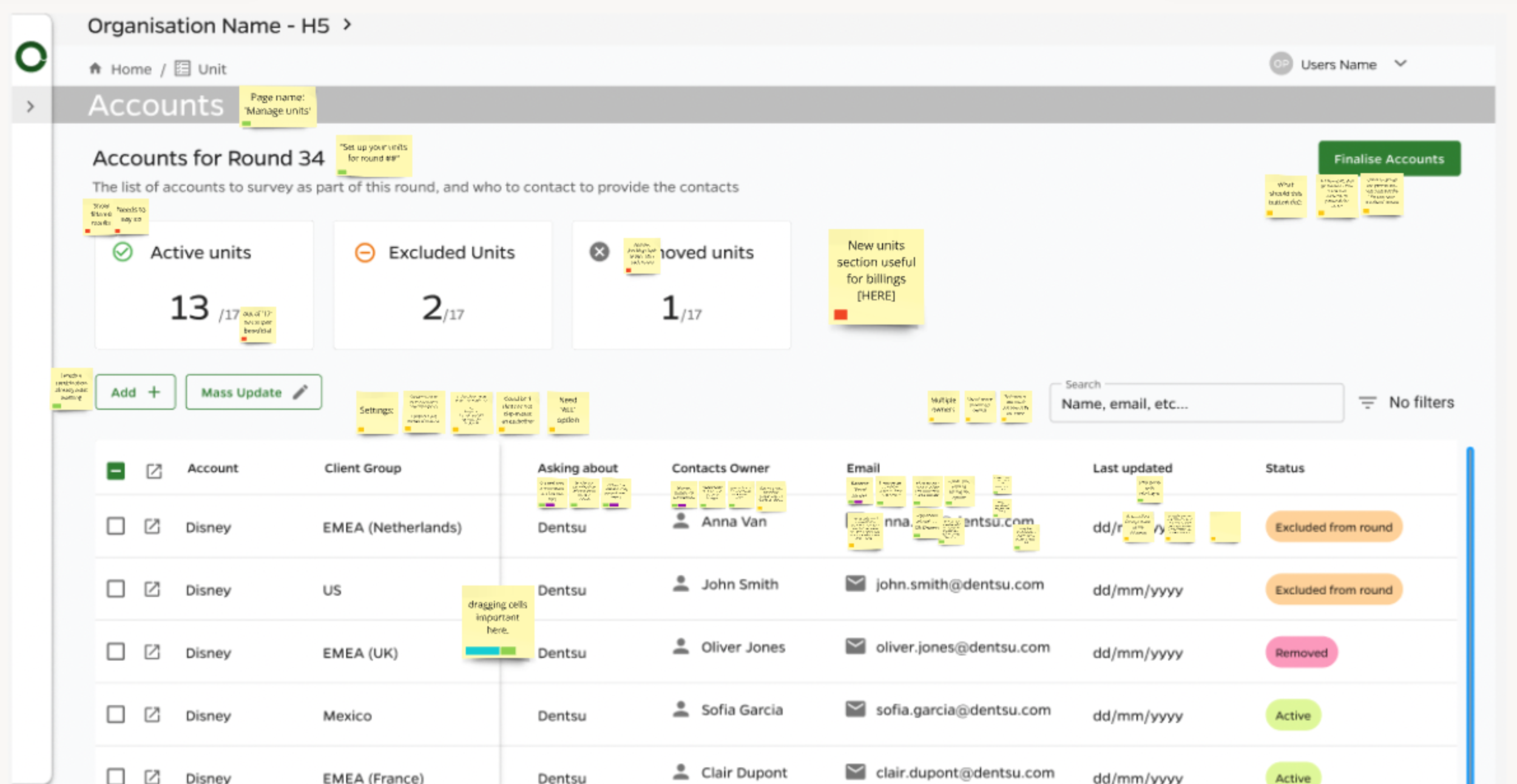
Survey setup experience in our new platform
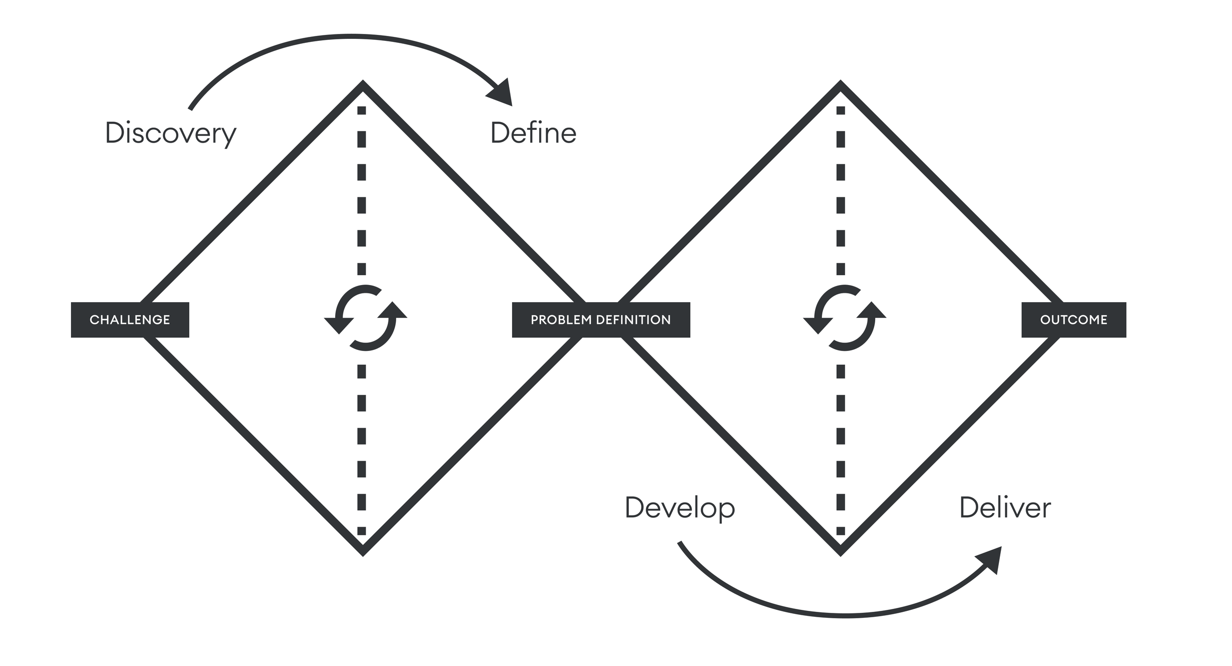
Discovery
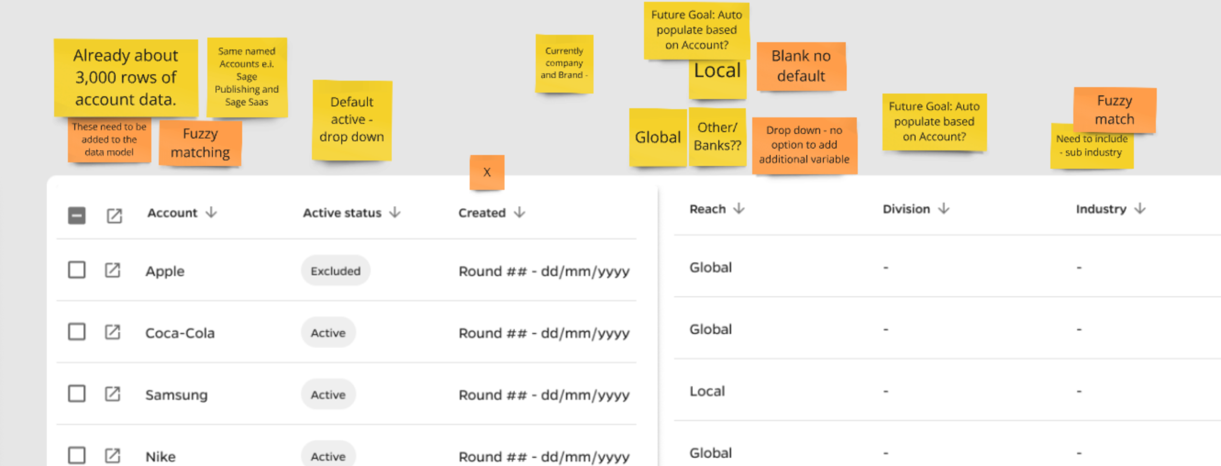
Collaboration with our data analytics team to protect data integrity
This reduction in data entry not only improved accuracy but also contributed to a better overall user experience, as it streamlined the process and made it more intuitive.
Develop We generated a list of desired features, including mass updating, fuzzy matching, and auto-save functionality. For each column and field type, we evaluated options, ensuring that limited option dropdown lists were utilized where appropriate. When we could infer information, we did so to streamline the user experience.
Delivery
I began the design process with paper sketches for early wireframes, then transitioned to low-fidelity for user testing and finally high-fidelity prototypes.
Wireframes of some of the Survey Set-up Pages
Learning
Building a well-structured design system with reusable components would have streamlined the workflow.
Clear onboarding comms and guides were key for a product like this
Collaboration with developers helped us understand what the MVP will be
What came next
This project positioned us to leverage AI for reporting and streamline survey setup via API integrations.
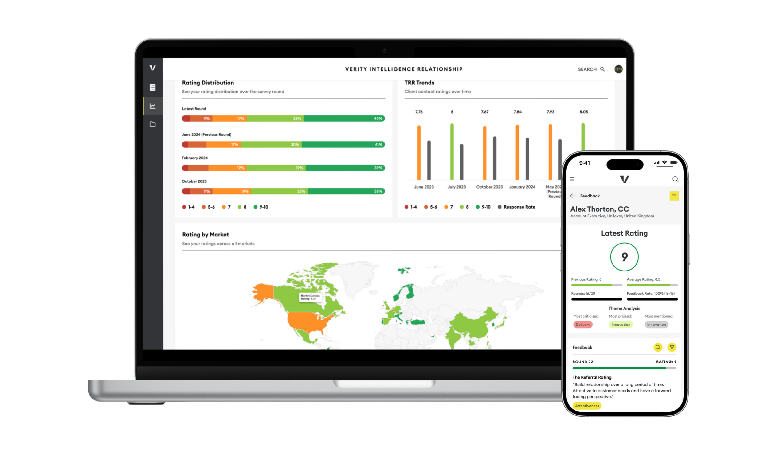
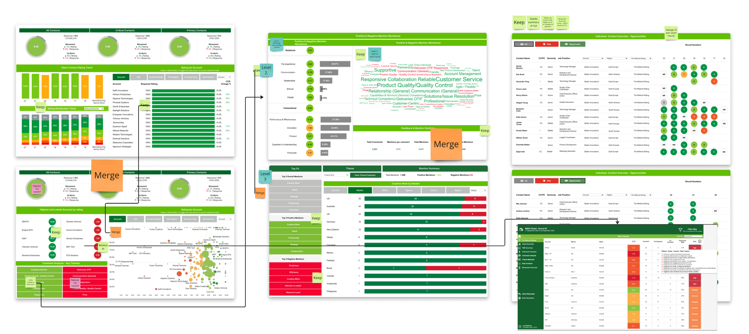
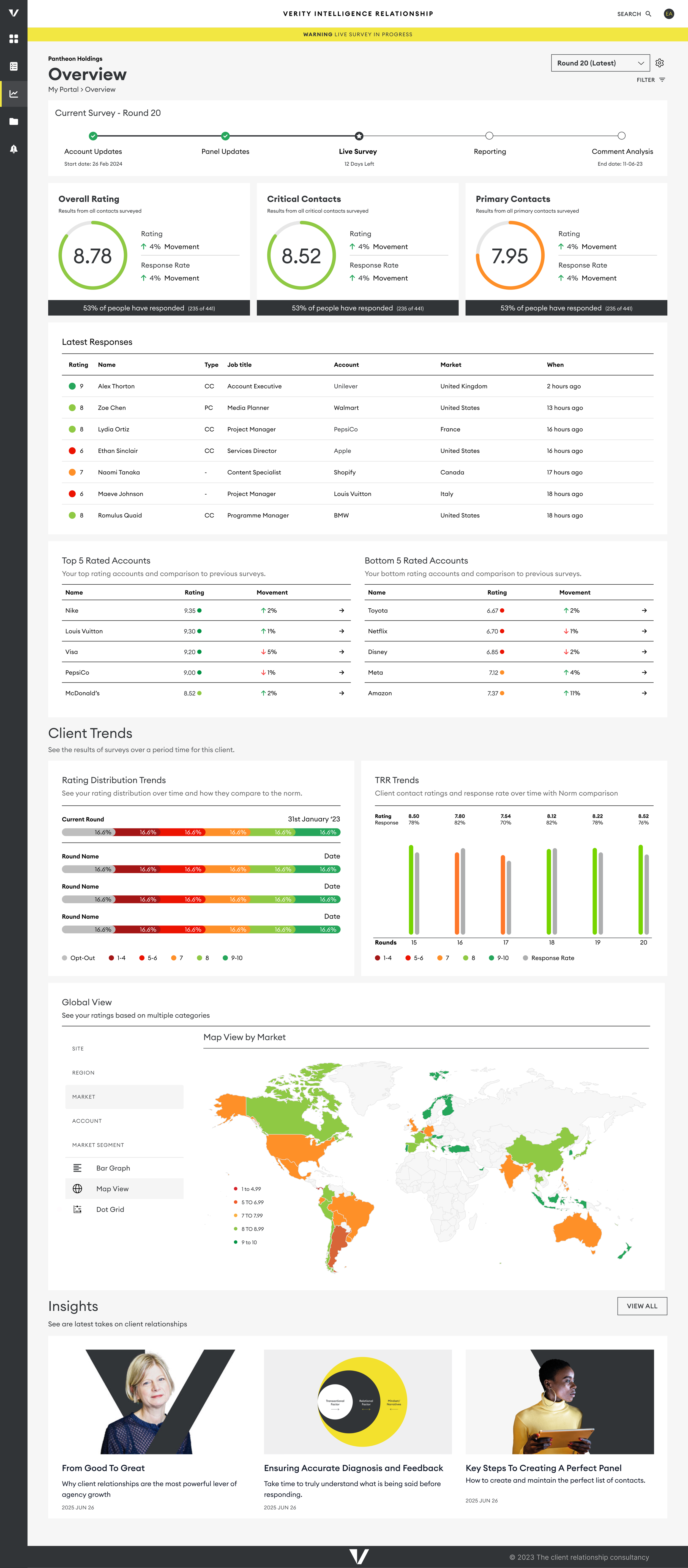
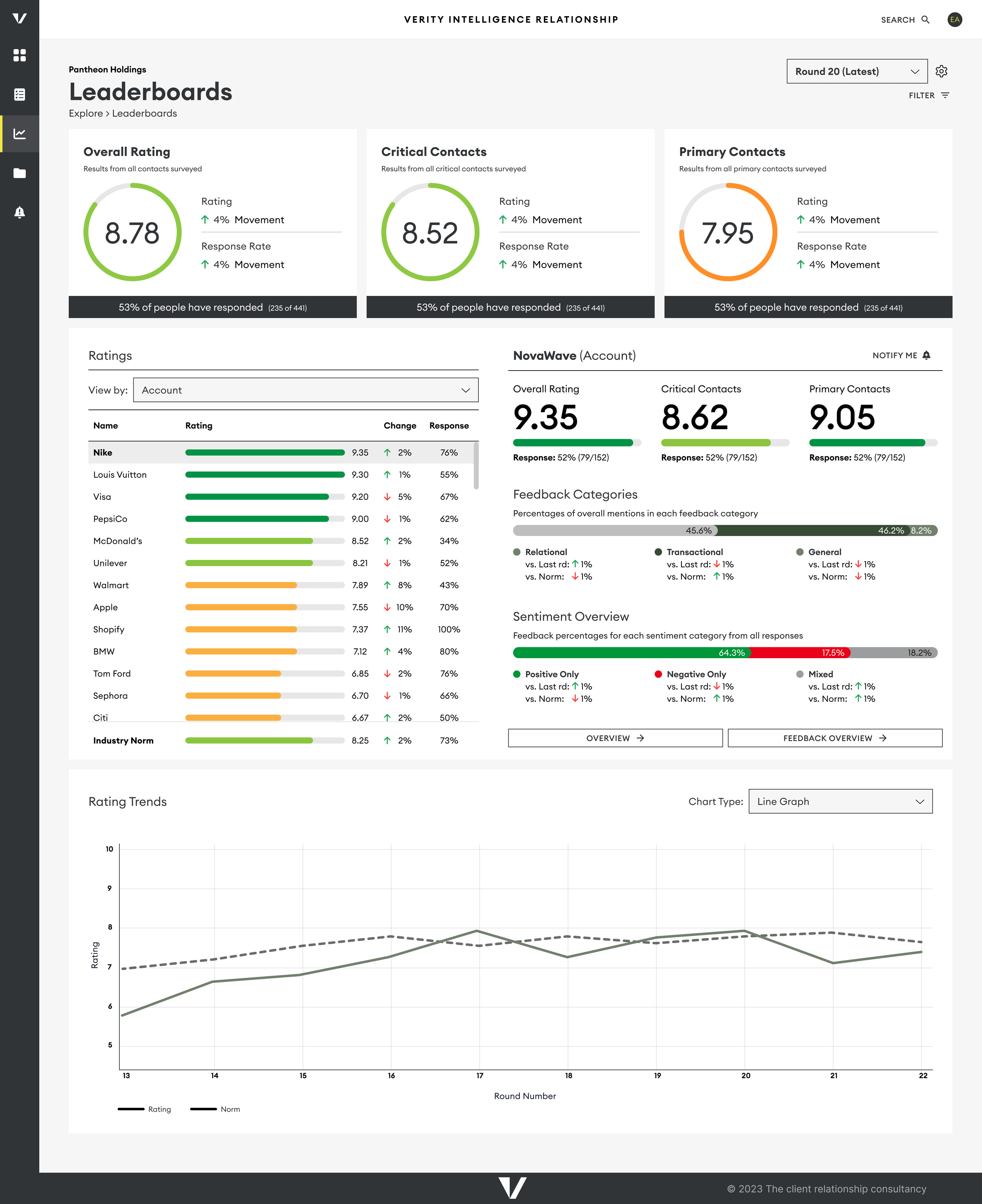
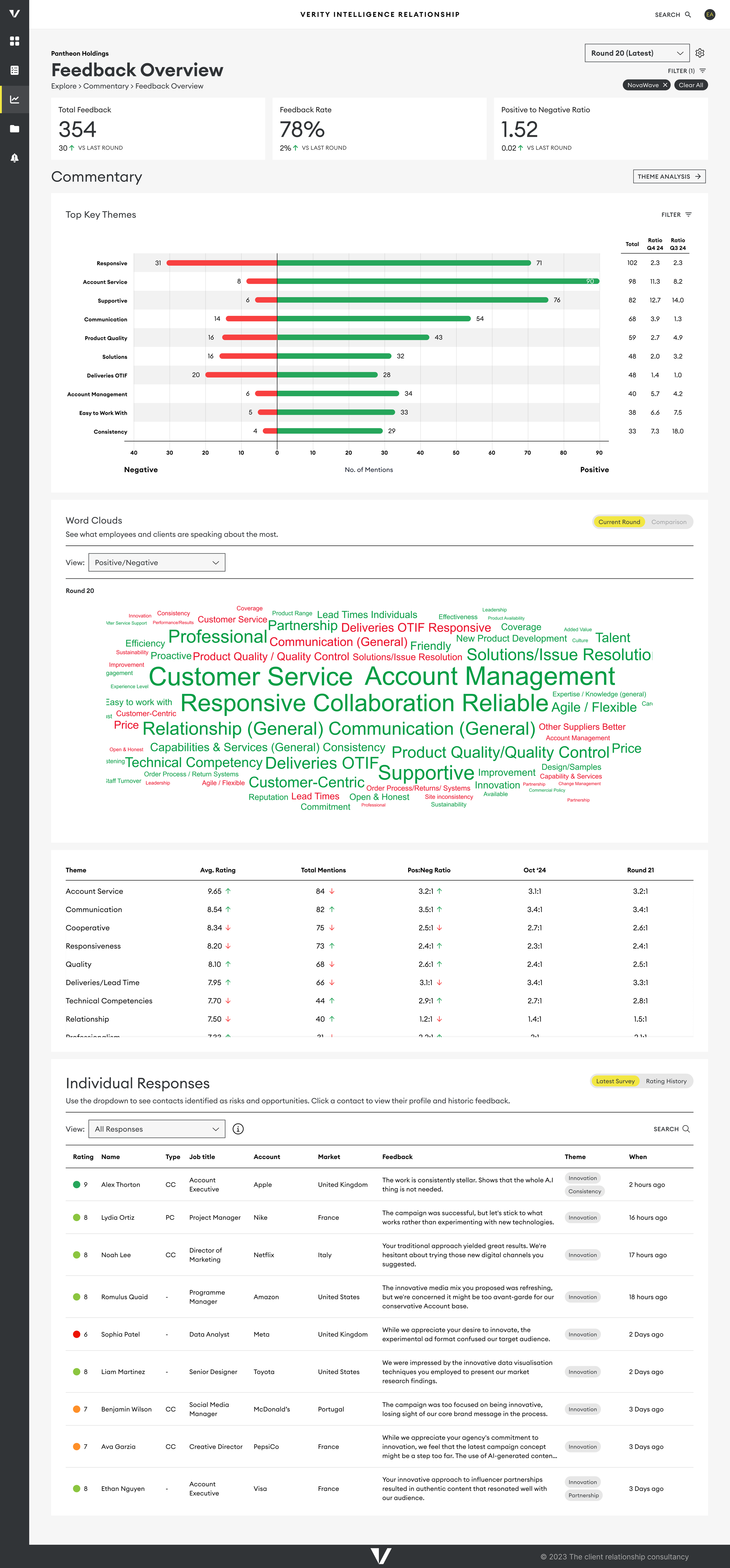
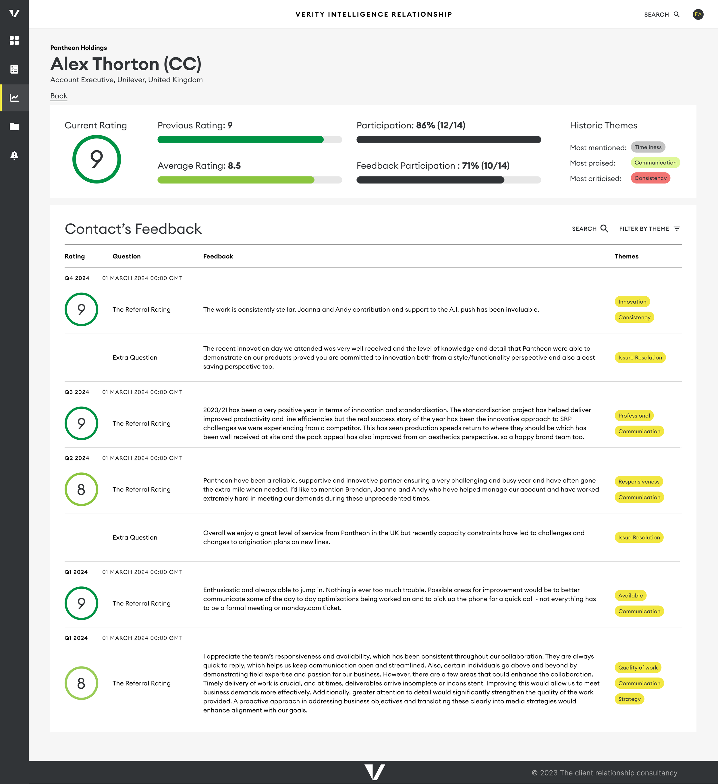
Designing the Dashboard
Designing the different dashboard views that show our users the results of their surveys.
User Testing / Prototyping / Figma
The Challenge
Our existing dashboard was cumbersome, built through a lengthy development process that involved creating customized solutions and stitching them together with tabs. This resulted in a disjointed user experience, with multiple sections showing similar results but causing confusion.
The Solution
Design an analytics dashboard that clearly guided users through their survey results that meets various personas’s needs
Audit of Current Material
Understanding User Needs Journeys
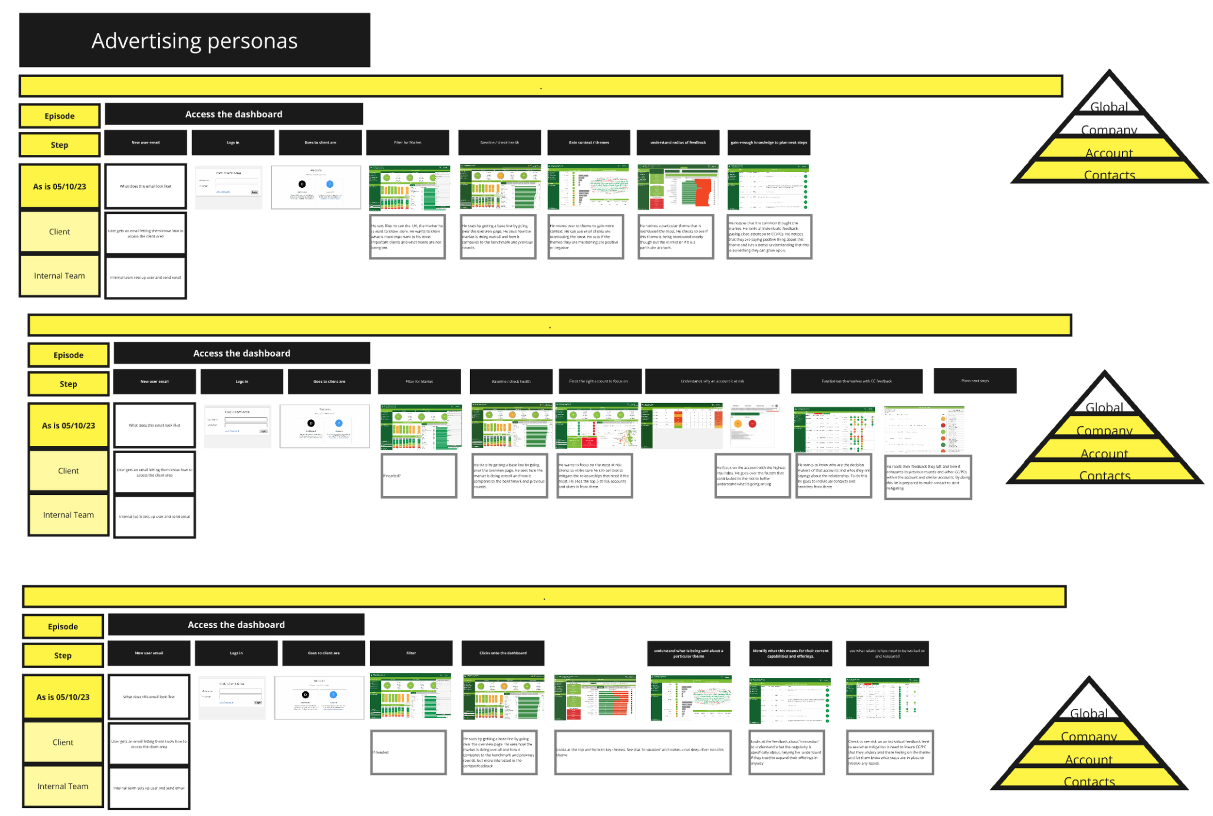
Mapping out Journeys
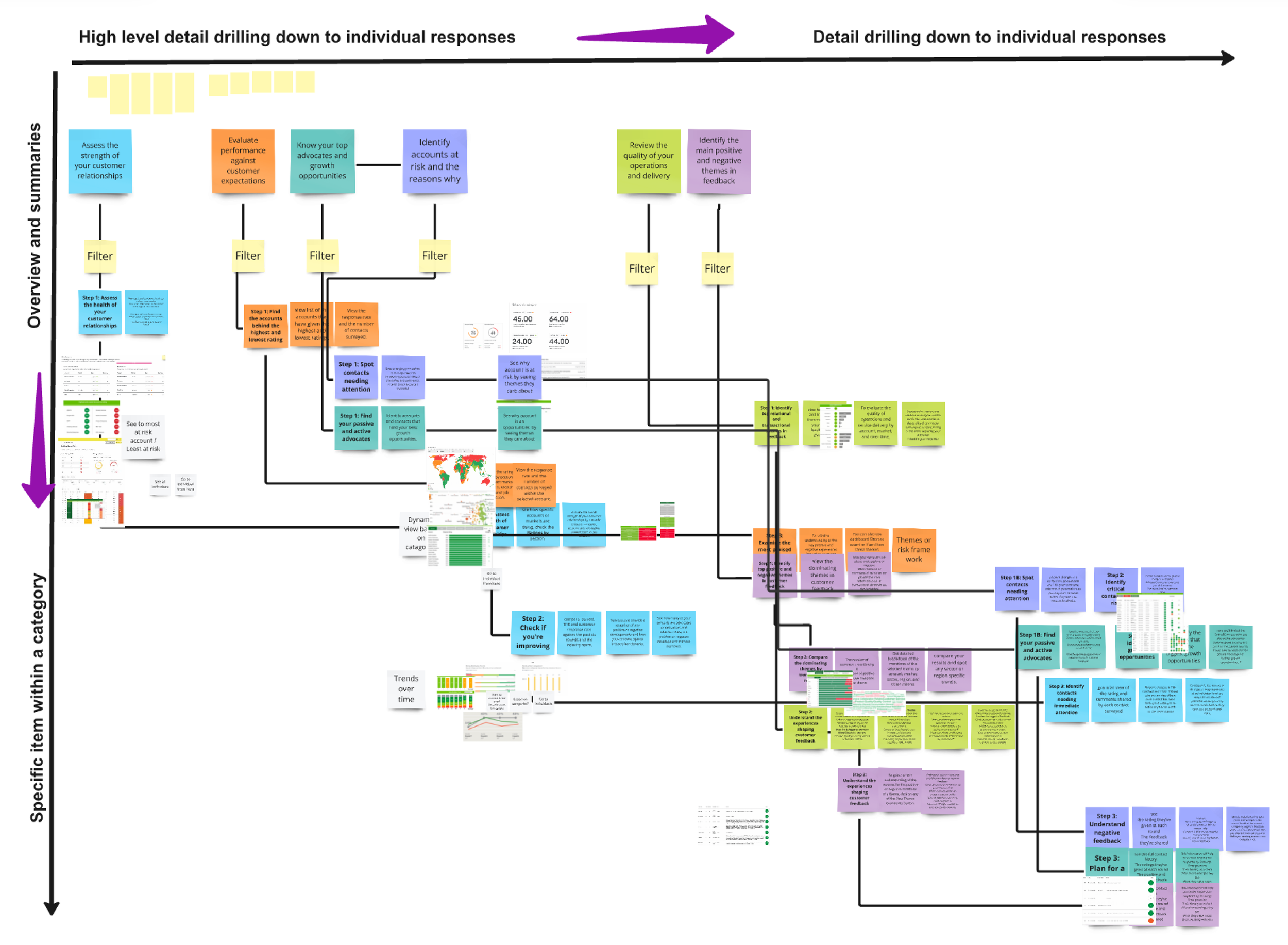
Information Architecture
By analyzing these user journeys, we structured the new dashboard's architecture around key views, including:
Overview and ratings
Context and themes
Individual responses from key decision-makers
Testing and Collaboration
We rapidly prototyped low-fidelity dashboards based on our initial structure and tested them with consultants.
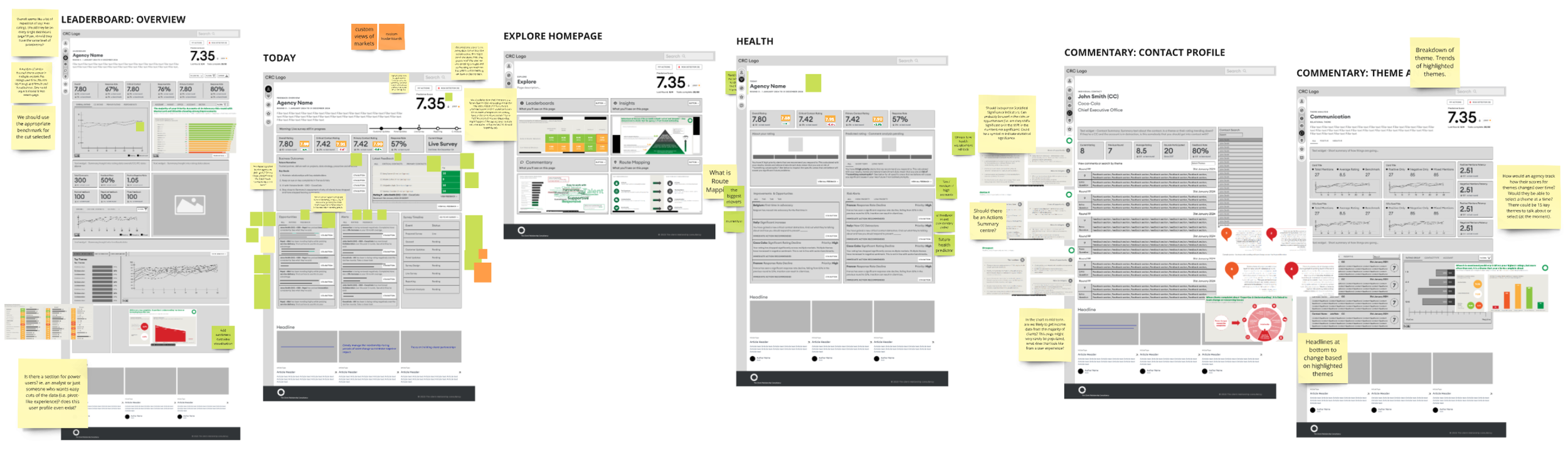
Wireframes of some of the Dashboard Views
Outcomes
What I learned, current status and future directions