
Digital Transformation
Designing a manual service into a digital product.
The Company
Verity, formerly known as The Client Relationship Consultancy, helps B2B companies manage their client relationships by regularly sending out client feedback surveys (The Relationship Rating or TRR). These surveys provide insights into how their business relationships are performing, allowing them to compare results to historical and benchmark data. A consultancy team accompanies these results to support clients in navigating their business relationships.
The Problem
Although clients benefited from our service, producing it required significant time and manual effort. We began to struggle to meet deadlines and even had to temporarily halt new business.
The process of collecting the data required to send out the survey would take weeks, involving the exchange of spreadsheets back and forth with our clients.
Manual reports and delayed insights limited their ability to get a clear view of overall client health.
Challenges in tracking historical trends across multiple accounts and ensuring company-wide consistency.
The lack of scalable solutions hindered the ability to expand business operations efficiently.
The Solution
We urgently needed to automate and streamline our processes. This led to a major digital transformation, which was accompanied by a complete tech restructure and rebranding. We rethought every aspect of the business, leading to the design of a new SaaS product, service, and customer experience. Though it was a significant undertaking, it allowed us to modernise and scale effectively.
What was at stake
Over the past 20 years, the company’s growth had been organic, allowing it to adapt to client needs. However, this also meant that there was no standardized way of delivering our services. Many clients were receiving bespoke versions of our product. We recognised that digitisation and automation would lead to more streamlined processes and the loss of some tailored offerings. Our challenge was to grow the business while maintaining the strong relationships we had built with our long-standing clients.

.What was to be gained
Automating our processes would enable us to do more, such as introducing AI-powered insights, API integrations, and a self-service version of the product for companies that could not afford our current offering. Most importantly, it would allow us to take on new business by reducing manual effort.
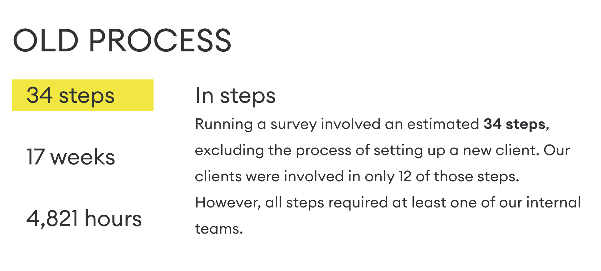
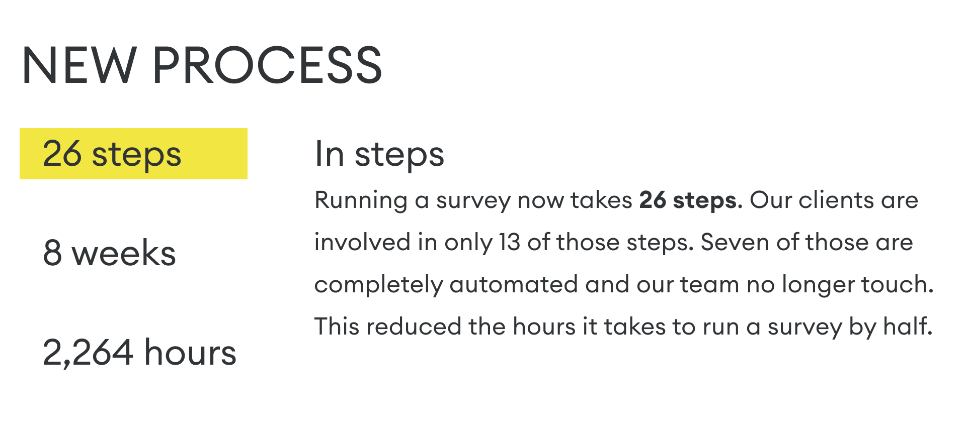
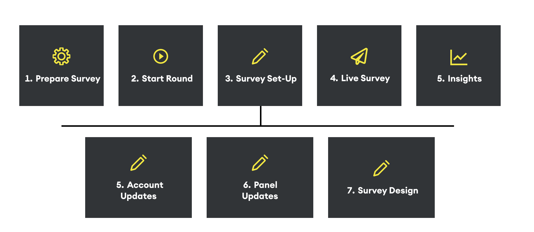
The digital transformation in numbers
The following are some of the projects that I worked on to help get us to the new digitally transformed experience.
The Service Blueprint
Do I look back at it? No. Was mapping it an important step? Yes.
Workshops / Miro / Survey / Internal stakeholders
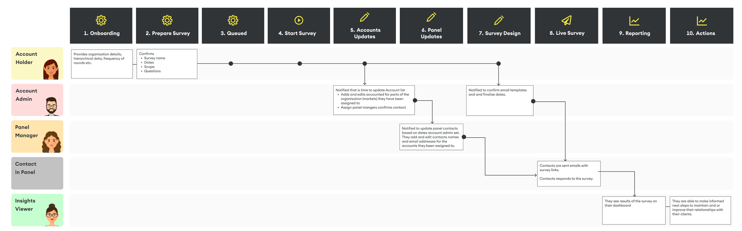
At the very beginning of my time at the company, I worked closely with our internal team to understand the entire process of running a survey from start to finish, at every level. This included multiple workshops and sending out a survey to our internal teams. This effort resulted in a detailed Service Blueprint.
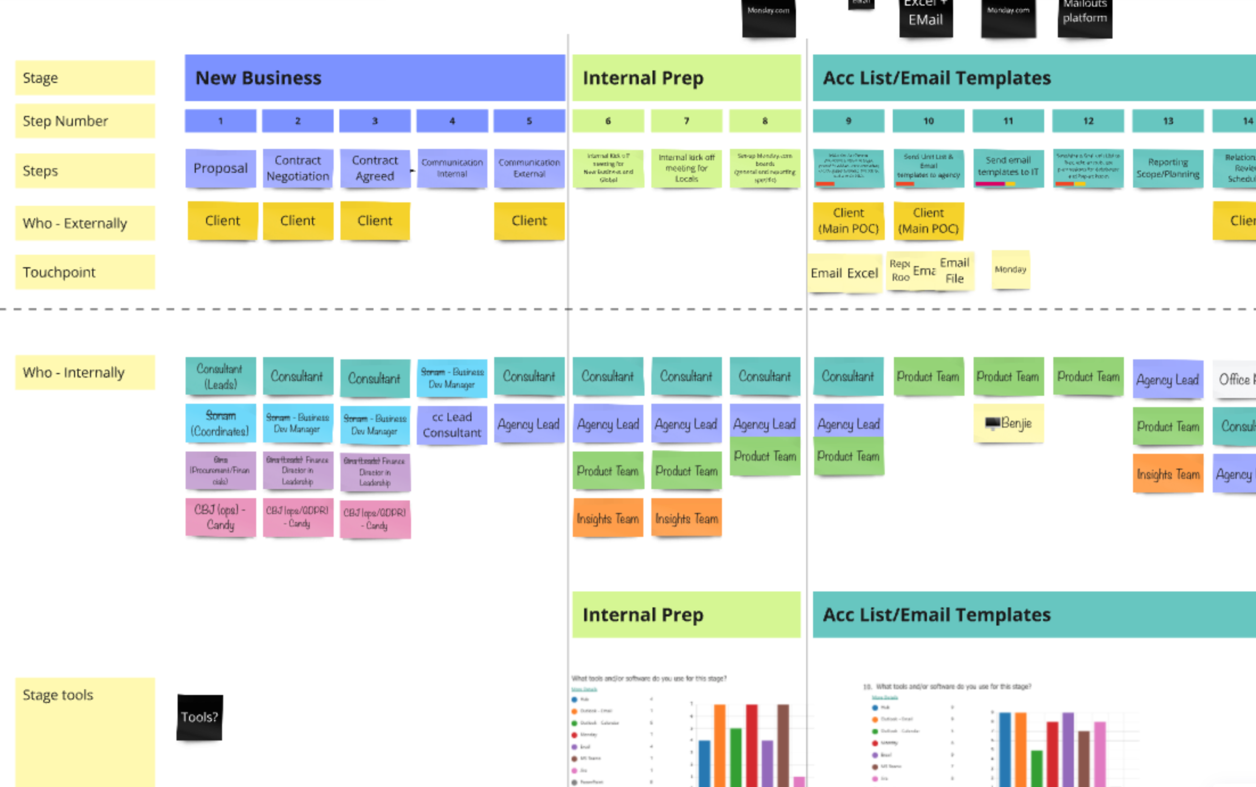
At the time of creating this blueprint, the decision to build a completely new platform had not yet been made. I assumed I would be working within the constraints of our existing technology. While some parts of the blueprint eventually became irrelevant, the process helped me deeply understand how the business operated, where the biggest opportunities for improvement were, what data needed to be collected and when, and who our key users were.
With this foundation, I could reimagine the new high-level customer journey with confidence, which became the foundation for more detailed journeys that followed.
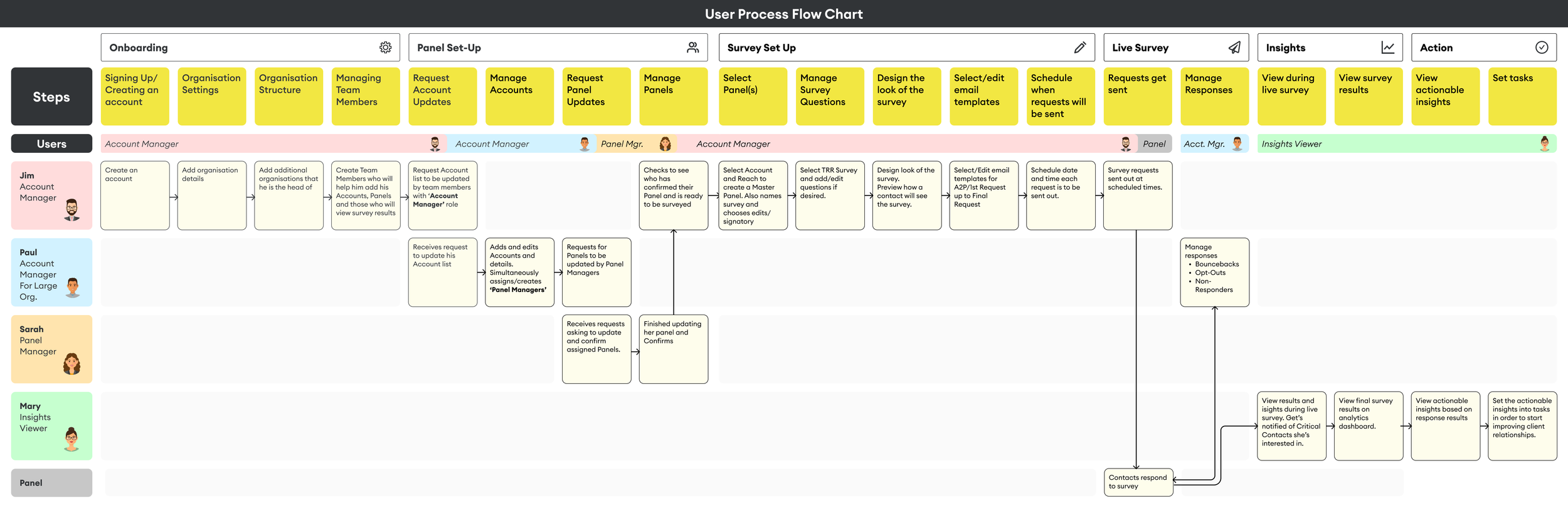
Our Users
Identifying Our Users - Roles and permissions for any size organisation
Workshops / User interviews / Data analysis team
This was the most complex problem when designing the new platform.
Rules:
Challenge
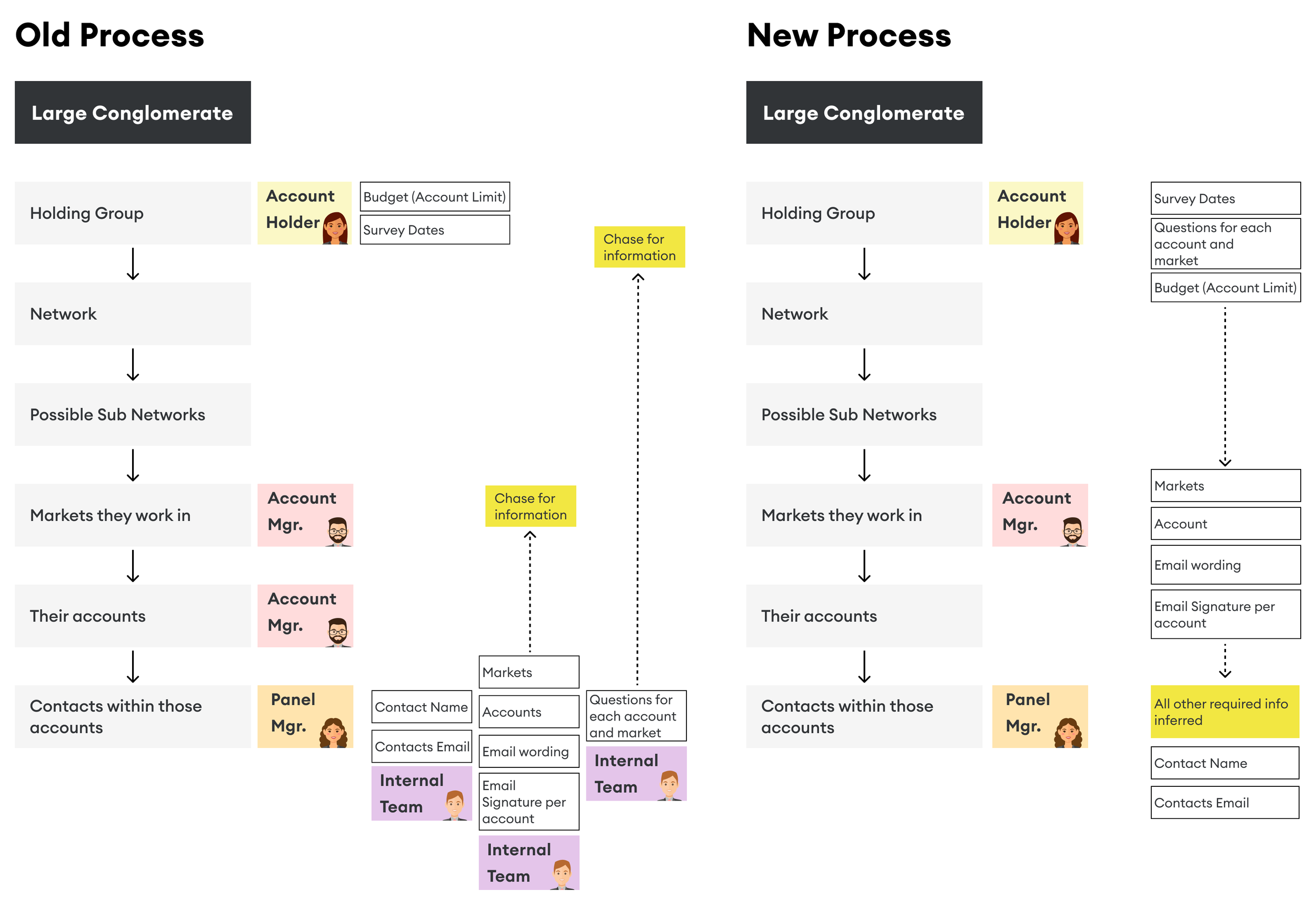
Setting up a survey was handled by our internal team, who had to communicate with multiple individuals within large companies to compile a list of contacts for the survey. This manual process was both time-consuming for our team and frustrating for our clients.
Solution
By mapping out the service blueprint and holding internal interviews, I gained a clear understanding of who we needed to contact, when, and for what purpose. This insight helped identify the roles necessary for the new platform.
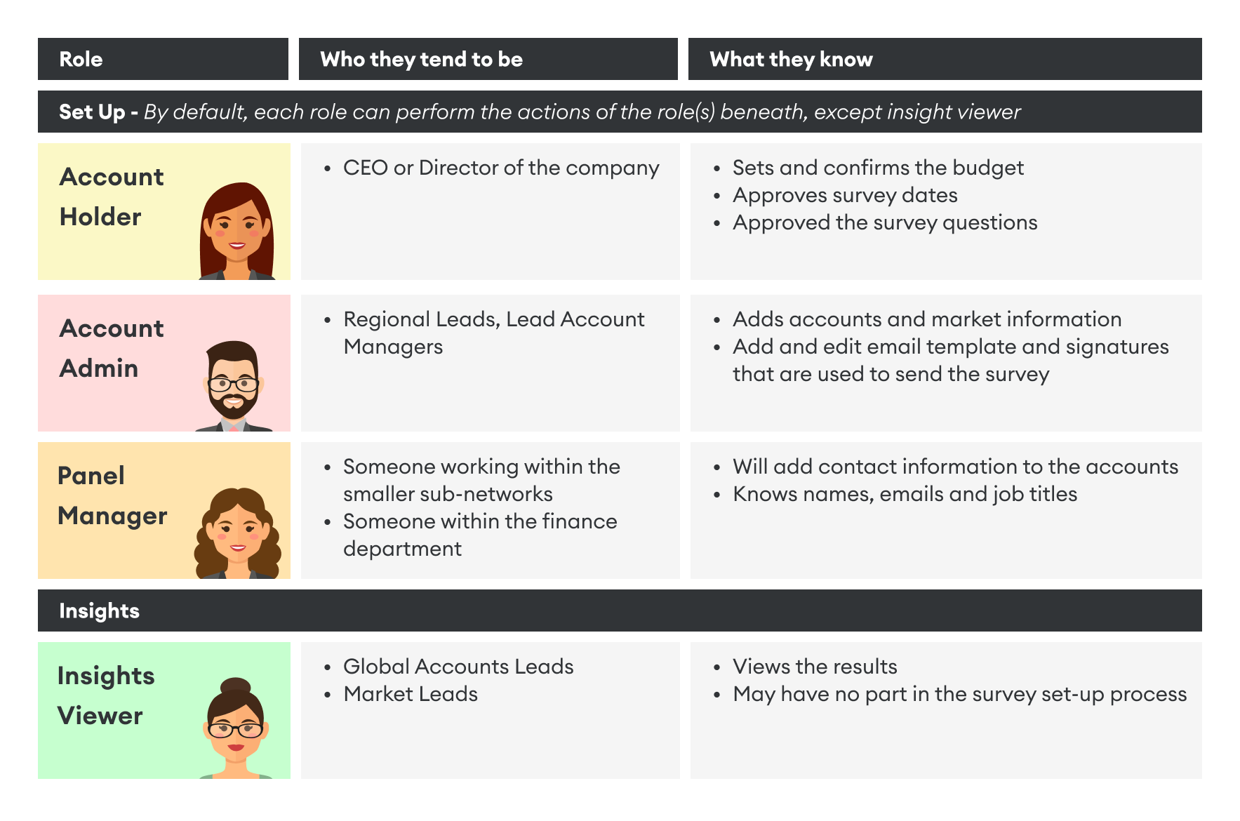
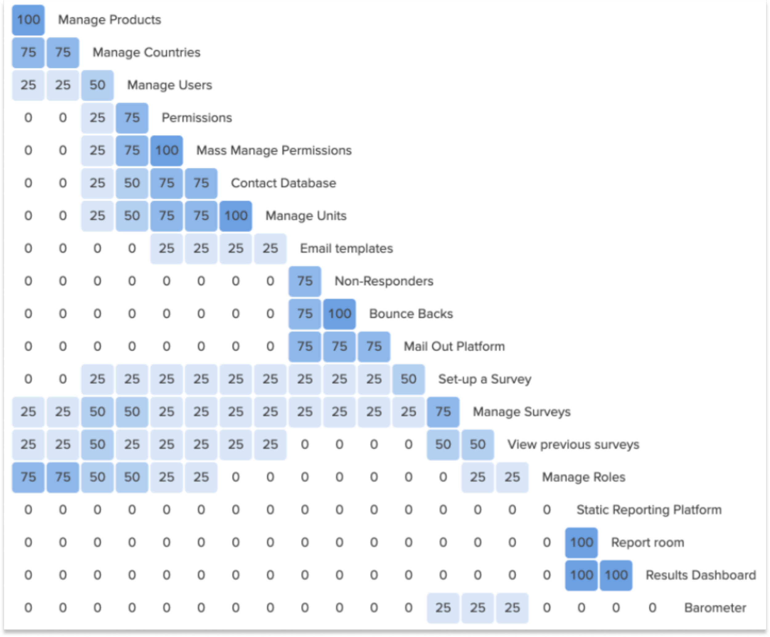
Permissions:
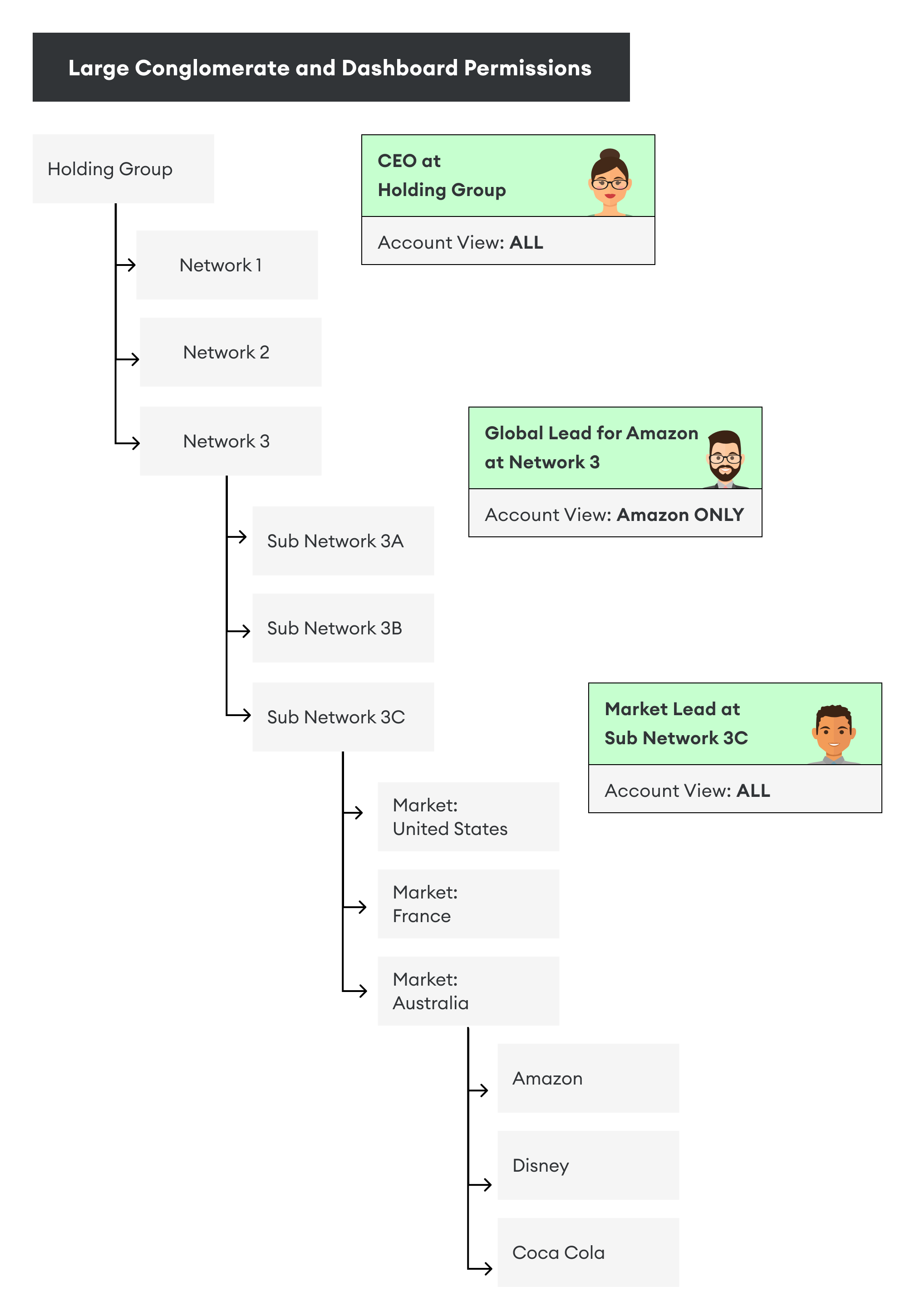
Challenge
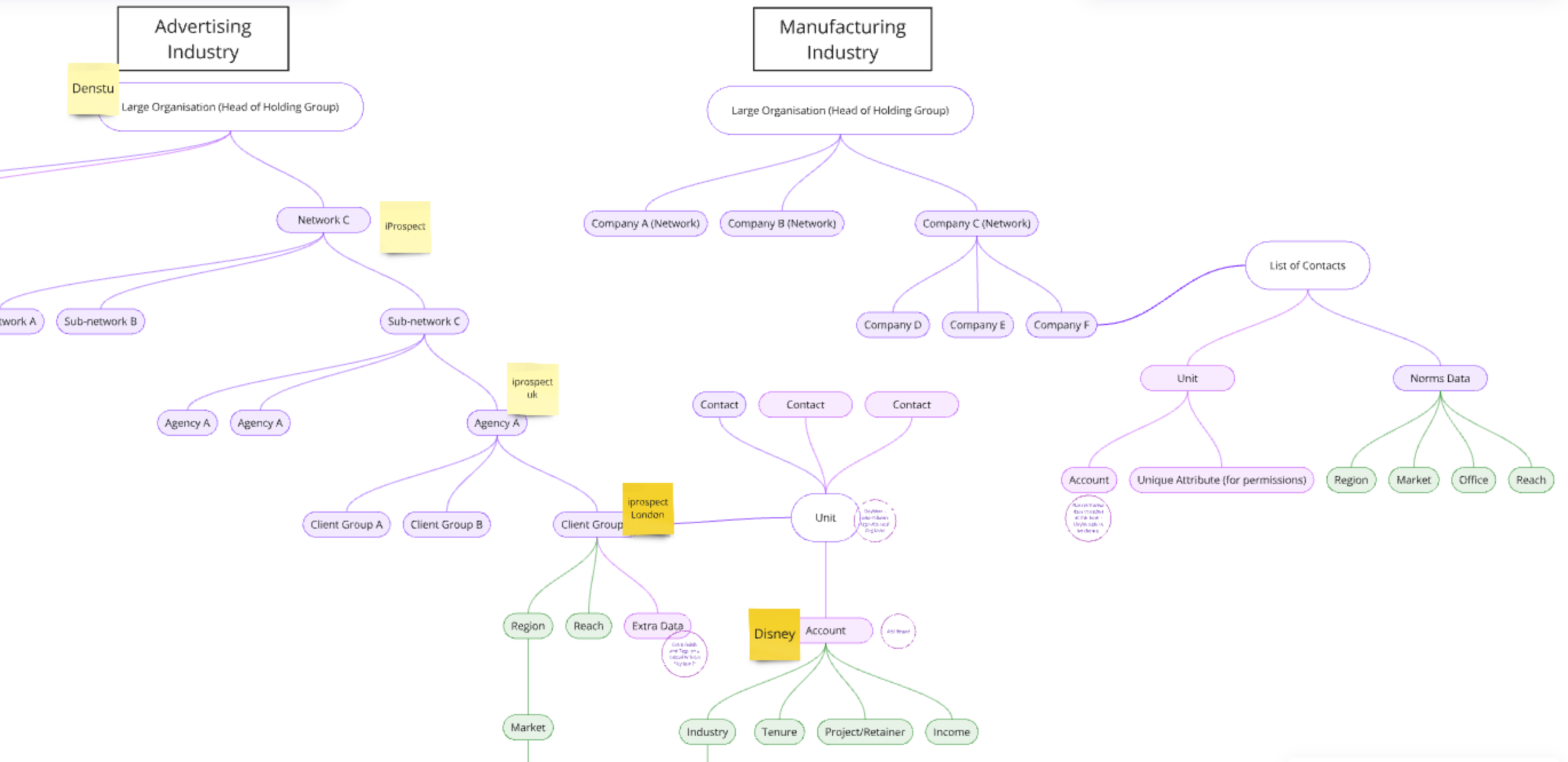
Many of our clients are large holding groups with multiple layers of networks beneath them, making it difficult to determine who should have access to specific data. Granting users access to the dashboard on the new platform needed to be precise, as the survey results were highly confidential.
Solution
By collaborating with our data analysis team, we shifted from a flat data structure to a hierarchical one. This allowed us to position users within their correct level in the business hierarchy. As a result, they could access everything below their level but nothing above it. Additionally, we implemented another layer of permissions to control which accounts each user could view.
Flexible organisation structure
Challenge: Our platform needed to support companies of any size, which meant that user roles also had to be adaptable to fit various company structures.
Solution: Moving to a hierarchical structure also helped address this challenge and also me to identify the best way to collect the data needed for sending out surveys on the new platform for a better user experience.
This led to the development of a "top-down vs. bottom-up" approach for gathering the necessary data.
With that, the customer journey started to take shape.
Terminology
A Quest for Stakeholder Buy-In
Survey / Competitor Analysis
Challenge
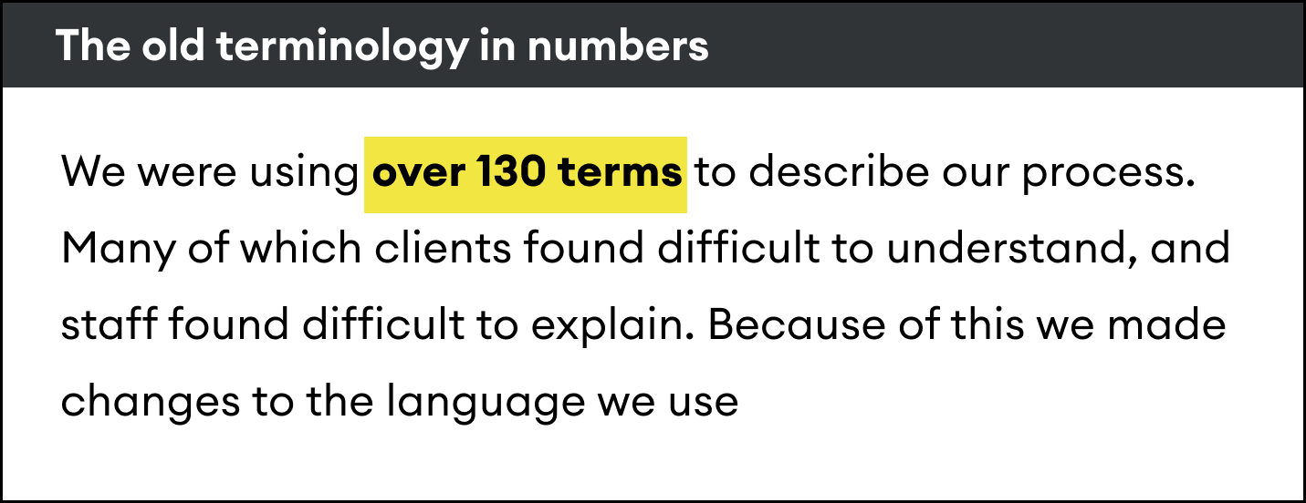
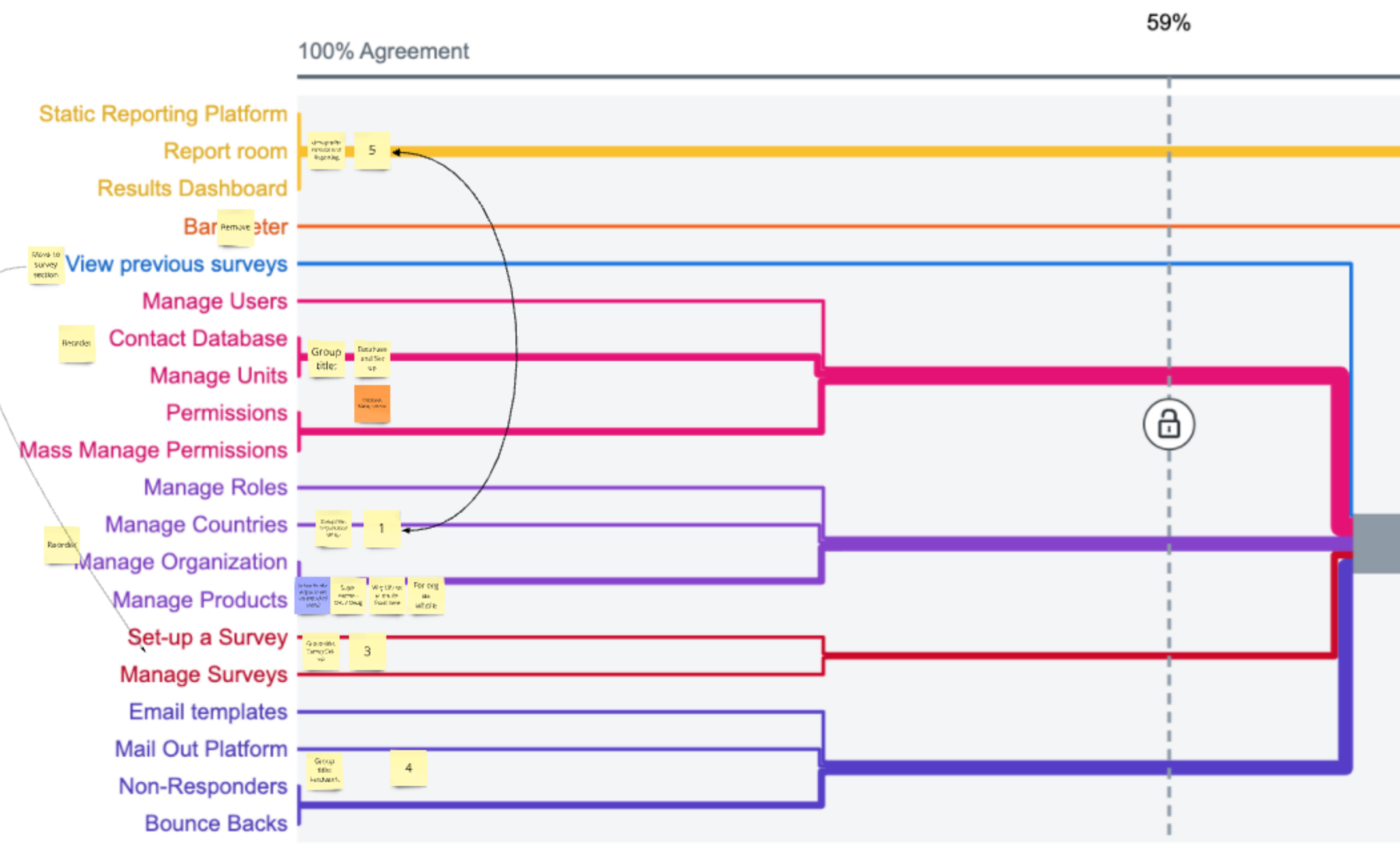
If user roles and permissions were a complex problem to solve, then terminology was a political one. Since there was no single, standardized way of doing things, multiple terms existed for the same concept, and stakeholders were passionate about the ones they used.
Internal Survey
To address this, my team first had to help stakeholders understand the problem. We conducted an internal survey asking them to identify terms they found confusing and to guess the correct terms based on provided definitions.
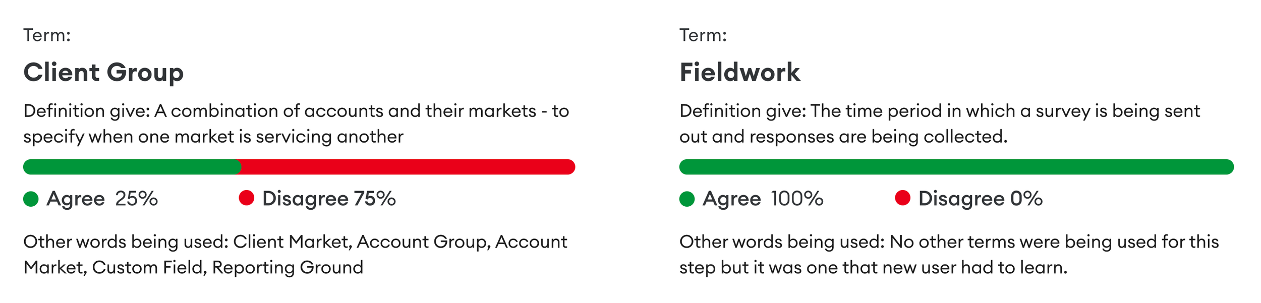
By presenting these results, it became easier to convey the problem. If we couldn’t define these terms internally, how could we expect our users to? Most of these terms were only being used internally, but as we transitioned to a client-facing platform, this needed to change.
Competitor Analysis
Next, we examined how our competitors labelled similar concepts. We also looked at companies outside of our direct competition but who also distributed surveys.
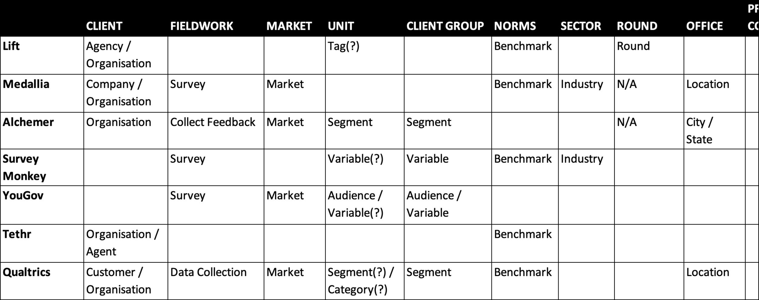
Policy Change
We then presented our findings and recommendations to the board for sign-off. This was important for gaining the rest of the company’s support. Here are some examples of the new terminology”
Team (OLD: Client Group) - A way to specify when a market is servicing another market or practices a certain discipline. i.e. The UK Media Team
Benchmark (OLD: Norm) - Average TRR rating and response rate, allowing an organisation to compare their results against a sector, market or customer average.
Live Survey (OLD: Fieldwork) - The period in which a survey is running and accepting responses.
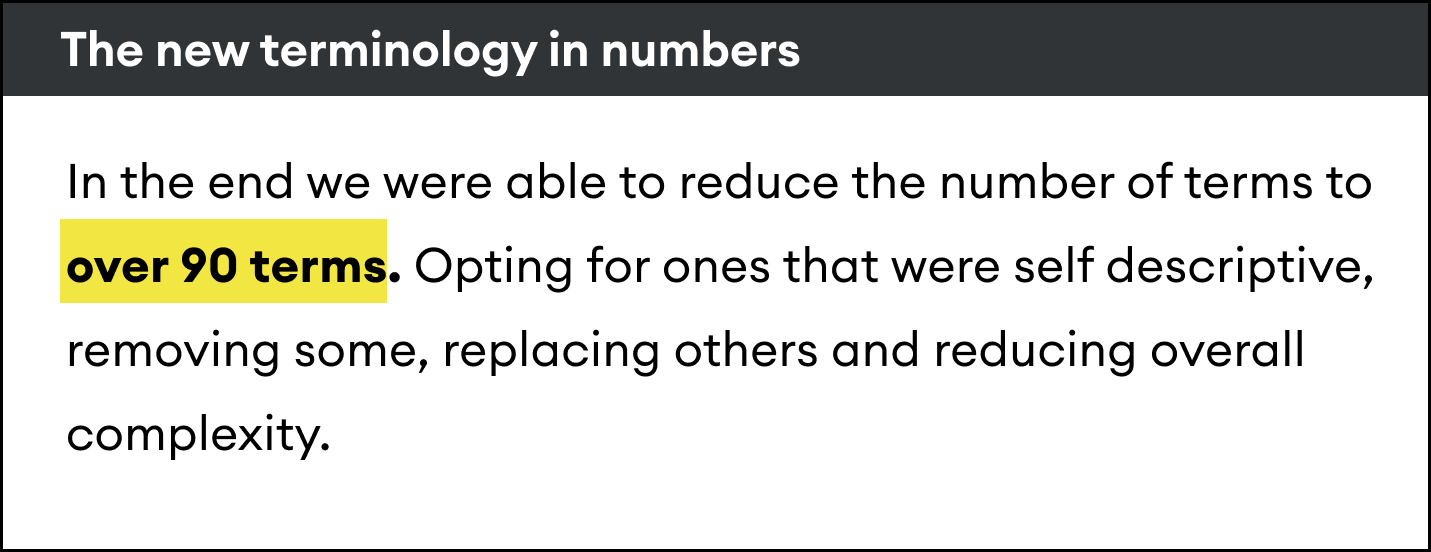
Learnings
By doing this, we nailed down our new terminology. Understandably, 20 years of calling something one thing and then changing it to something else doesn’t happen overnight; it takes unwavering consistency and repetition on my team’s part. However, the results make everything that follows so much easier, from creating a new data structure to developing a new platform. It also supported other teams, like marketing with the rebrand, the sales team when discussing products, and onboarding new employees.
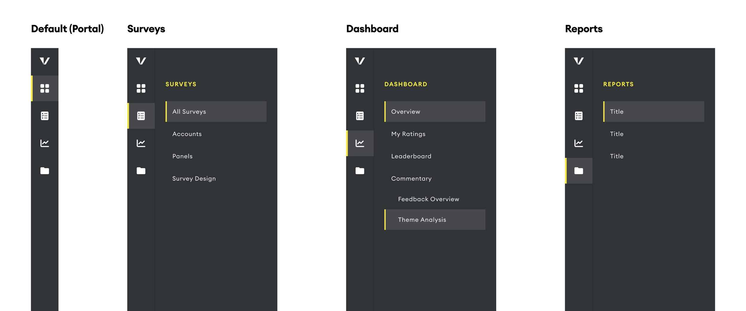
Information Architecture
Laying the Foundation of the New Platform’s Navigation
Card Sorting / Tree Testing / Optimal Workshop
Challenge
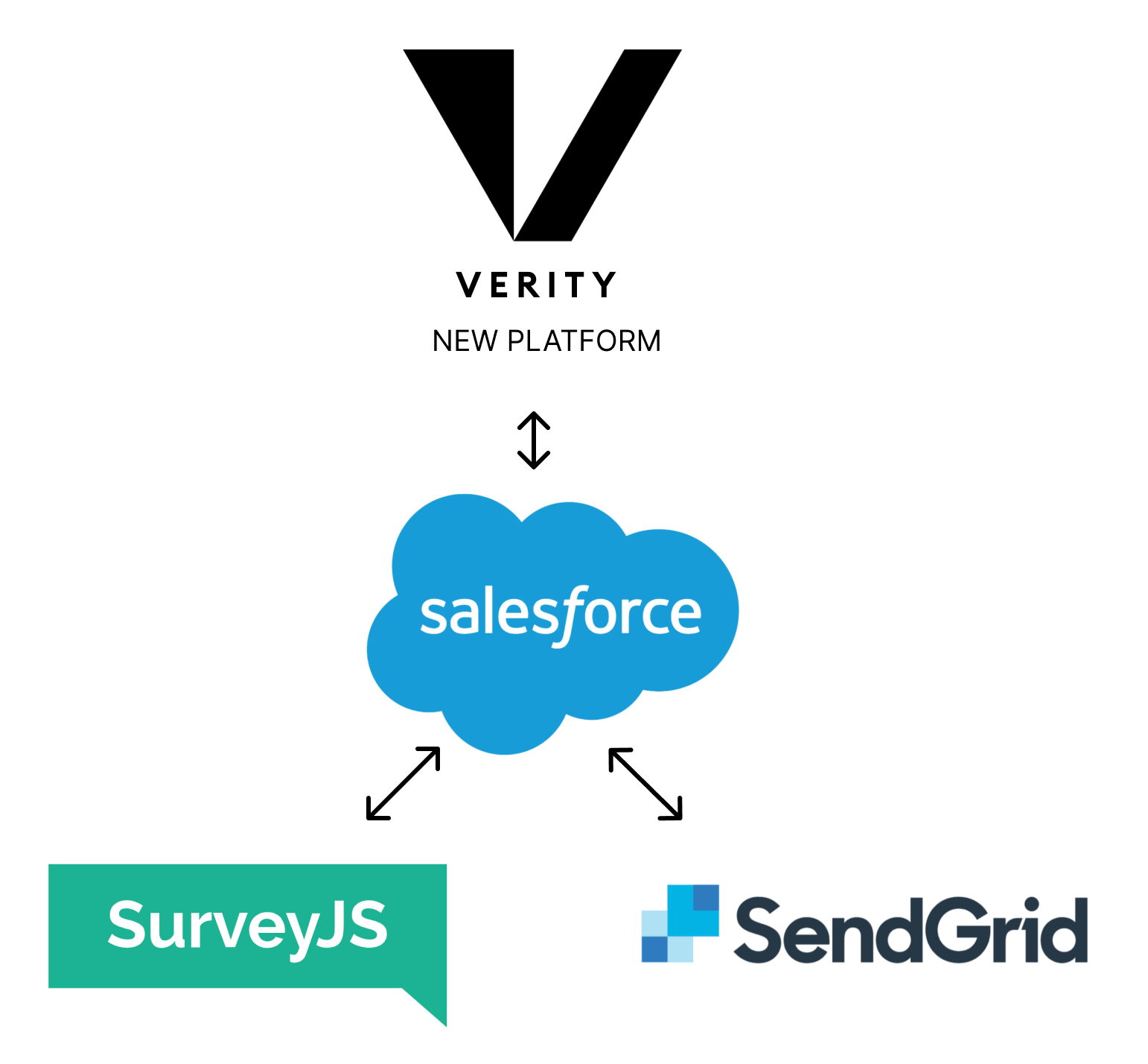
As we embarked on developing a new client-facing platform, we identified the need to establish a solid information architecture that would serve as the foundation for user navigation. Verity decided to use Salesforce as our primary source of truth, with the new platform designed to overlay it.
Project Overview
The new platform would consist of two main components:
Survey Setup: A section where users can easily update all necessary information to send out surveys.
Dashboards: Interactive views displaying survey results, along with tools to assist users in managing their relationships, such as action tracking features.
User Journey and Information Architecture
To create a user-centric design, we analyzed the tasks users would perform throughout their journey. This analysis informed my hypothesis about the platform’s information architecture.
Card Sorting Exercise and Tree Testing
To validate this hypothesis, I conducted card-sorting exercises and tree tests with 17 users. This method helped us structure content and features in a way that made sense for a seamless navigation experience.
Confirming Informaiton Atchetiure
This resulted in creating a shallow 3 level information architecture.
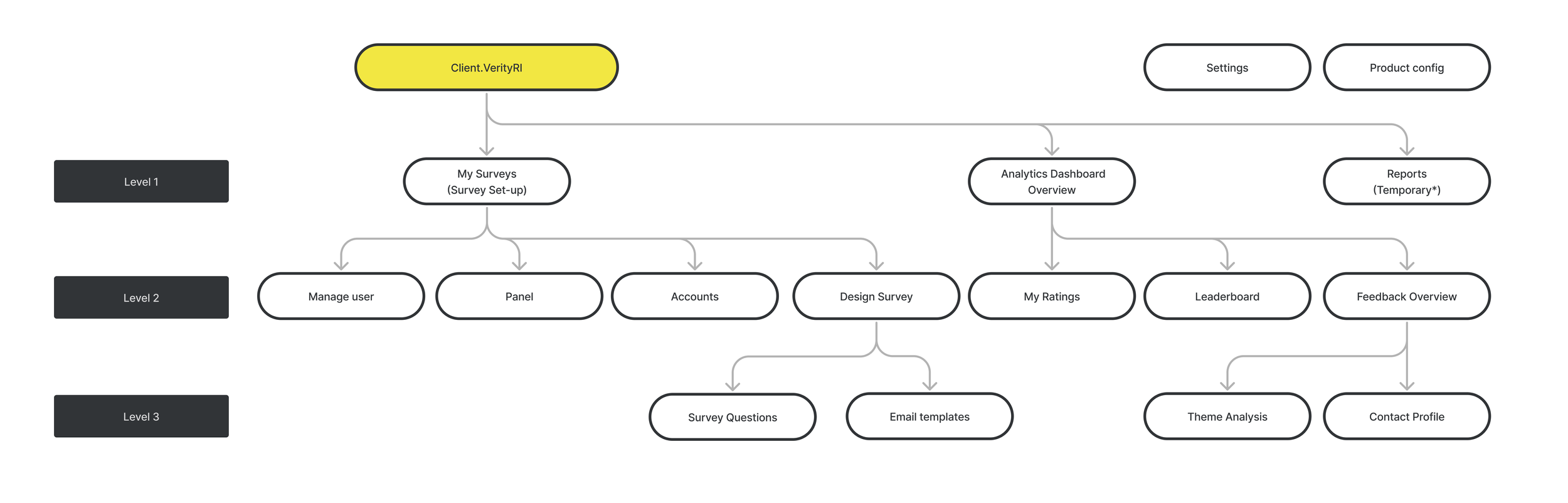
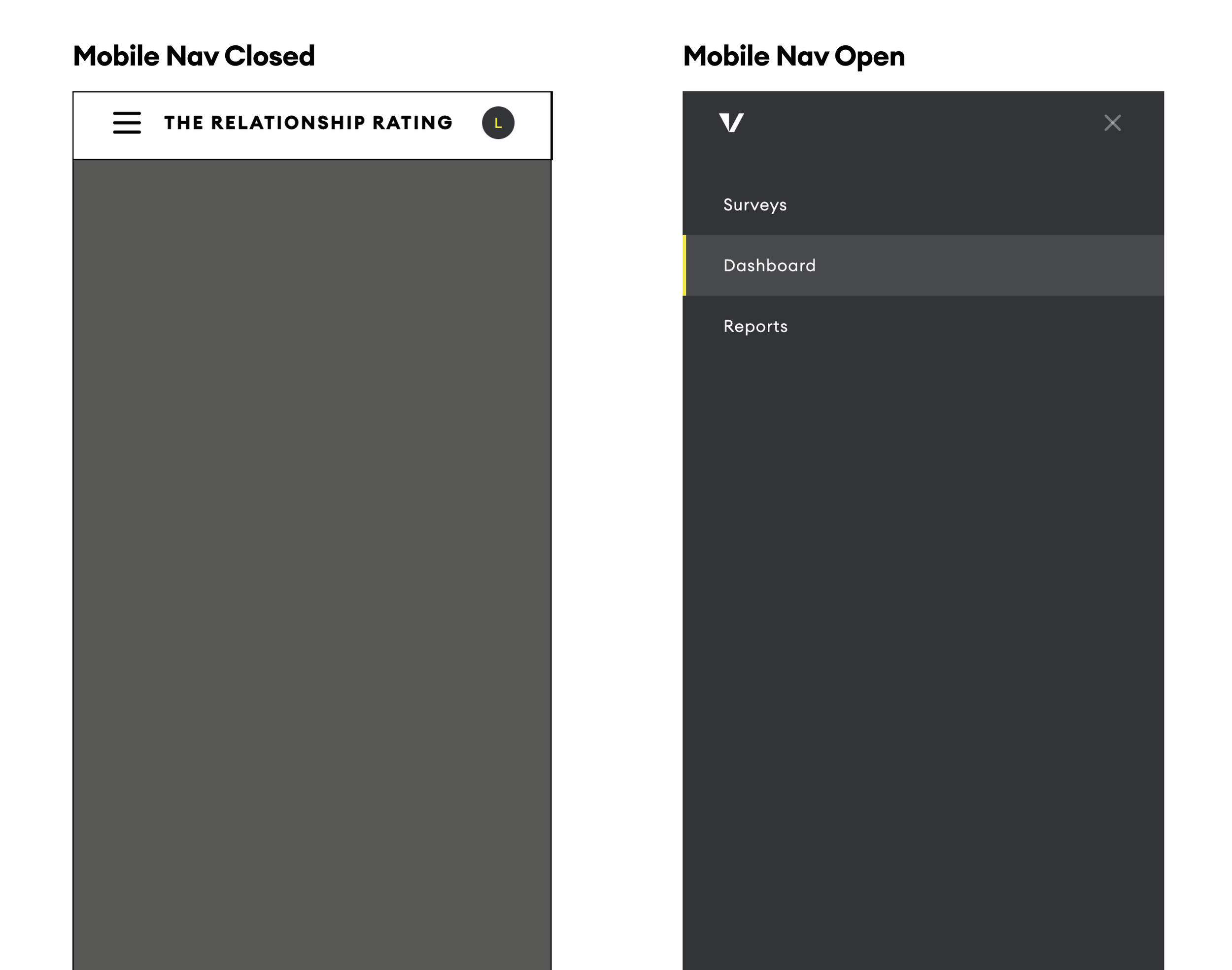
Designing the Navigation
By establishing a clear information architecture we laid the groundwork for a platform and were able to confidently design the navigation of the platform.
Designing The Platform
Designing the survey setup experience in the new platform
User Testing / Survey / Prototyping / Figma
Overview
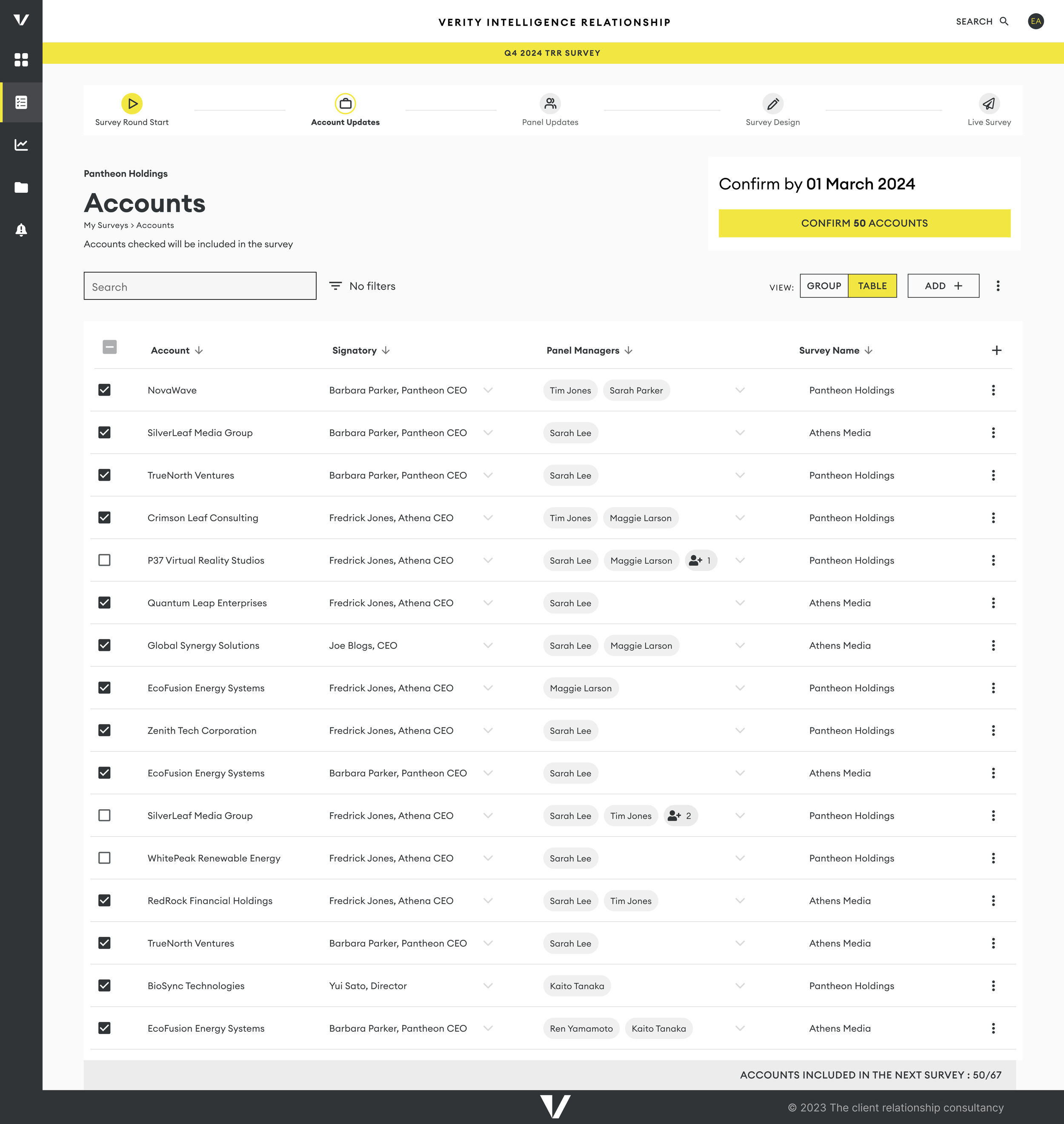
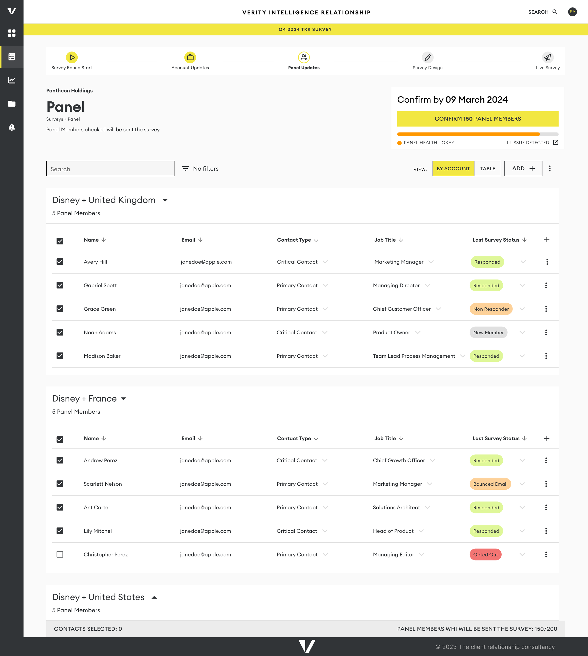
To create an efficient survey setup experience in our new platform, we employed the Double Diamond design process. This method guided us in designing pages where users could list their accounts and the contacts who would receive the surveys.
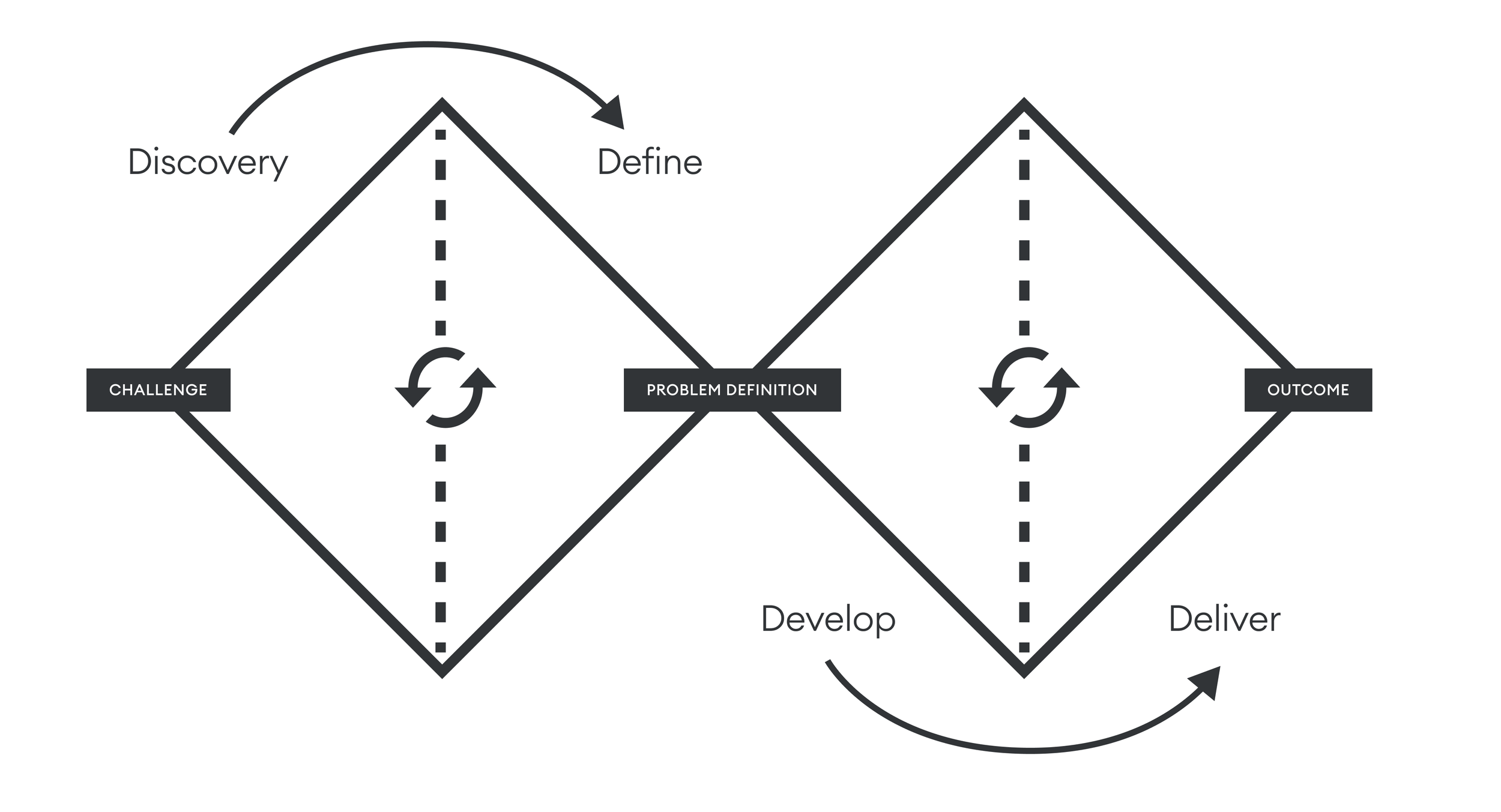
Discovery
Collaboration with our data analytics team was essential to understanding the current data collection methods and the purpose of various data points. We identified a significant pain point related to data integrity, as reliance on shared spreadsheets often resulted in dirty data. We also looked at survey results asking about the old process.
Define
Our goal was to infer as much information as possible from the hierarchy structure, reducing the amount of data users needed to input each time they wanted to run a survey. By minimizing user input, we aimed to enhance data integrity; the less users had to manipulate data, the cleaner it would be. This reduction in data entry not only improved accuracy but also contributed to a better overall user experience, as it streamlined the process and made it more intuitive.
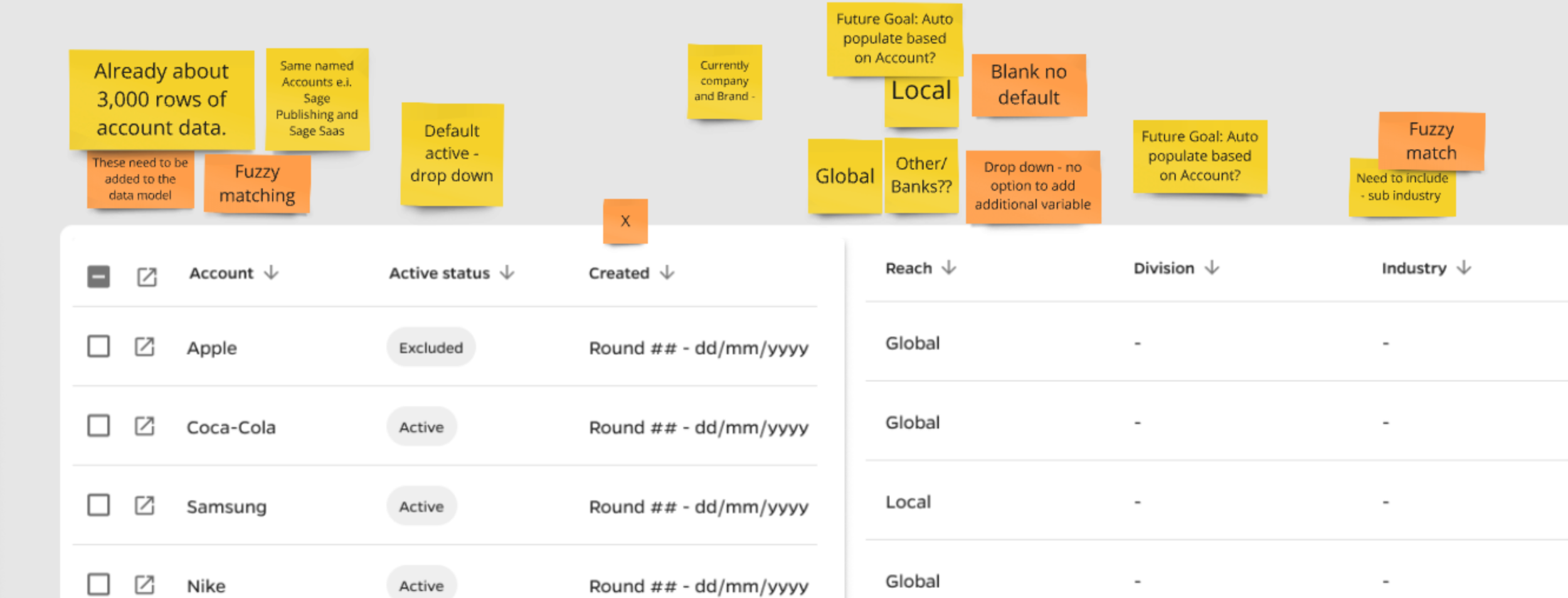
For instance, we did not have a single Account Profile for each account, which meant that obtaining benchmark ratings for global brands like Apple required extensive manual work from our insights team
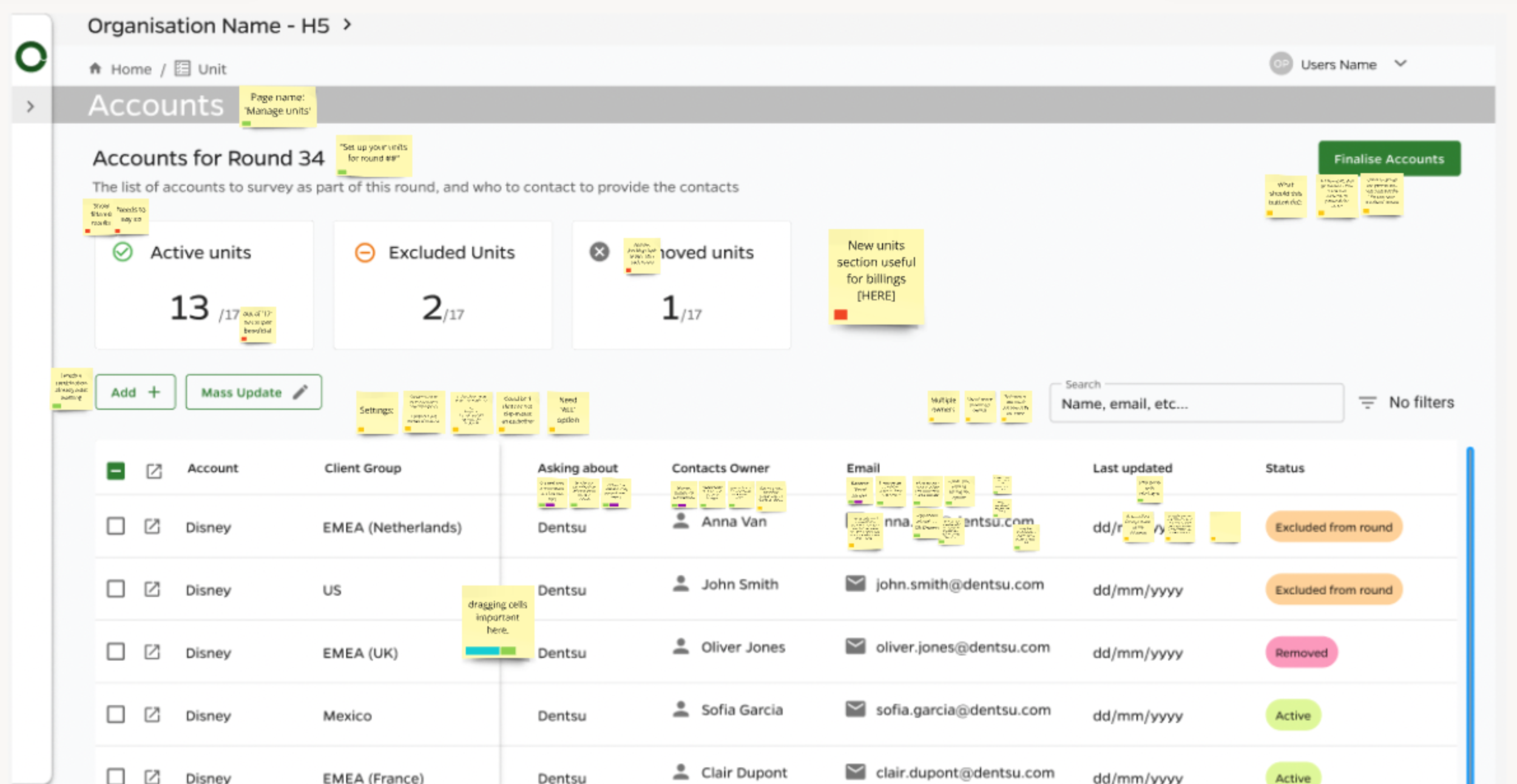
Develop We generated a list of desired features, including mass updating, fuzzy matching, and auto-save functionality. For each column and field type, we evaluated options, ensuring that limited option dropdown lists were utilized where appropriate. When we could infer information, we did so to streamline the user experience.
Delivery
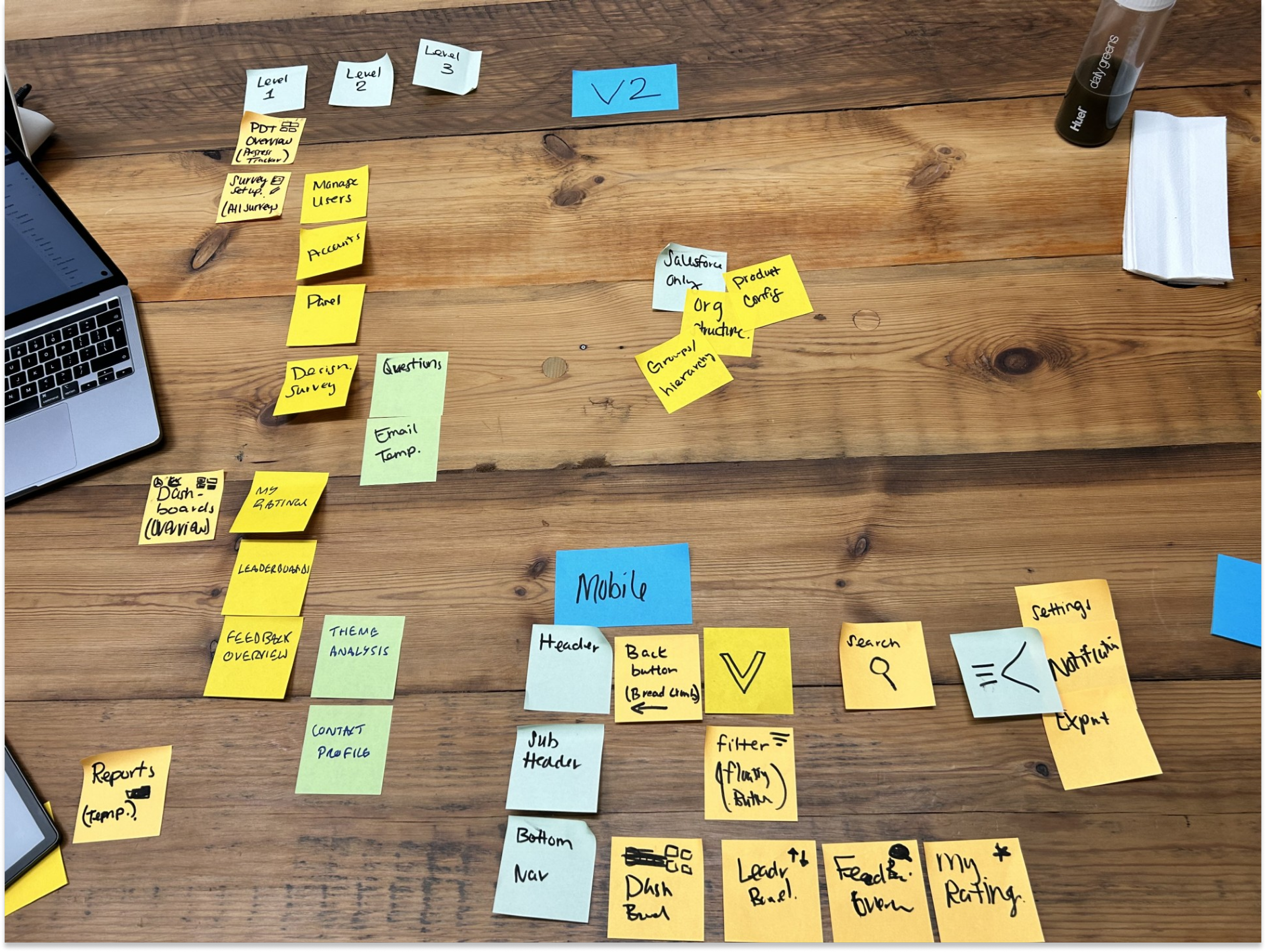
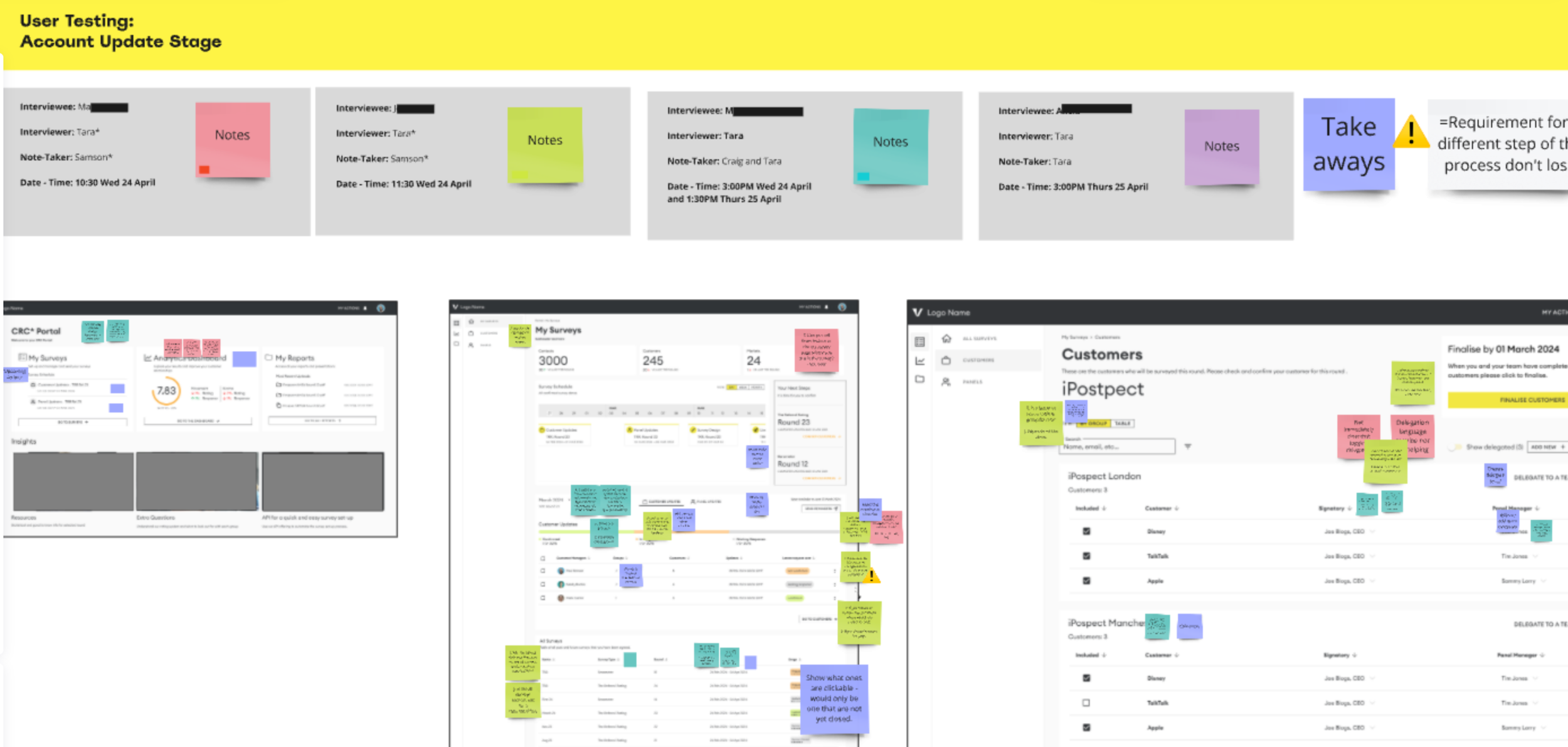
I began the design process with paper sketches for early wireframes, then transitioned to low-fidelity and finally high-fidelity prototypes in Figma. As the rebranding developed, we revisited high-fidelity designs to ensure alignment with the new visual identity.
Wireframes of some of the Survey Set-up Pages
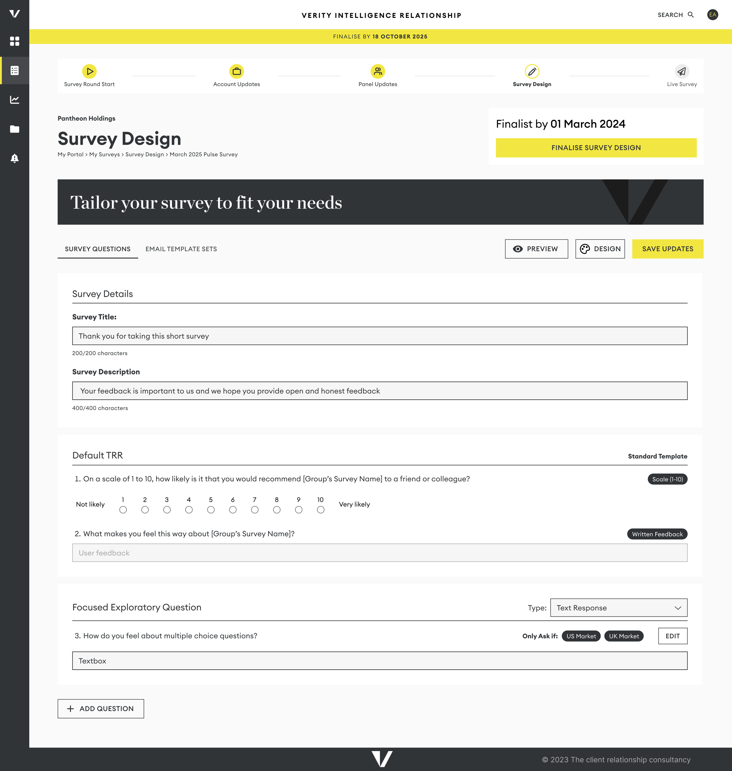
We conducted multiple rounds of testing with our internal teams before launching the designs to external users, including Account Managers and Panel Managers.
Learning
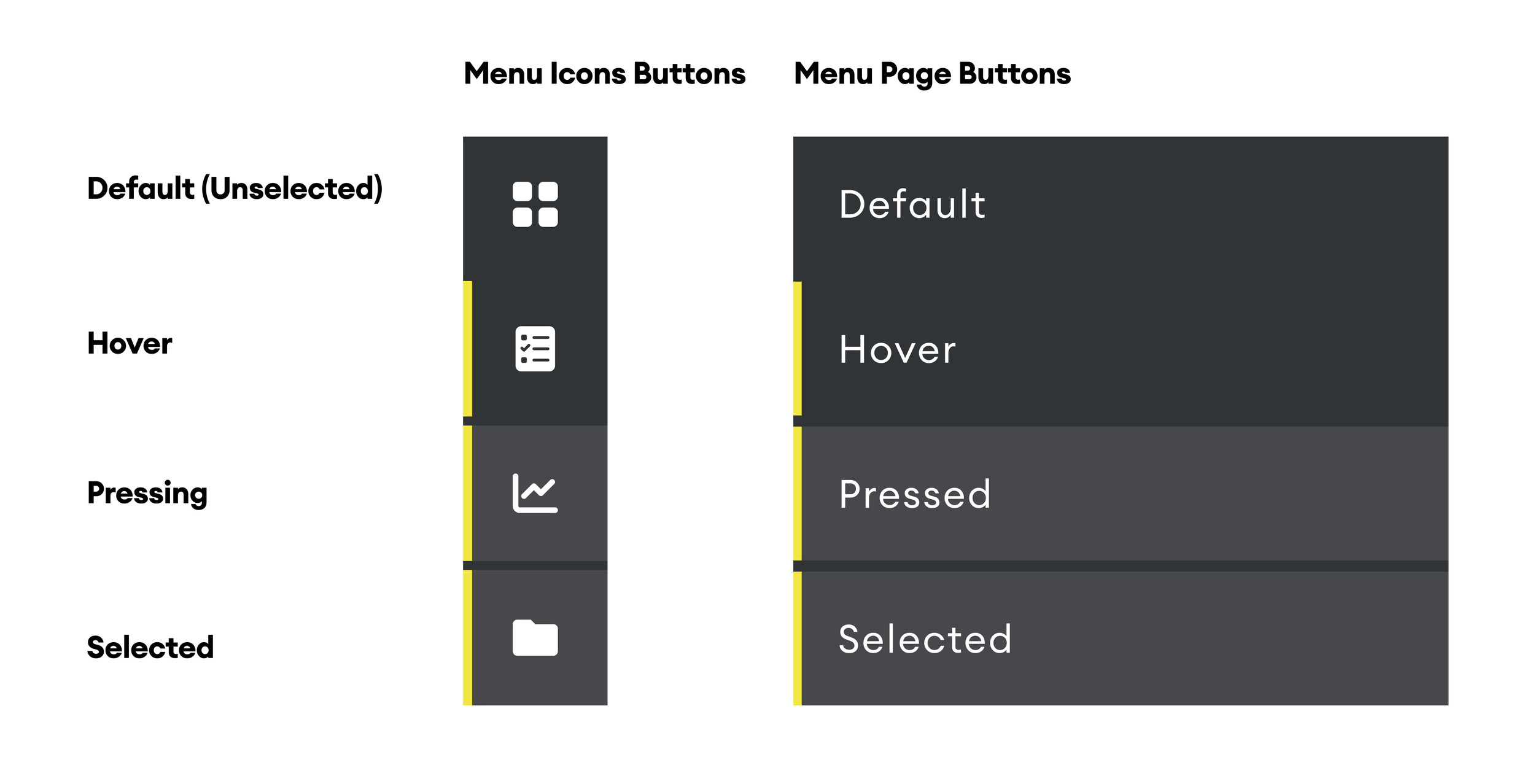
Creating a well-organized design system library with reusable components significantly streamlined the design process and saved valuable time. However, finalizing the rebranded designs before implementation would have further expedited our progress.
Challenges and Prioritization
While I wish we could have included all the envisioned features in the MVP version of the platform, time constraints necessitated some difficult decisions. By collaborating closely with developers to understand build times and the impact of each feature, I was able to prioritize essential functionalities and defer others for Version Two of the platform.Learning
Effective communication with our team regarding their wants and needs proved essential. By ensuring they felt heard and reassured that their requests were acknowledged, we maintained high morale and alignment throughout the process.
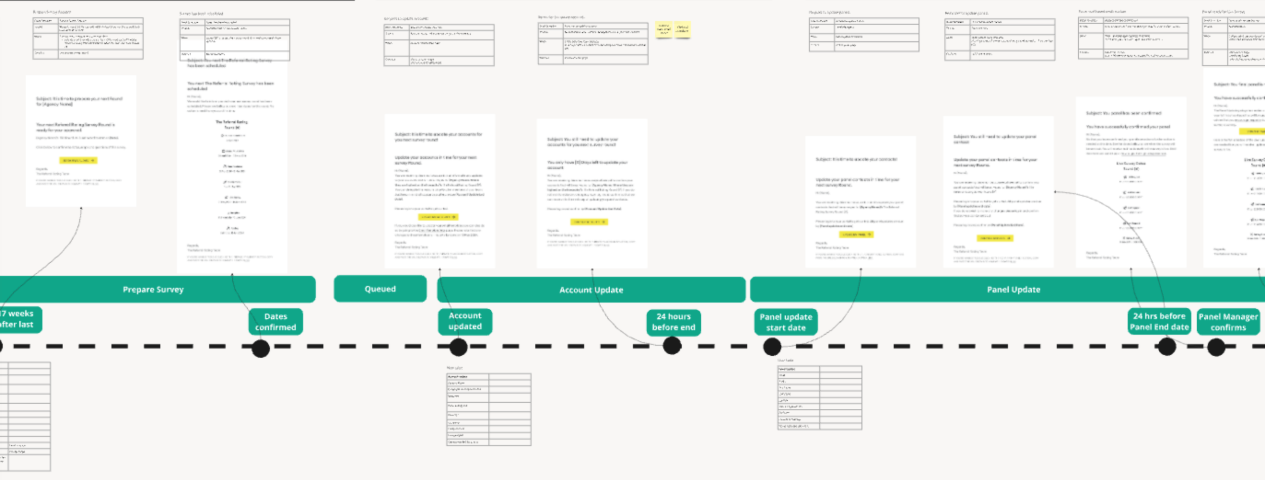
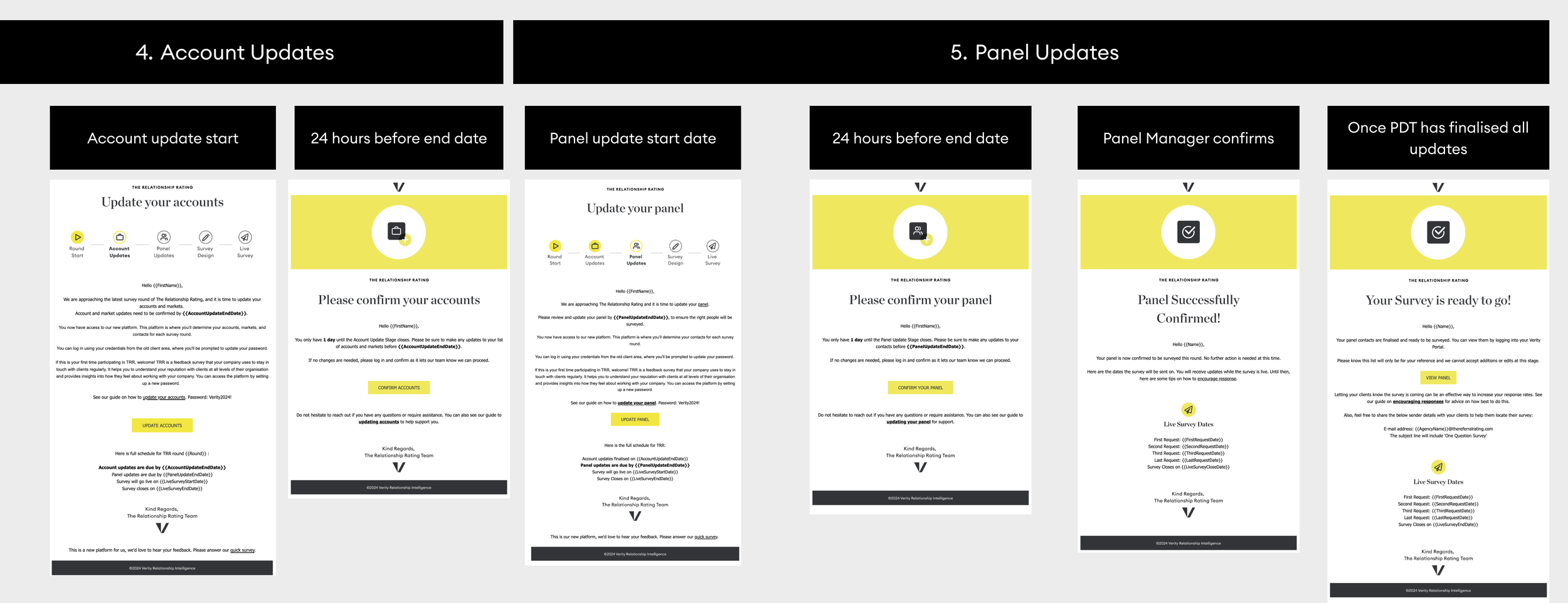
Notification Email Journey
Designing and building email notifications our users receive through the process of running a survey.
User Research / Competitor Analysis / Figma / SendGrid
Challenge
The survey setup process relied heavily on manual emails sent using templates. This approach was inefficient and prone to delays, leading to inconsistencies in the information users received.
Solution
To address this issue, we proposed building automated emails that would be sent out at appropriate times. This solution aimed to save internal teams time while ensuring that users received accurate and timely information.
Journey Mapping
Using the insights gathered, I mapped out the necessary emails and identified the target users for each message. I then selected the triggers that would allow Salesforce to automatically send these emails based on user interactions.
User Research
We began by conducting interviews with both internal and external users to understand their email experiences. We asked questions about when they typically received emails and what information those emails contained. Additionally, we performed an audit of our existing email templates to identify areas for improvement.

Development and Design
Effective communication with the development team was crucial throughout this process. I designed the email templates in Figma, breaking them down into reusable interchangeable components and collaborated with a third-party content writer to ensure that the emails aligned with our new brand's tone of voice.
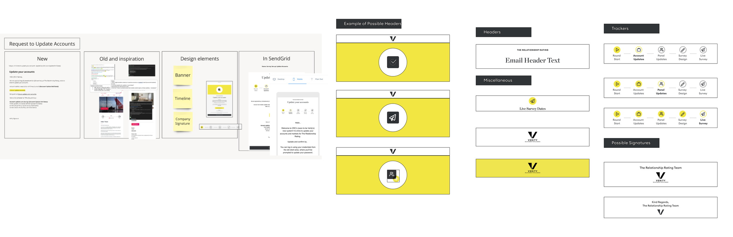
Build
Once the designs were finalized, I built the emails on SendGrid and worked closely with developers to establish the correct events in Salesforce that would trigger the automated emails
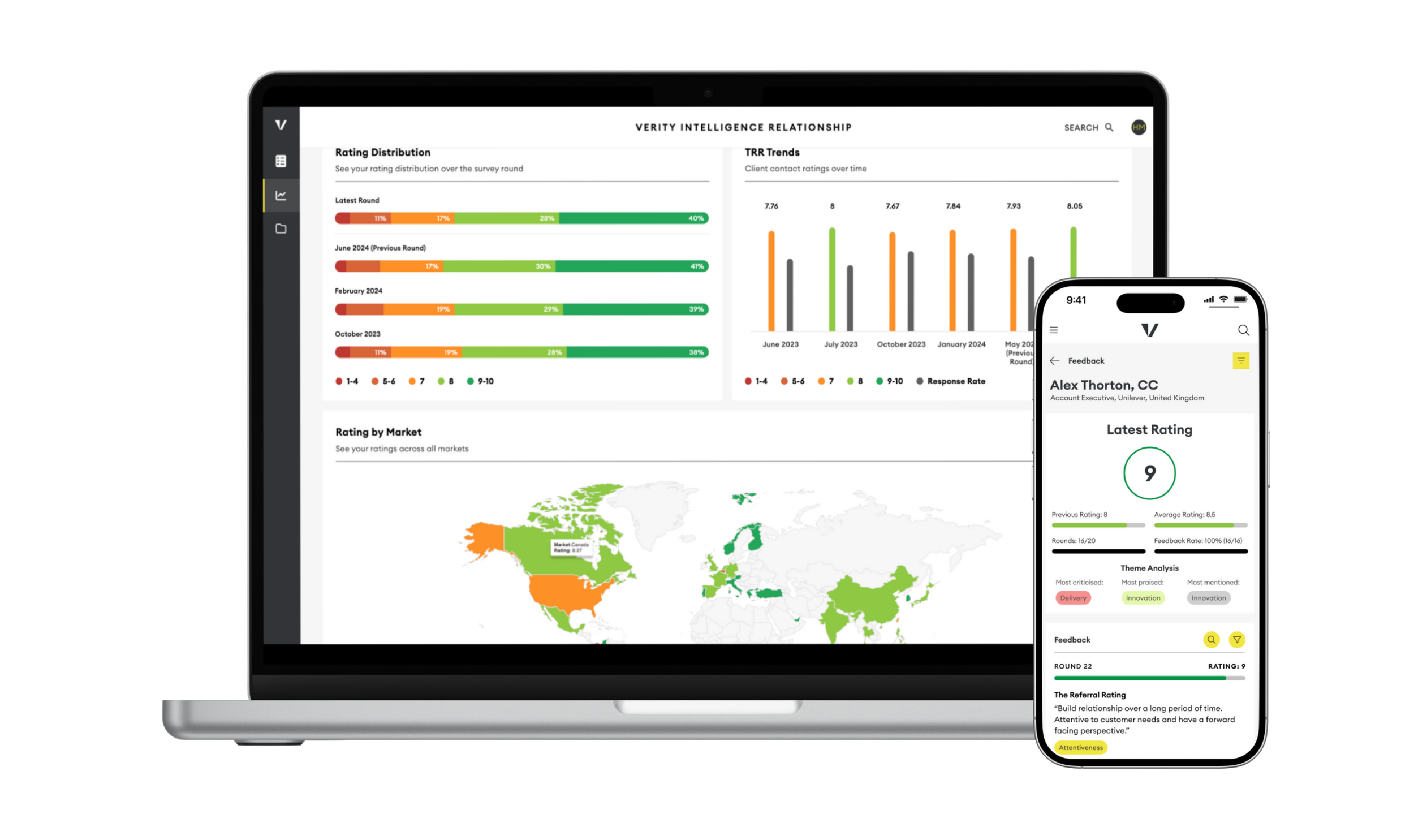
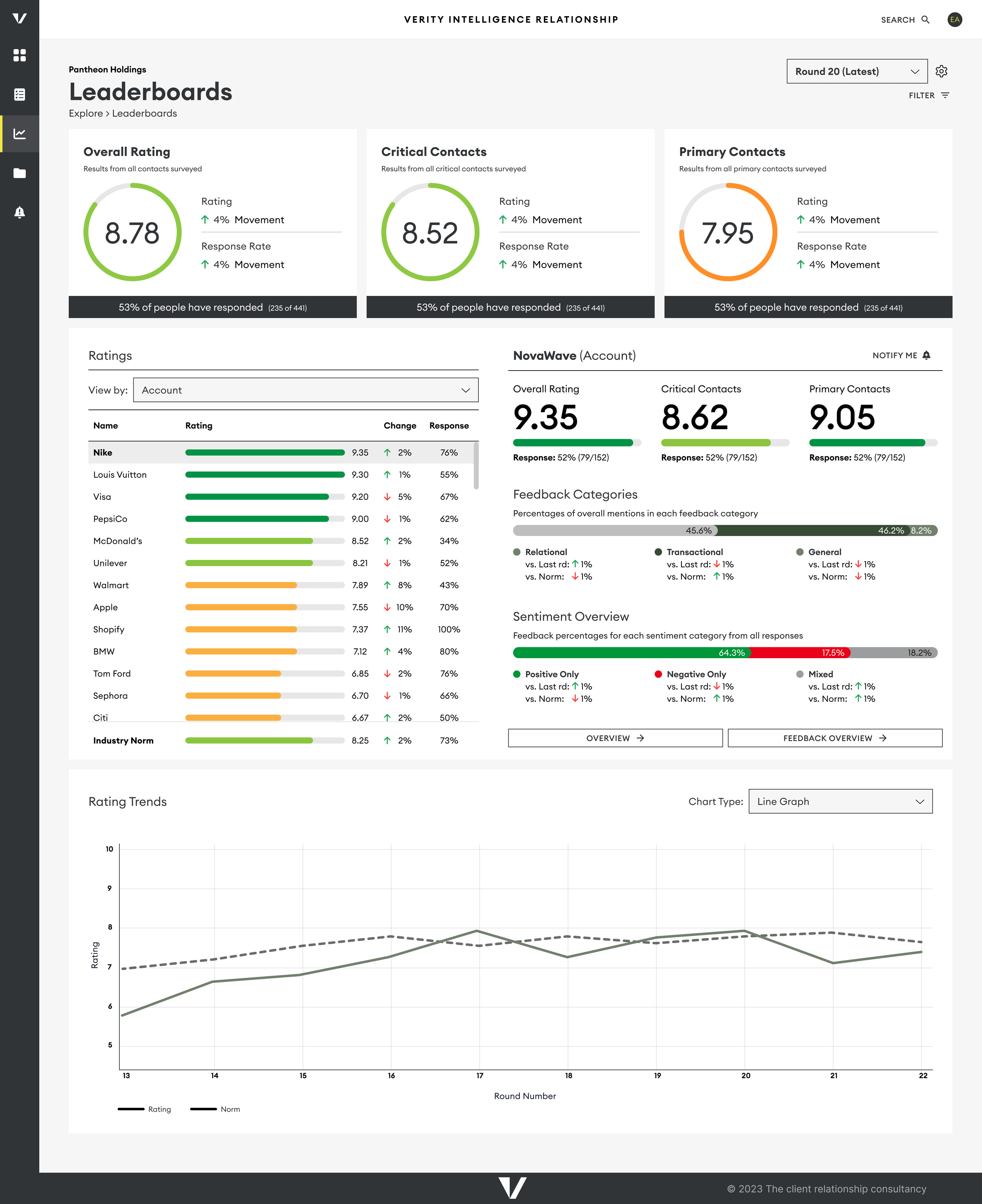
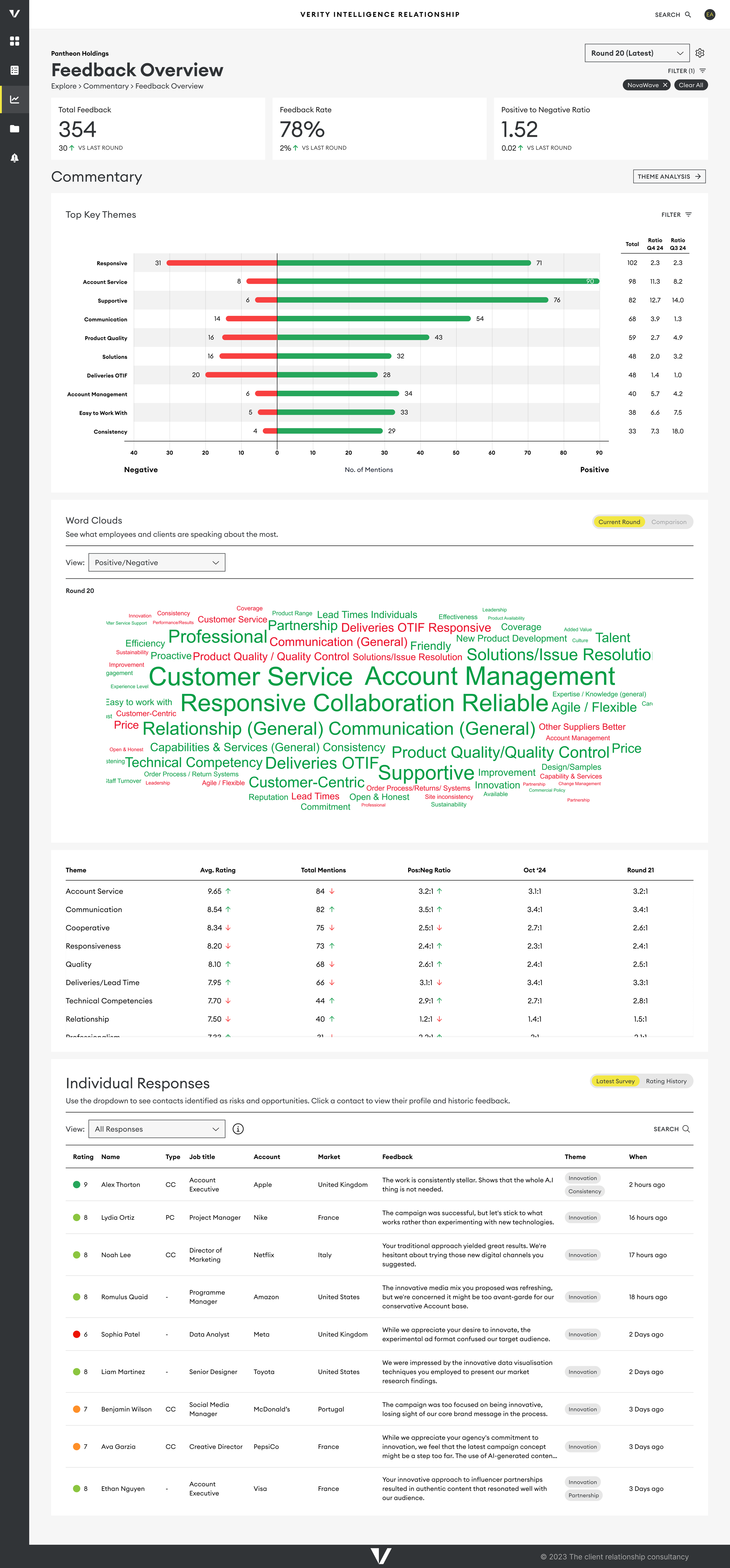
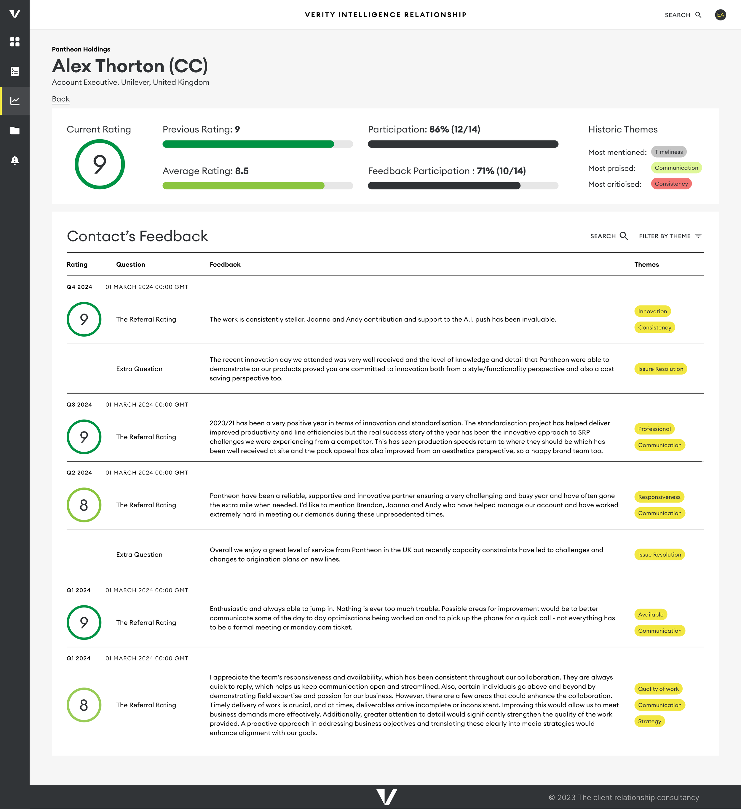
Designing the Dashboard
Designing the different dashboard views that show our users the results of their surveys.
User Testing / Prototyping / Figma
The Challenge
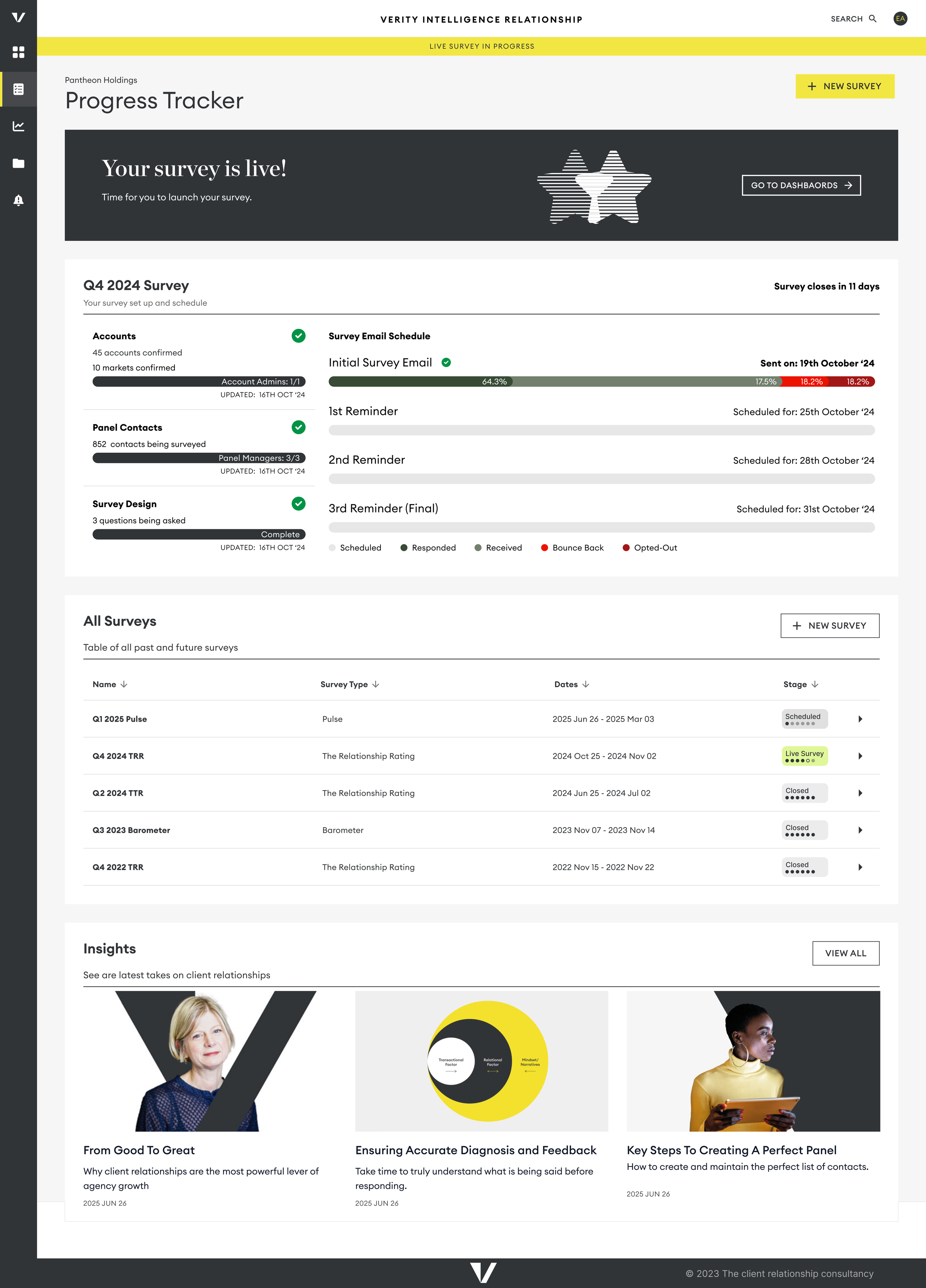
Our existing dashboard was cumbersome, built through a lengthy development process that involved creating customized solutions and stitching them together with tabs. This resulted in a disjointed user experience, with multiple sections showing similar results but causing confusion. Additionally, the use of Tableau limited our ability to make timely adjustments, complicating efforts to streamline our product.
The Solution
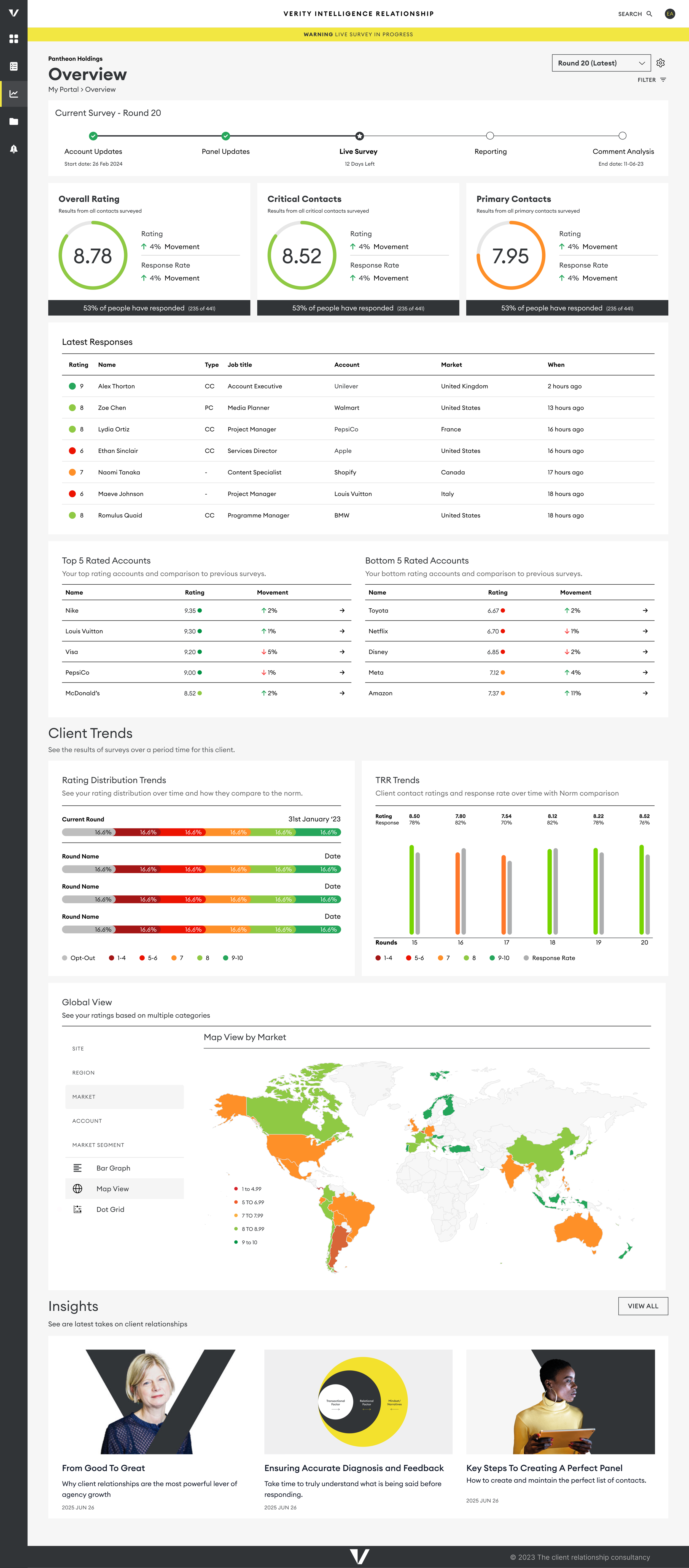
We aimed to create an analytics dashboard that clearly guided users through their survey results. Understanding the diverse needs of our users, we designed the dashboard to cater to various personas while accommodating current data and allowing for future features. Importantly, we ensured that the dashboard was responsive for mobile screens, allowing users to access critical insights on the go.
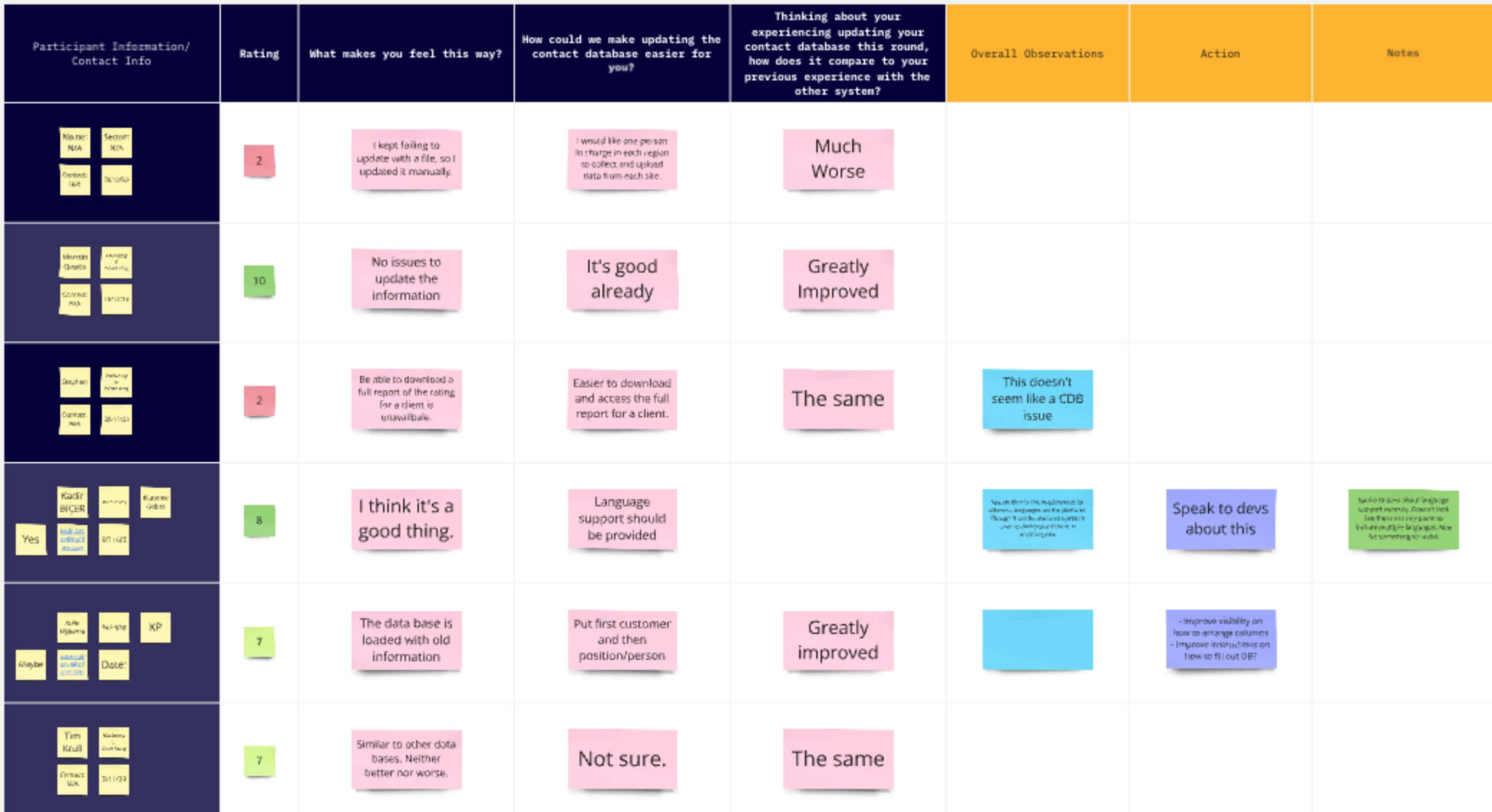
Audit of Current Materials
We began by reviewing the current dashboard and how users engaged with it. Analytics revealed that many users logged in but quickly stopped using the dashboard, often relying instead on PDF reports that provided a clearer narrative but lacked real-time data. These reports, while requiring significant time from our analytics team, included customizable elements that could be replicated in the dashboard. By auditing these materials, we identified similarities and organized them effectively.
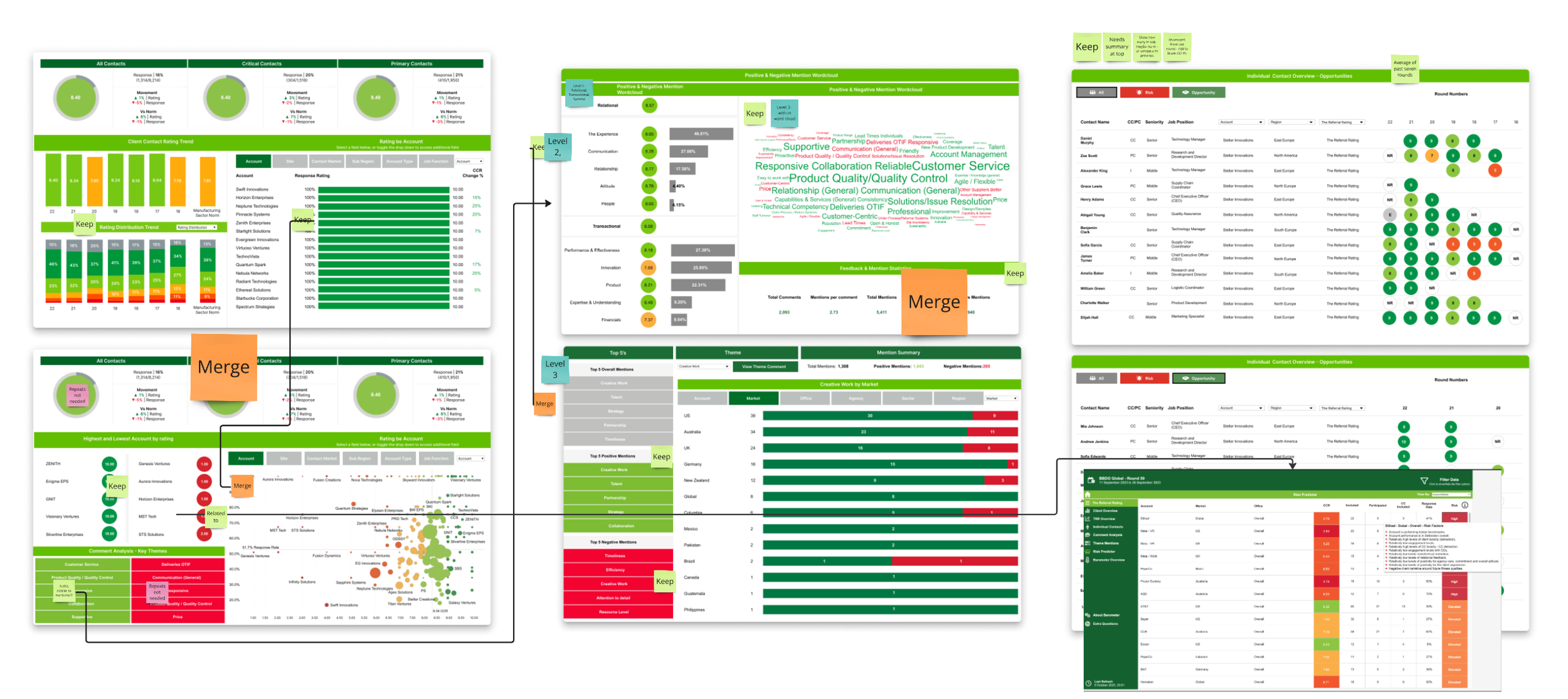
Understanding User Needs Journeys
To gain insights into data consumption, we engaged with our primary personas—Market and Agency Leads in the advertising industry—and attended ten Relationship Review Sessions. These meetings revealed user priorities and the steps they took to access information, which was crucial for real-time feedback during client meetings.
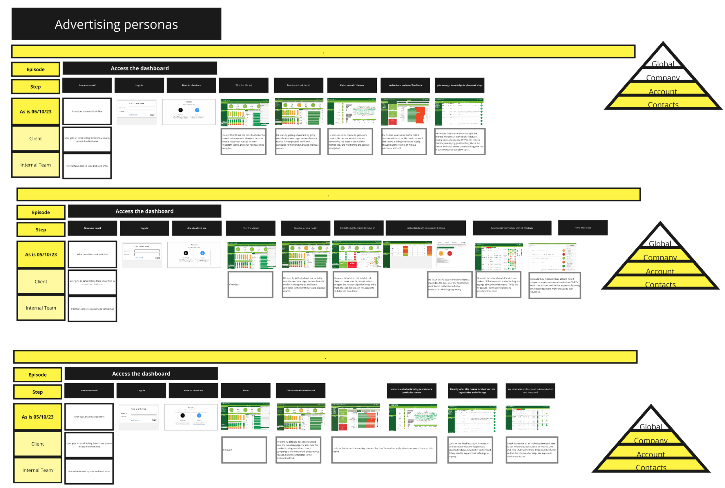
Mapping out Journeys
We mapped out user journeys, starting with a need for contact information and moving into detailed analyses. Users wanted to assess overall ratings, compare them to previous surveys and benchmarks, and drill down into specific ratings to identify themes and critical feedback from decision-makers. While users appreciated detailed insights, they also needed quick alerts for urgent issues, such as identifying at-risk accounts
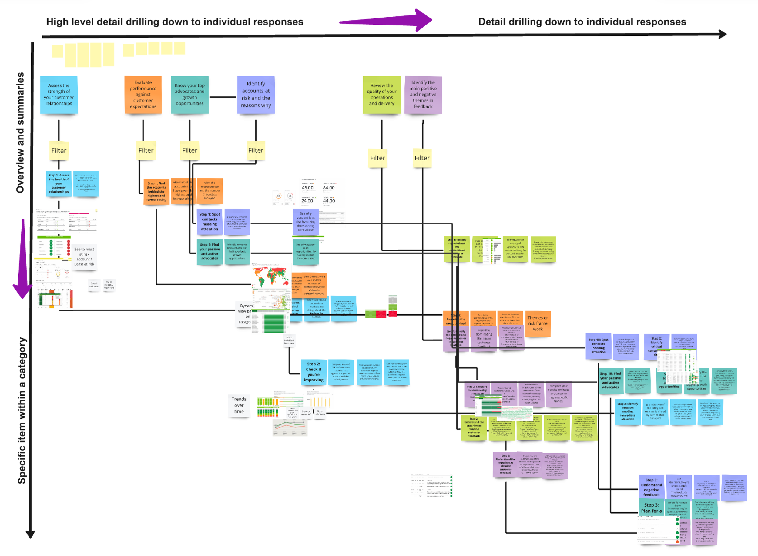
Information Architecture
By analyzing these user journeys, we structured the new dashboard's architecture around key views, including:
Overview and ratings
Context and themes
Individual responses from key decision-makers
Testing and Collaboration
We rapidly prototyped low-fidelity dashboards based on our initial structure and tested them with consultants. Rather than formal user testing, we partnered with our leadership team, presenting prototypes as part of a collaborative development process to gather feedback.
Results
As a result, we observed an increase in dashboard usage during and after live surveys, leading to a reduction in manually created reports. While the old dashboard only tracked visit frequency, we saw a significant increase in engagement compared to the previous version, and we successfully onboarded more users thanks to the streamlined design.
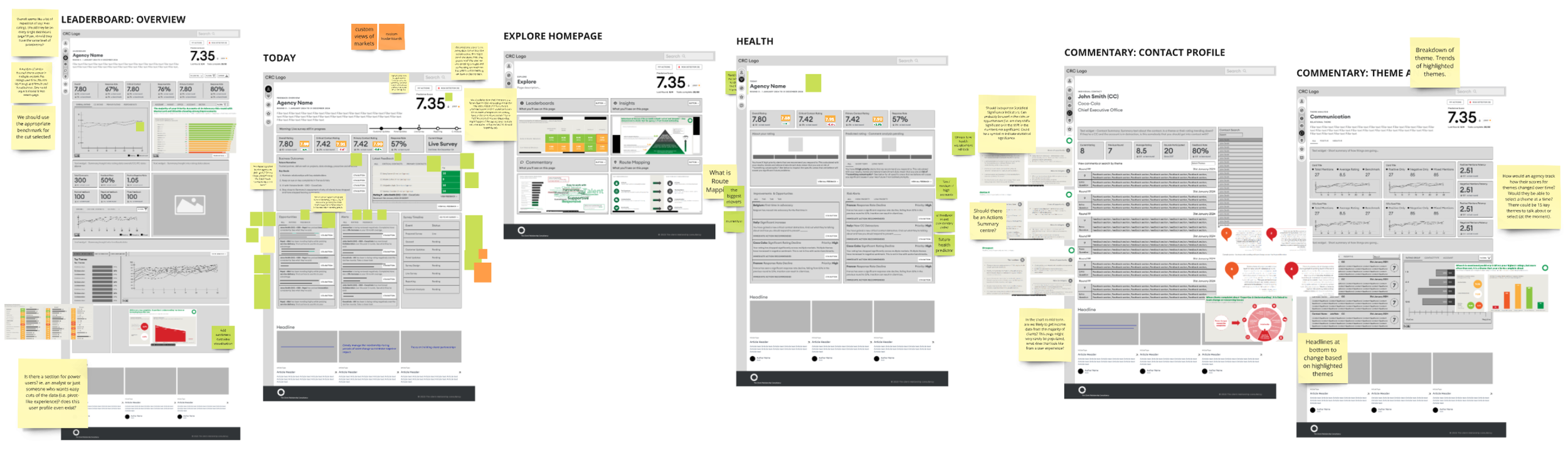
Wireframes of some of the Dashboard Views
Next Steps
A key aspect of our offering is the consulting provided alongside customer satisfaction survey results. To enhance the dashboard, we are working closely with consultants to develop a risk and opportunity framework and action planning feature that will help clients improve their customer relationships based on survey insights.
Learnings
What I learned, current status and future directions
Effective communication with my team proved essential throughout this process. As a user experience designer, my instinct was to engage directly with users; however, the definition of our users was still evolving. At that stage, they primarily had experience with outdated tech and cumbersome Excel spreadsheets. Interestingly, the internal team responsible for survey setup provided the most valuable insights during the early phases. This perspective shifted as I began designing the survey results dashboards.
Now that we’ve transitioned to Salesforce and established a digital process, we’re positioned to leverage AI in our reporting and further streamline survey setup through API integrations. Although we currently focus on the Creative Agencies and Manufacturing industries, this new infrastructure allows us to explore expansion into additional sectors.